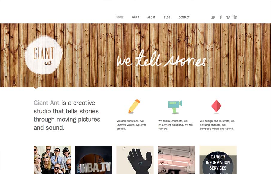
by Gene Crawford | Sep 20, 2012 | Design Firm, Gallery
Nice simple and effective website design, it does what it needs to do and packs it in with a clear yet dense layout. I like the way these guys are selling themselves as a “storytelling” agency, that’s a fun and compelling message to me. Love the wood...
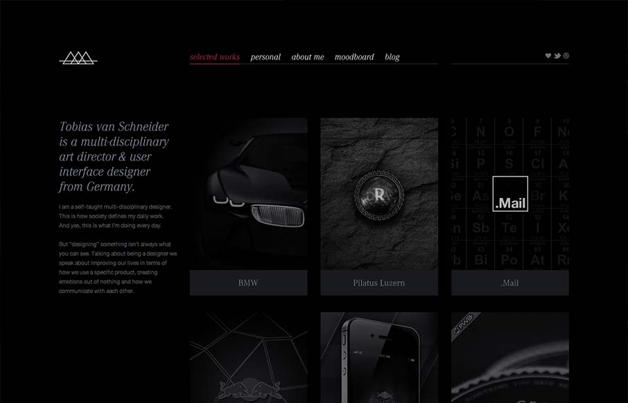
by Gene Crawford | Sep 19, 2012 | Gallery, Portfolio
I like the moody darkness of this website. The interaction of the X that loads over the work samples is nice and has a good feel to it as you mouse around. The mood board is a clever look into who this designer is and the blog is a superb minimal example IMHO. Love...
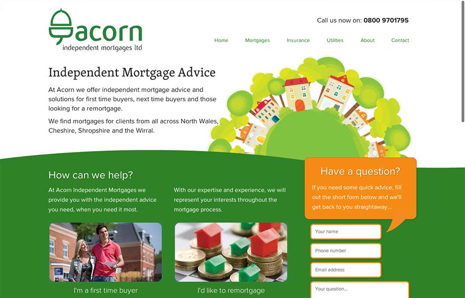
by Gene Crawford | Sep 18, 2012 | Gallery
There’s a lot to like about this design. The animation of the rows of houses spinning in a big circle like that is used perfectly in conjunction with the rest of the otherwise static feeling design. The design doesn’t beat you over the head with the...

by Gene Crawford | Sep 18, 2012 | Gallery, Marketing
Via: Bob Galmarini on Dribbble Really fun little microsite / landing page for the Pantech Flex went live today. Check out the screen swap to show off the different phone UI. What a great website design. It’s just a single pager or microsite as they’re...
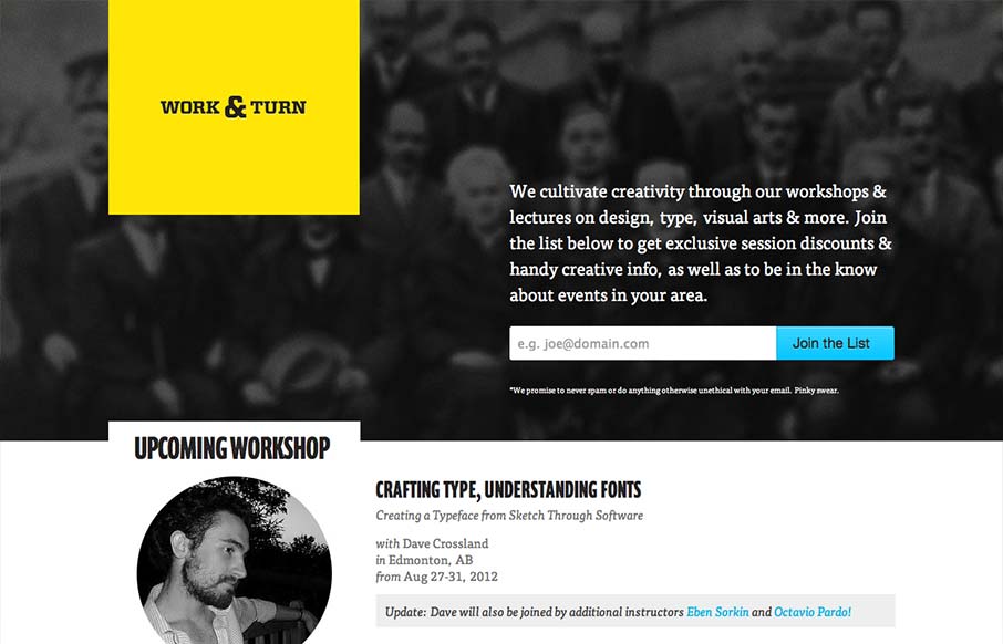
by Gene Crawford | Sep 18, 2012 | Gallery
Nice asymmetrical yet super balanced feeling design. From the colors, the yellow and black with that blue is striking – can you make colors feel asymmetrical too? Super clean look and feel with some superb type handling pitched in for good measure.