by Gene Crawford | Nov 26, 2012 | Gallery
Submitted by: Vito Salvatore @vitosalvatore Role: Designer & Developer I’m Vito Salvatore an Italian Digital Designer/Art Director based on London. This is my portfolio website. Here are showcased all my works: websites, photo, graphics, and more…...
by Gene Crawford | Nov 21, 2012 | Gallery, Portfolio
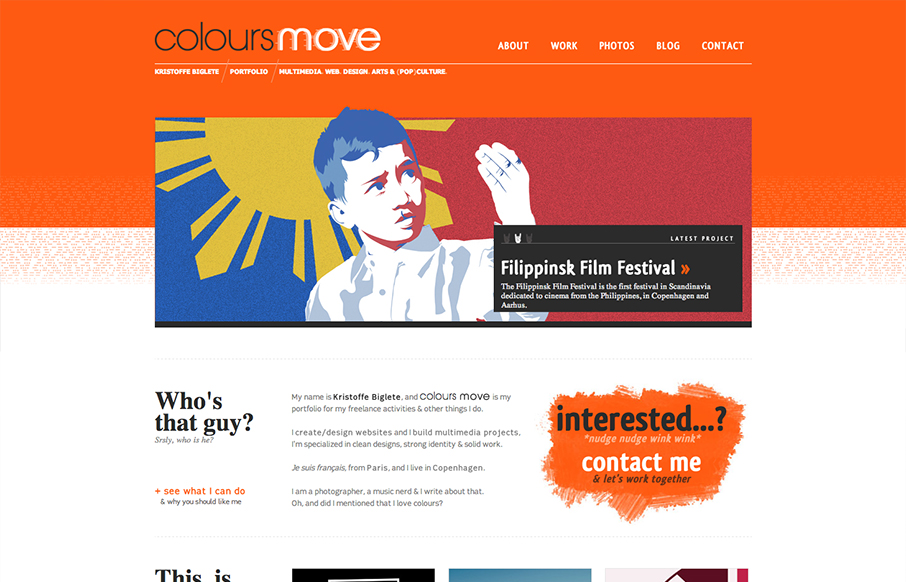
Submitted by: Kristoffe Biglete @kristoffe_ Role: Designer & Developer Colours Move is a portfolio, and has a minimalist design, with a strong visual identity. The palette is very contrasted, with a mix of bright and light colours. It is conceived in a grid...
by Gene Crawford | Nov 21, 2012 | Gallery
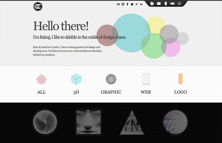
Submitted by: Balraj Chana @circularchaos Role: Designer I like how all the links and sections are presented in this design. The icons and mouse overs are nice. I also really dig the experience section towards the bottom of the page.

by Gene Crawford | Nov 20, 2012 | Gallery, Portfolio
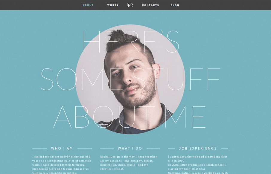
This site is a great example of setting the user up for great surprises. The home page is slick but rather minimal in it’s appearance but you are treated to all sorts of cool images and a nice layout when you get to looking at the portfolio and about page(s)....
by Gene Crawford | Nov 16, 2012 | Church/Religious, Education, Gallery
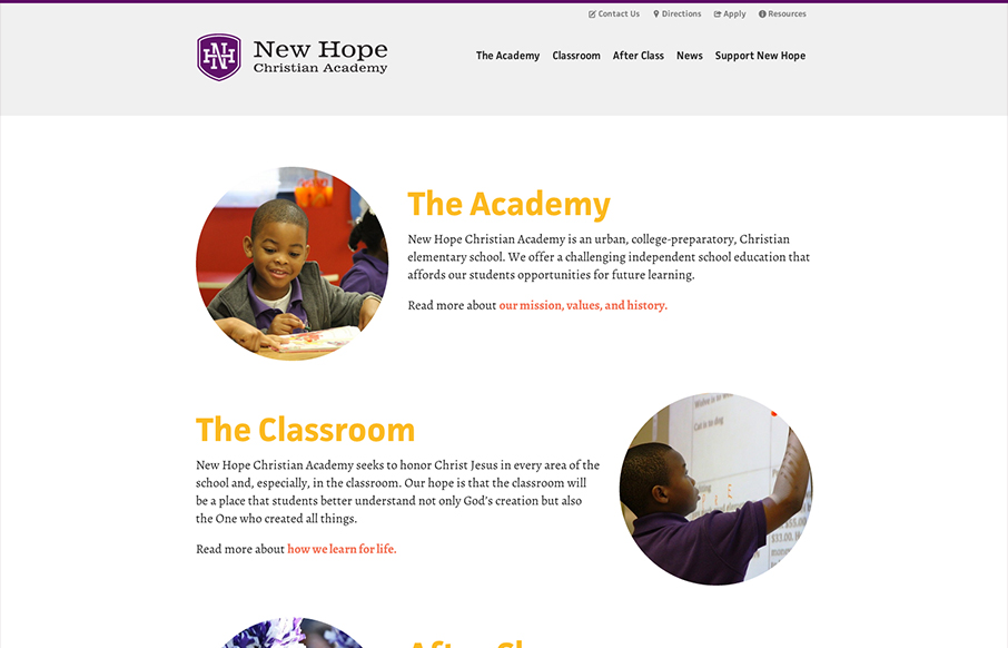
This new site launch by SimpleFocus is very intriguing to me. It has a nice simplified feeling to the layout visually but there’s still just about as much “stuff” on the page as any typical site I’ve seen. I can’t help but think this is...