Submitted by: Kristoffe Biglete @kristoffe_
Role: Designer & Developer
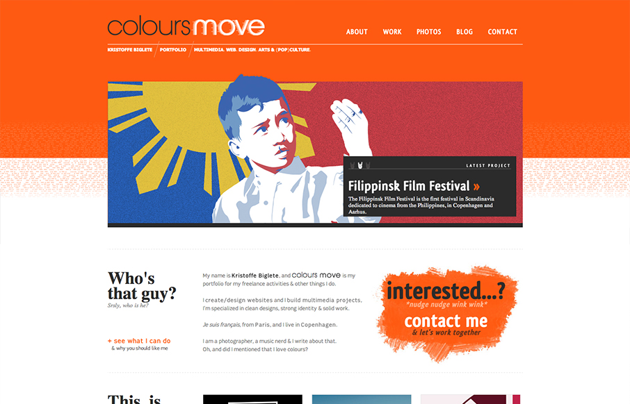
Colours Move is a portfolio, and has a minimalist design, with a strong visual identity. The palette is very contrasted, with a mix of bright and light colours. It is conceived in a grid layout.
I like the visual gradient of content blocks that go from one large slideshow down to four smaller blocks/areas. I always like visual solutions like that for some reason. Feeds the scroll so to speak, right? Nice slideshow and even nicer copy used throughout the site. The About page is my favorite, I have a hard time not wanting this to just be the home page too. Nice work!


0 Comments