
by Gene Crawford | Dec 6, 2012 | Gallery
What a richly packed layout we have here. It’s simple and open yet very dense visually at the same time. That’s very hard to achieve and Mobilla does it very well. I especially like the main hero image that’s responsive and static almost with the...
by Gene Crawford | Dec 6, 2012 | Gallery
Super beautifully crafted website design. The colors, typography layout choices – it just sings! Just beautiful! I really love how the main nav slides up to be a fixed header from the home page on. Seamless and smart feeling.
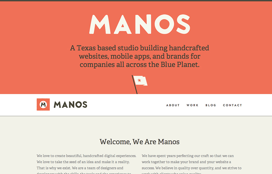
by Gene Crawford | Dec 5, 2012 | Gallery
I like the clear blocky grid for this design. Right angles and squared off images, then the big oversized slideshow at the top. Pretty common layout formula but it’s pretty groovy here to me. Pretty funny use of the animal heads throughout the site. Humor is...
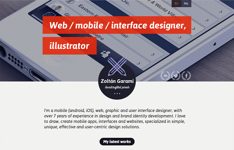
by Gene Crawford | Dec 4, 2012 | Gallery, Portfolio
Submitted by: Zoltan Garami @garamiz Role: Designer I like the placement of the red behind the white text that’s over the monochromatic image. I know it’s simple and been done before but it’s nicely done here and I just like it. The logo is nicely...

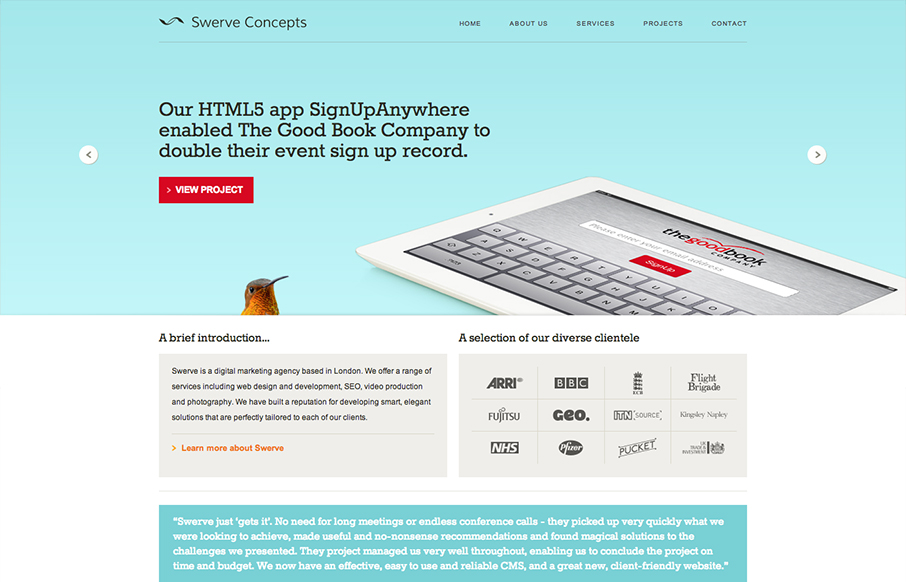
by Gene Crawford | Dec 3, 2012 | Gallery
The new An Event Apart site had landed. It’s a well done example of clean design and responsive/mobile-first implementation. I think we’d all except no less from the masters themselves. They’ve given us a nice writeup on the site re-launch on their...