Zoltan Garami

http://zoltangarami.com/

Submitted by: Zoltan Garami @garamiz
Role: Designer

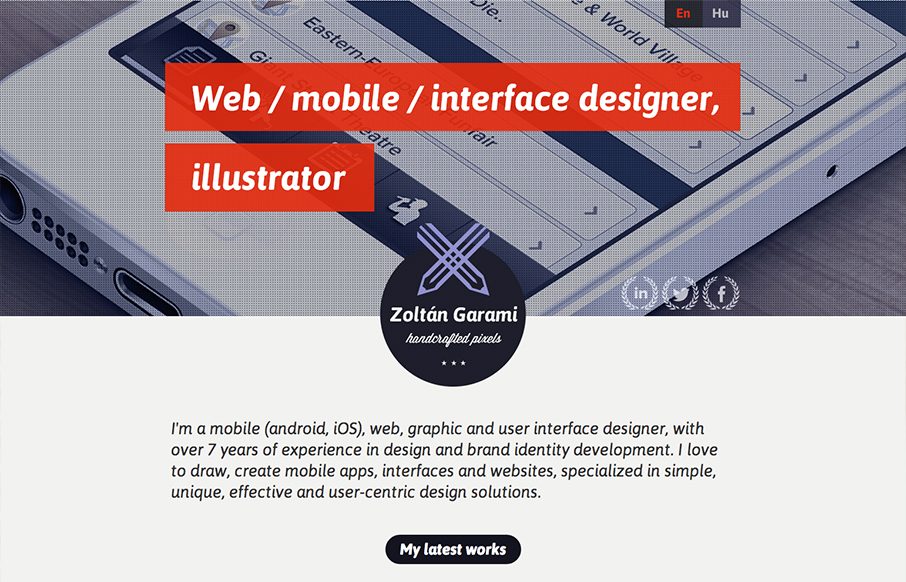
I like the placement of the red behind the white text that’s over the monochromatic image. I know it’s simple and been done before but it’s nicely done here and I just like it. The logo is nicely placed in the center of it all rounding out a nice minimal(ish) and beautiful site.

Kinsta

0 Comments

Submit a Comment

Your email address will not be published. Required fields are marked *

Time limit exceeded. Please complete the captcha once again.

News & Articles

Monochrome Minimalism

Monochrome Minimalism

Monochrome Minimalism merges Bauhaus discipline with IKEA simplicity. Clean grids, muted tones, and functional beauty create digital calm, proof that restraint, not decoration, defines timeless design.

4 CSS Features That Changed Everything

4 CSS Features That Changed Everything

Over the past five years, a handful of new CSS features have completely reshaped how we build for the web. According to the 2025 State of CSS Survey, these are the true game-changers.