by Gene Crawford | Apr 29, 2014 | Gallery, Portfolio
Damn I love this website. Just beautiful illustrations supported by a clean design base.
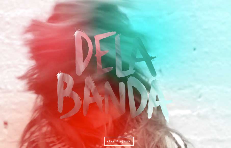
by Gene Crawford | Apr 24, 2014 | Gallery
Pretty crazy presentation here with the video and large “splash” section. I really dig how that transitions into the asymmetrical layout with the photos and how they handle while changing screen widths.
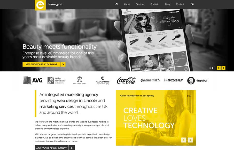
by Gene Crawford | Apr 16, 2014 | Gallery
Nice looking adaptive site. I like the yellow and black palette. My favorite part is the lower 3rd of the page, the grid and blockiness of the layout works really well there.
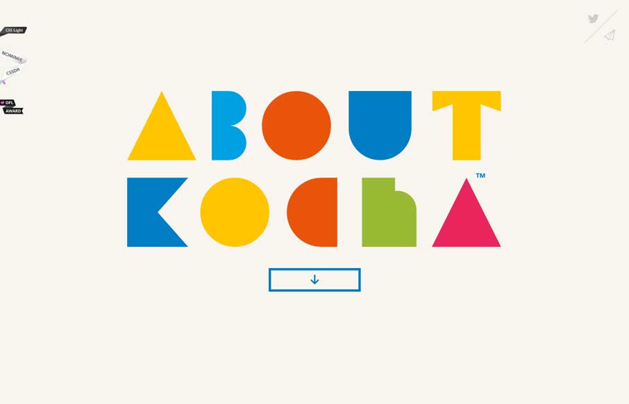
by Aaron Griswold | Apr 15, 2014 | Gallery
Little details make the site. I like the little movement the down arrow has, just to let you know it’s there. Then the little paper airplane on the contact button is nice.
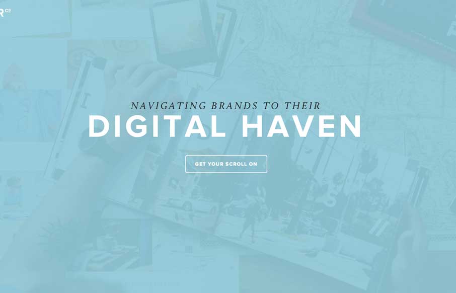
by Aaron Griswold | Apr 14, 2014 | Gallery
Nice minimal approach to the HARBR Co site design. I like the “menu” link and how that interaction works. It helps to keep the site clean and focused.