
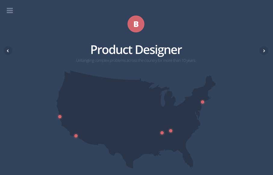
by Gene Crawford | May 13, 2014 | Gallery
Pretty neat animations/interactions. I love how all the things slide into view in an almost surprising way as you scroll down. The multi use of the scroll and arrow keys is smart too. Also it’s responsive.
by Aaron Griswold | May 7, 2014 | Gallery, Portfolio
Really, really great design for a portfolio site. I love the different pieces worked up for the slider/hero area. Brilliantly visualized and communicated stories. The rest of the site is simply wonderful and simple as well.

by Aaron Griswold | May 5, 2014 | Gallery
What a fun website. I love the illustrations and the atmosphere they work to set. Beautifully done simple storytelling with just visuals that get you hooked.
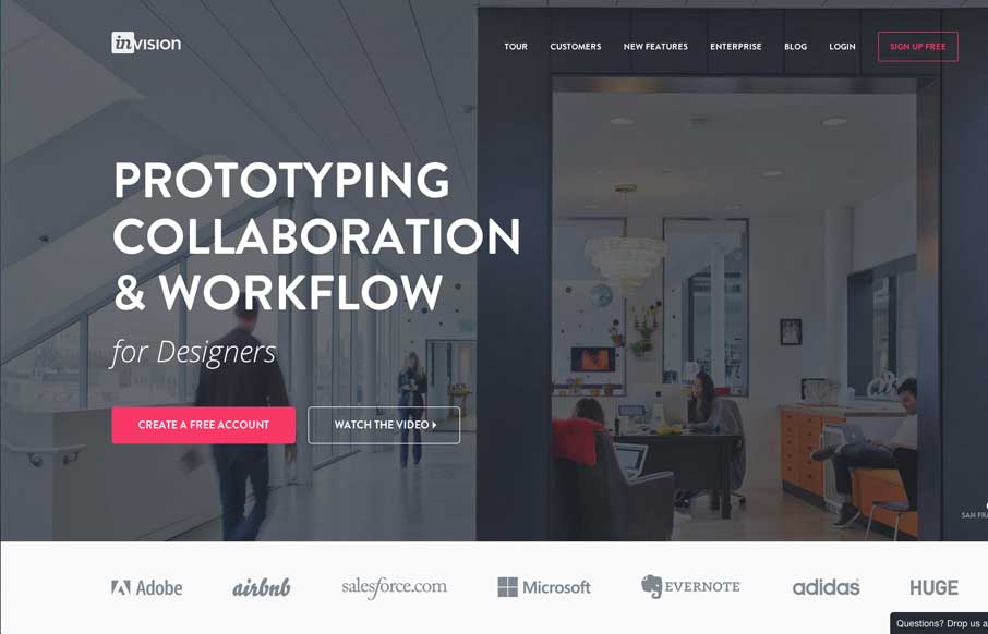
by Gene Crawford | May 5, 2014 | Gallery
Nice redesign of the Invision website. I dig the embedded videos down the page. I also think the way they’ve used the “stories” to display other brands is pretty smart too. Great stuff here.

by Gene Crawford | May 1, 2014 | Gallery
Beautiful and simple approach to this site’s layout. Cool use of the Masonry like layout below the hero image area too – actually putting it to work via the content too.