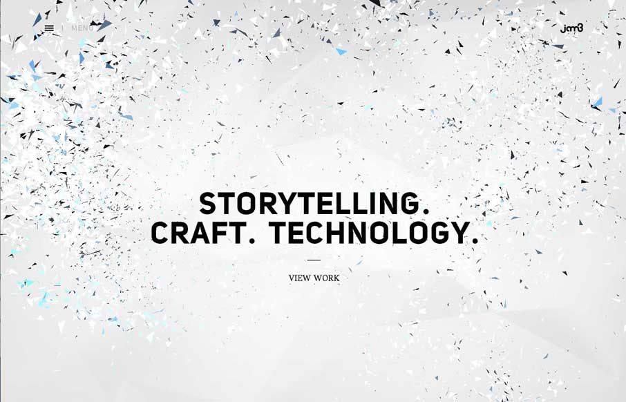
by Aaron Griswold | May 28, 2014 | Gallery
Maybe it’s my ADD, but it took me a while to get off of Jam3’s home page. I dare you to move your cursor around the page and through the copy. I’ve seen a similar this a couple of weeks ago when I was doing research for Radar...
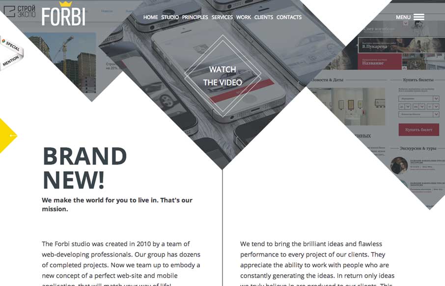
by Aaron Griswold | May 22, 2014 | Gallery
I really like the unconventional way Forbi has their “big pictures” at the top of the site. What follows is very simple and clean, with abstract line drawings as accents, that don’t detract from the content. There are just enough fade ins to give...
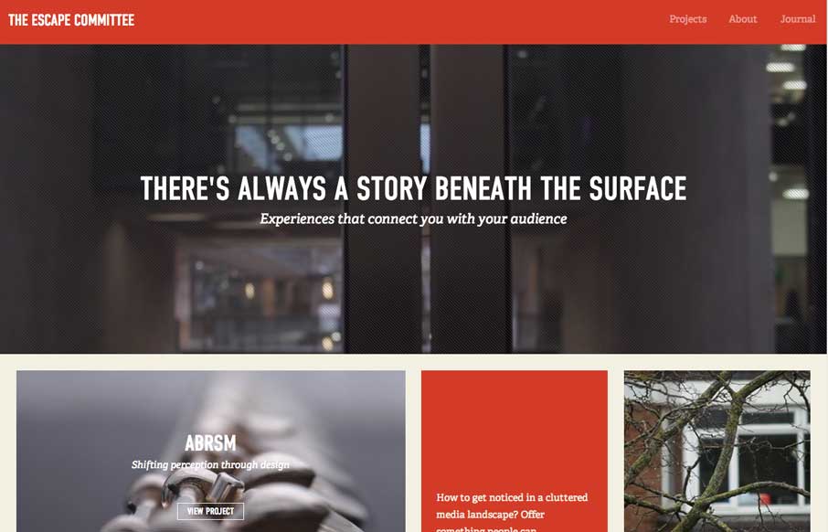
by Gene Crawford | May 15, 2014 | Design Firm, Gallery
Really cool layout for the Escape Committee website. I really dig the sharp lines and boxes the design is based on. The typography fits exactly how it feels like it should too. Makes me want to read all the articles.
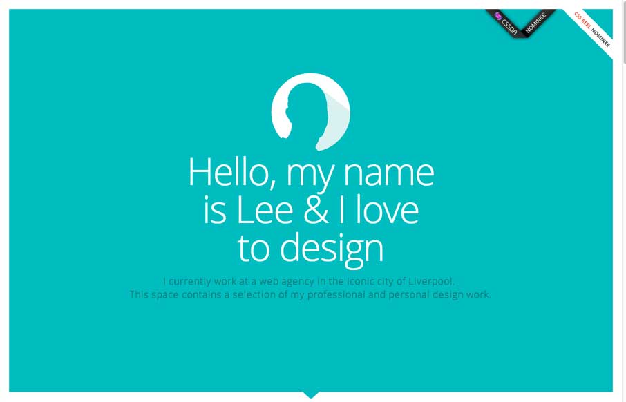
by Gene Crawford | May 14, 2014 | Gallery
Nice clean layout with some interesting interaction; where the work samples slide into view as you scroll. I like the primary feeling color palette and how it’s responsive. I’m not sure it holds up super well at the smaller screen widths but overall...
by Gene Crawford | May 13, 2014 | Gallery
Kind of a weird look for a web design company’s site. It feels very much like a blog or news site. However I kind of like that, by focusing on the usefulness of the content it’s putting the most important part first – the words. Debate it however you...