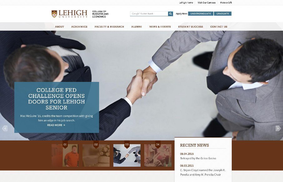
by Aaron Griswold | Jun 9, 2015 | Education, Gallery
Like the clean site from Lehigh University College of Business and Economics – think it has good (and appropriate) UI / UX, even down to the main content / sub-pages. Like how they have the hamburger menu below the hero image so that you can go into more detail...
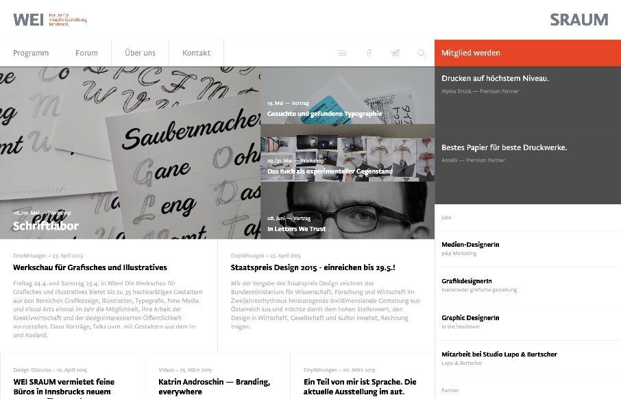
by Gene Crawford | Jun 4, 2015 | Conference, Gallery, Nonprofit
There is a lot going on here to get this website responsive visually. The grid is pretty core to its layout and it flows really well from screen to screen width. I also really dig how the header/nav stays fixed and moves up visually as you scroll down. From the...
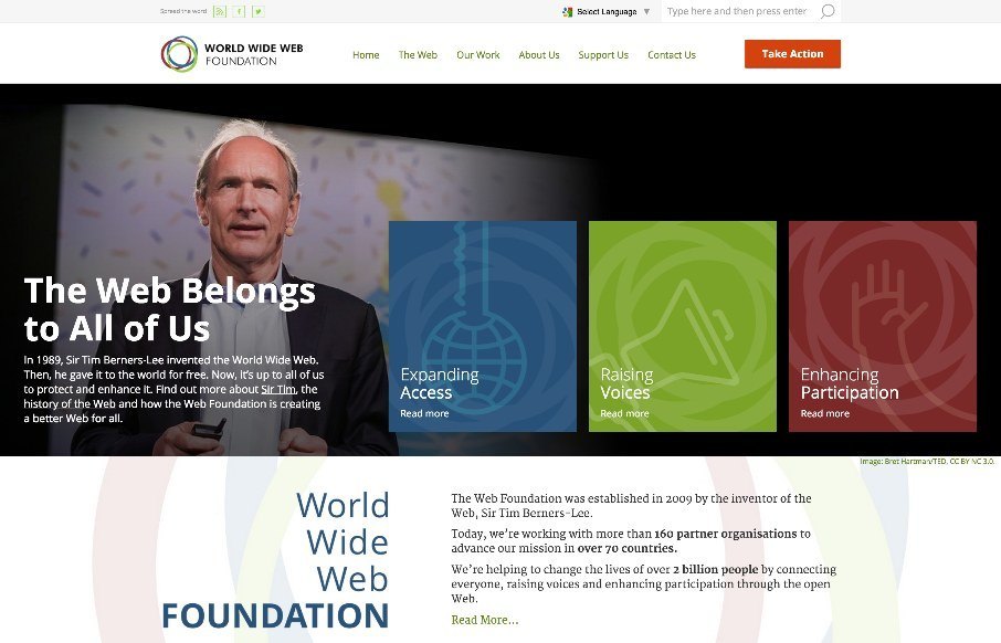
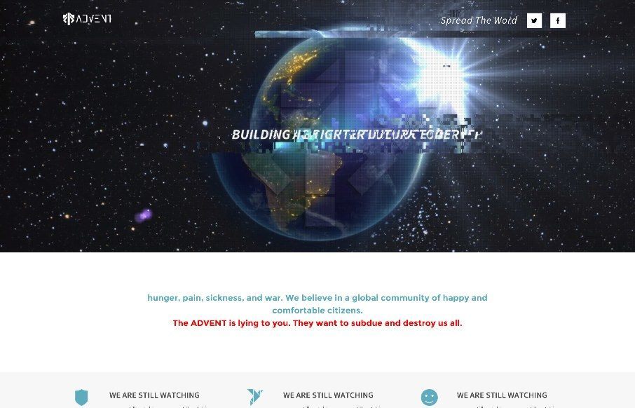
by Gene Crawford | Jun 3, 2015 | Gallery, Nonprofit
Solid, solid design here. There’s a lot to this design but I only want to look at one thing for this write up. Take a look at the screen layout changes between what looks like iPhone and iPad – the marquis areas break out of being on top of the hero image...
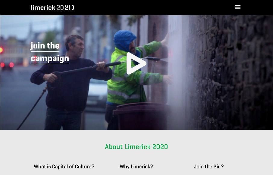
by Aaron Griswold | Jun 1, 2015 | Gallery, Government
Interesting site out of Limerick, Ireland, in their bid to become the European Capital of Culture for 2020 – love to see a site that is built around the cultural events of a city. Really like how they have taken their logo – made a font out of it –...
by Aaron Griswold | Jun 1, 2015 | Gallery, Gaming
What the… I only wish some of the hacked websites we’ve seen over the years could have been this cool. I’m writing this Sunday, May 31st – and not sure how the site is changing on June 1st (the last part of this one-pager for possibly a video...