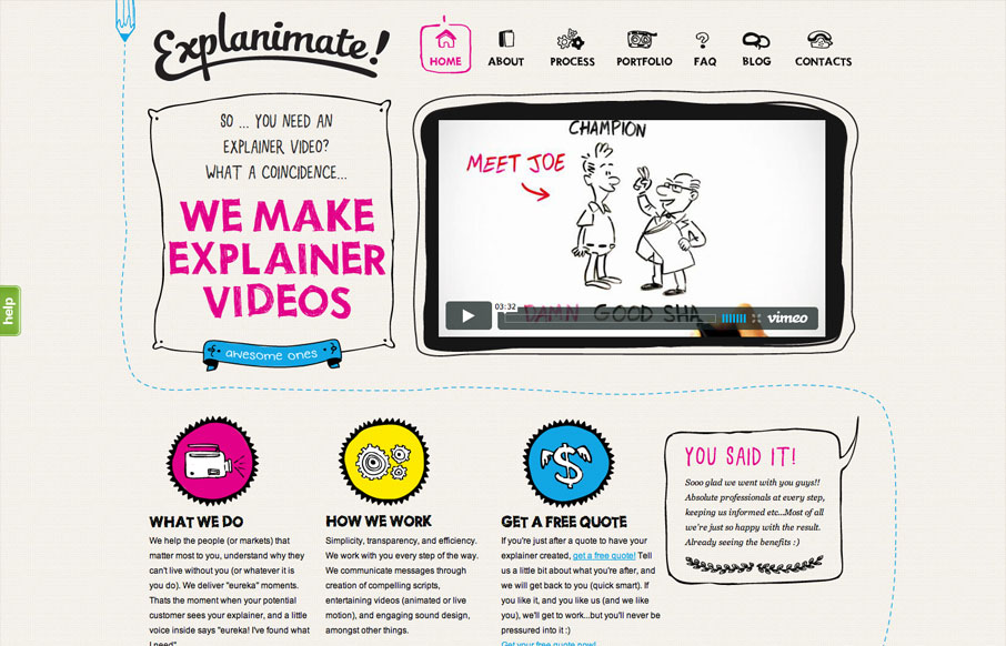
by Gene Crawford | Aug 6, 2012 | Gallery, Marketing
The website is built visually around what these guys do as a service. They illustrate what your product or service does, so they use that same skill on their own stuff. Very fun and open feel. Simple colors and type all work in tandem together like it should....
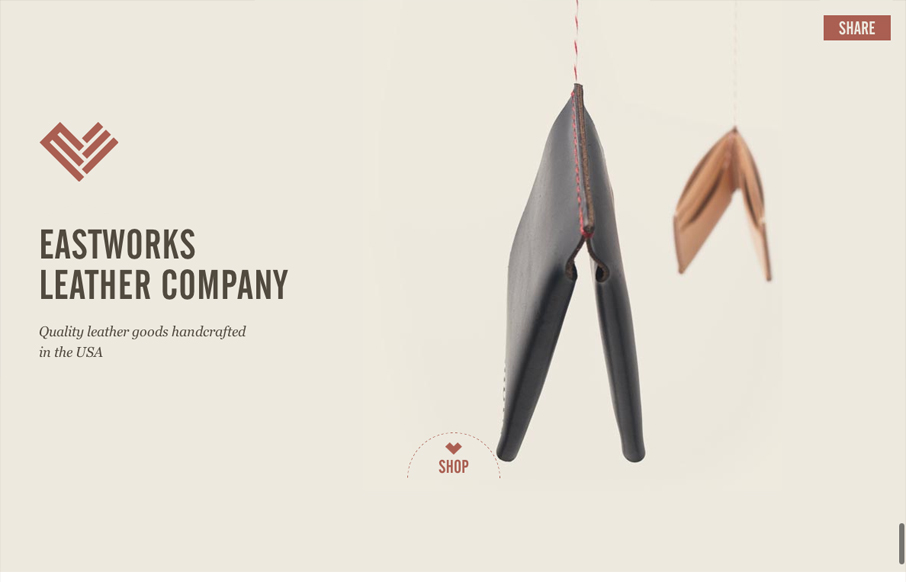
by Giovanni DiFeterici | Aug 2, 2012 | Gallery, Shopping
Are you mesmerized by the spinning wallet? You should be, its a nice stop animation effect that is slightly hypnotic. I love the look of this site. The layout is open and presents the small assortment of items beautifully. Gotta love the logo and nav treatment as you...
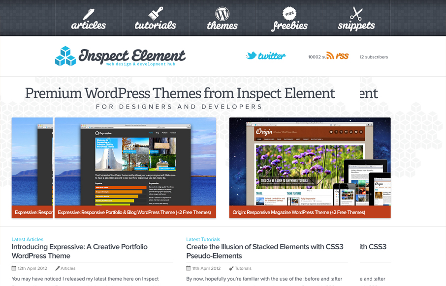
by Gene Crawford | Aug 1, 2012 | Gallery
Really nice simple yet deep looking layout for the Inspect Element website. I really like how the main nav sort of hides under the page as you scroll down, that’s a small detail but it makes you really notice it. Then the simple feeling 2 column layout with...
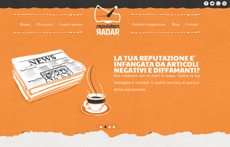
by Gene Crawford | Aug 1, 2012 | Gallery
The animated slideshow is very cool. It’s the thing that makes you pay attention to this site. Then the action on the fixed navigation as you scroll down has added impact. The home page is jammed with content and graphics and there is a ton of content across the...
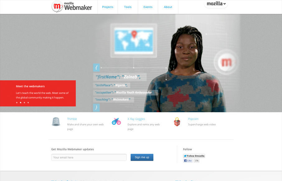
by Maria | Jul 30, 2012 | Gallery
Nice clean and straight forward design for the Mozilla Webmaker website. Some interesting responsive navigation changes too. Wonder why they chose to drop that big selection nav off the Mozilla logo on smaller screen sizes. Overall I like the minimal feel to it while...