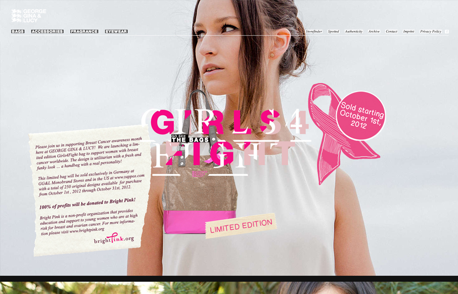
by Gene Crawford | Oct 2, 2012 | Gallery
It’s definitely the year of scrolling/parallax designs. This one is quite nice. The crazy type effect reminds me so much of something David Carson would do. It feels fun and free yet ordered.
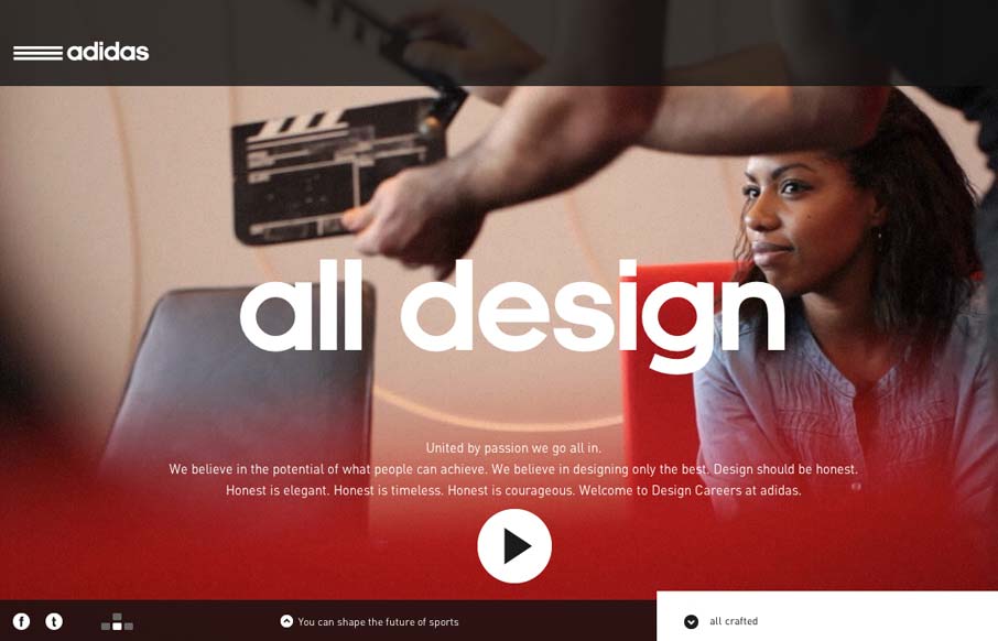
by Gene Crawford | Oct 1, 2012 | Gallery
Damn this is a sexy website for the Adidas design studios. I love the navigation design and it incorporates with the overall UX and look of the rest of the site. Overall the narrative driven design just gets me excited. I love the sections and the keyboard nav...
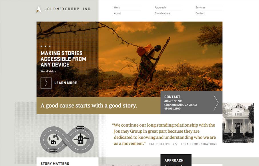
by Maria | Oct 1, 2012 | Gallery
Order yet disorder. That’s how I like to think about this design. It starts off with this really strong grid feel and then the shapes and blocks of copy/images start to feel really asymmetrical and wonderful. I like the blocky vibe with the type and the flat...
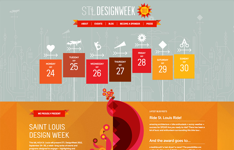
by Gene Crawford | Oct 1, 2012 | Gallery
Super rich design for STL Design Week. I love the way the icons are mixed into the design so smoothly. The page to page transitions are strikingly interesting visually speaking, they get a bit tedious if you’ve been to the site a few times however. Overall...
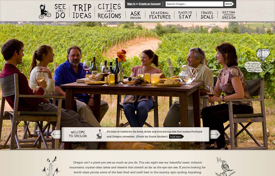
by Gene Crawford | Sep 27, 2012 | Gallery, Travel
Oh man, I love this design. There’s so much going on here with the responsive design. The search box has some interesting changes across screen sizes, which is worth some study. I also really like how the main hero/slide show is done, where when you get down to...