by Gene Crawford | Oct 11, 2012 | Blog, Gallery
The red and black design always works IMHO. Mixed with a nice grid and a diagonal it just comes off as smart. I like the subtle grid pattern that can be seen behind the design and the type mix works well with the grid vibe. I like that search form design a lot. Great...

by Gene Crawford | Oct 10, 2012 | Gallery
Wow, what a beautifully designed layout. It immediately makes me think of the swiss school of design. I love the diagonally aligned screenshots and then the timeline is a really smart inclusion. I also love how it get’s more involved visually and interaction...

by Gene Crawford | Oct 10, 2012 | Gallery
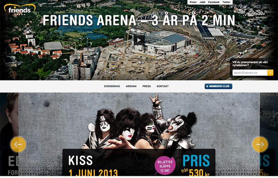
Those who are about to rock, we salute you: check out the responsive site for Sweden’s national arena! friendsarena.se /via @skogberg— Responsive Design (@RWD) October 8, 2012 I like how the header/navigation goes from being under the main image to being fixed...

by Gene Crawford | Oct 9, 2012 | Education, Gallery
The whole purpose of this site/page is to help you decide to become a student at this school. It’s a great linear narrative and it uses some cool techniques to engage you and some super great photography to show you around. I dig the fixed navigation design, it...

by Gene Crawford | Oct 3, 2012 | Gallery
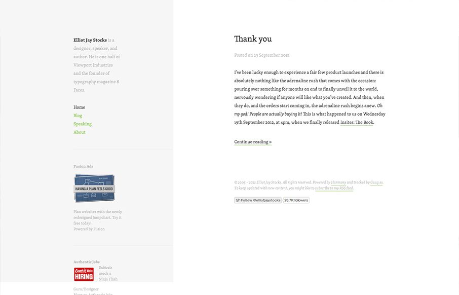
Minimal design approach on Elliot Jay Stocks website redesign. I like the intellectual approach to keeping the design focused around the content. In his post on the redesign Elliot says: When we focus on measure, we are of course focussing on the pleasure of the...
