by Gene Crawford | Nov 21, 2012 | Gallery, Portfolio
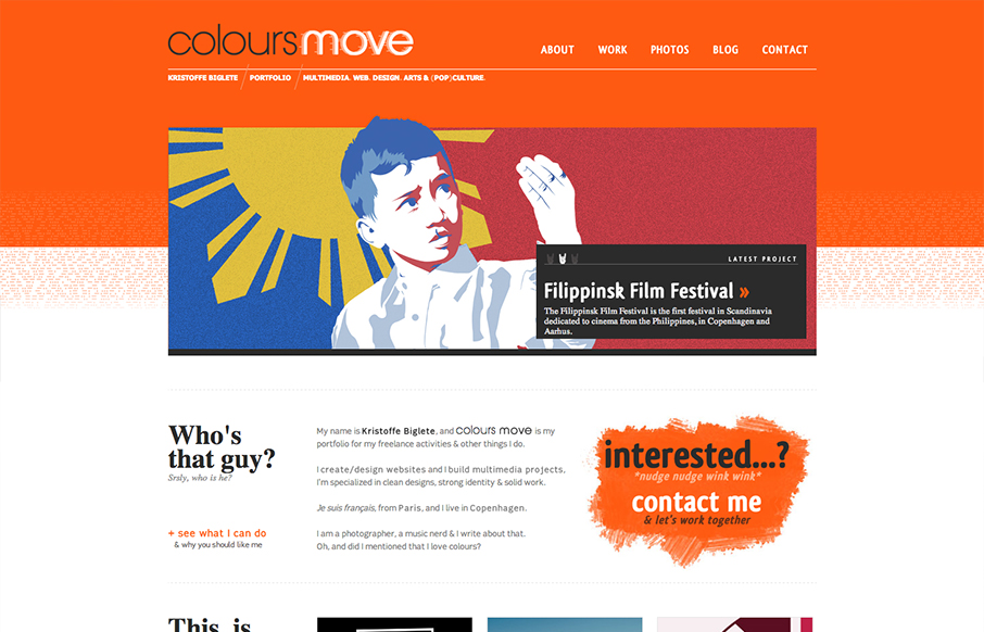
Submitted by: Kristoffe Biglete @kristoffe_ Role: Designer & Developer Colours Move is a portfolio, and has a minimalist design, with a strong visual identity. The palette is very contrasted, with a mix of bright and light colours. It is conceived in a grid...
by Gene Crawford | Nov 20, 2012 | Gallery, Marketing
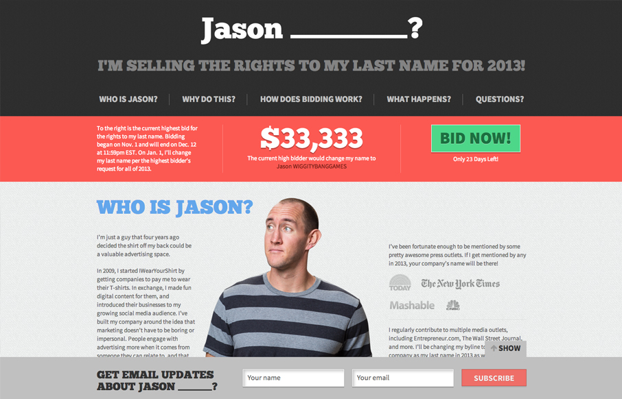
Jason is crazy. But Jason has a cool website. I like the colors most of all they’re very inviting and mixed with the imagery it works really well. Good choice on keeping it a simple one pager too. Nice!
by Gene Crawford | Nov 20, 2012 | Gallery
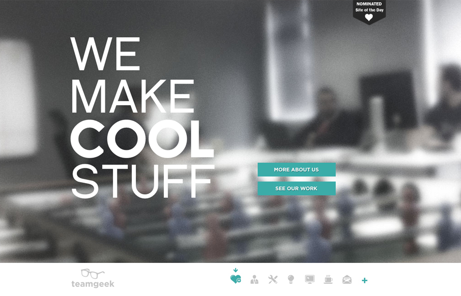
Nice prototypical type design but I like the minimal palette and the fixed nav interaction. Nice icons and general look and feel.

by Gene Crawford | Nov 19, 2012 | Gallery
This is an interesting problem to solve. There are several networks or resource website and then a few sub-page type sections that all have to be tied together. This solution, using this page as a hybrid splash page of sorts, with an interesting interaction for the...

by Gene Crawford | Nov 19, 2012 | Design Firm, Gallery
Bold colors and simple copy help sell this company even if I can’t speak the language. It’s a nice simple yet bold interaction design that has a nice feel to it. I like the little contact envelope that rolls out to be more info in the bottom right the...