by Maria | Sep 12, 2012 | Gallery
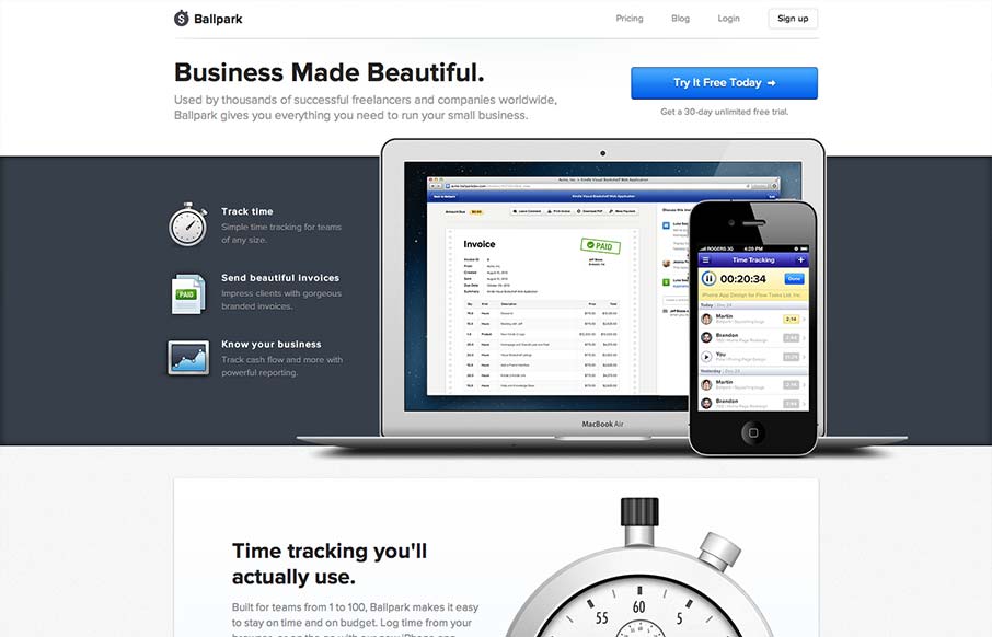
incredibly elegant getballpark.com — Matthew Smith (@whale) August 15, 2012 Take away the beautiful aesthetic and you’re left with a clearly defined product page. The copy is straightforward enough to be informative, and polished enough to be engaging on its...
by Giovanni DiFeterici | Sep 10, 2012 | Design Firm, Gallery, Screencast Review
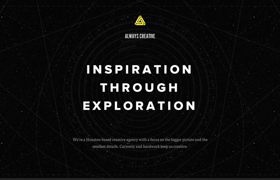
This site is beautifully wide open, with subtle animations and a complex mix of textures. It is somewhat narrative through a combination copy about exploration and imagery of space. Their vision is simply stated, which I like, and the design is super-clean (which I...
by Gene Crawford | Sep 10, 2012 | Gallery
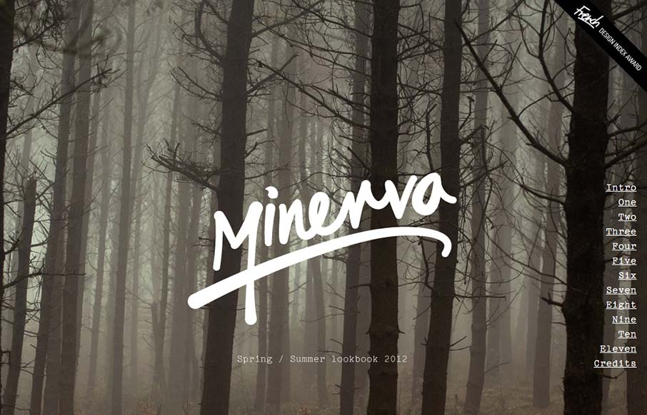
Great looking single page scroller. I love the long almost narrative feel to the catalog here, the product displays are well done too. I think the fixed nav element is a little bit understated but it’s a subtle design and I totally understand it in the...
by Giovanni DiFeterici | Sep 7, 2012 | Food and Beverage, Gallery
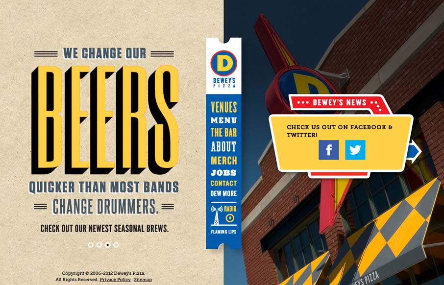
I usually hate when websites hit me with a ‘site soundtrack’, but in this case I really think it helps to complete the experience. The colors, texture, and typography go really well with the music. It took me a little while to realize that the center...
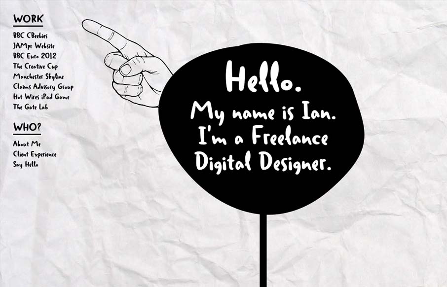
by Giovanni DiFeterici | Sep 6, 2012 | Gallery
Ian put together a nice post for us about his thought process while building this site. I love the experimental feel of the design, so I thought I’d throw it in the gallery. As Ian mentioned, this site certainly makes accessibility sacrifices to accomplish the...