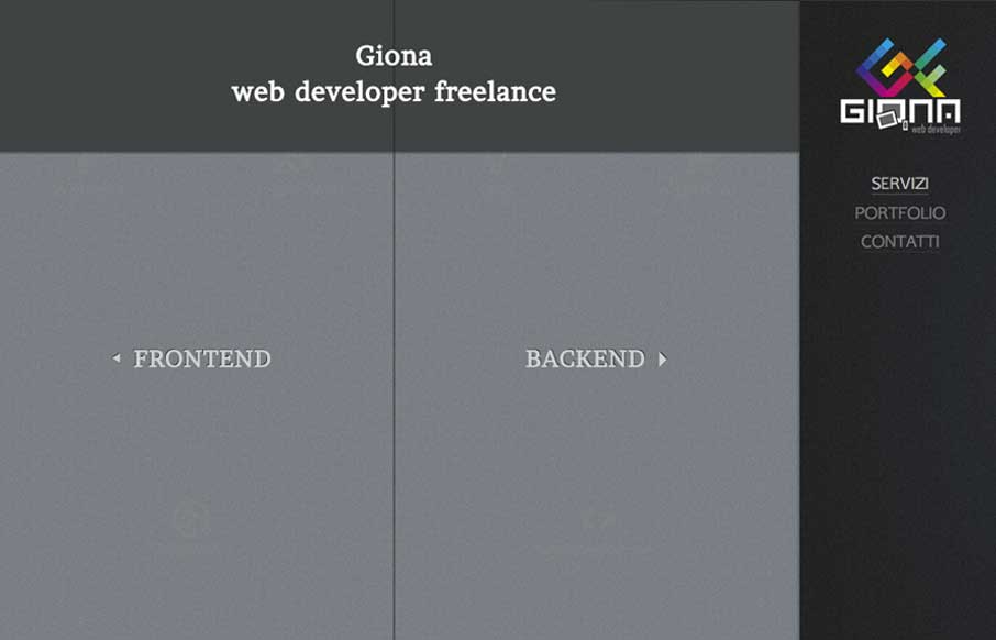
by Gene Crawford | Mar 18, 2014 | Gallery
Really nifty interaction design. I like how the interactions allow you to play, the left and right sides of what this person can do are represented pretty well with this design too. It’s also responsive which looks like it was a lot of work.
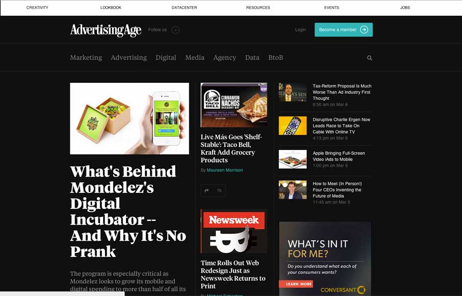
by Gene Crawford | Mar 14, 2014 | Gallery, Marketing
I dig the new Ad Age website. I like the top section that has the black background and how it uses that section for featured content. As you make your way down the page there’s some nice “sectioning” of specific styles of content. I love how the...
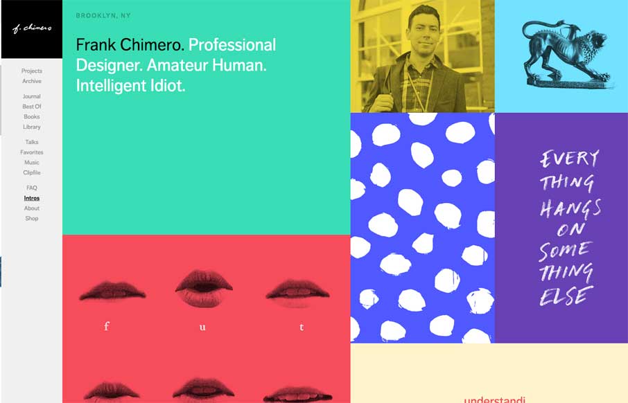
by Gene Crawford | Mar 12, 2014 | Gallery, Portfolio
The latest version of Frank Chimero’s personal website is just great. I love that it’s largely traditional in that the nav is just there on the left, in text form, for anyone to see and click. It’s this kind of understated beauty that reminds me why...
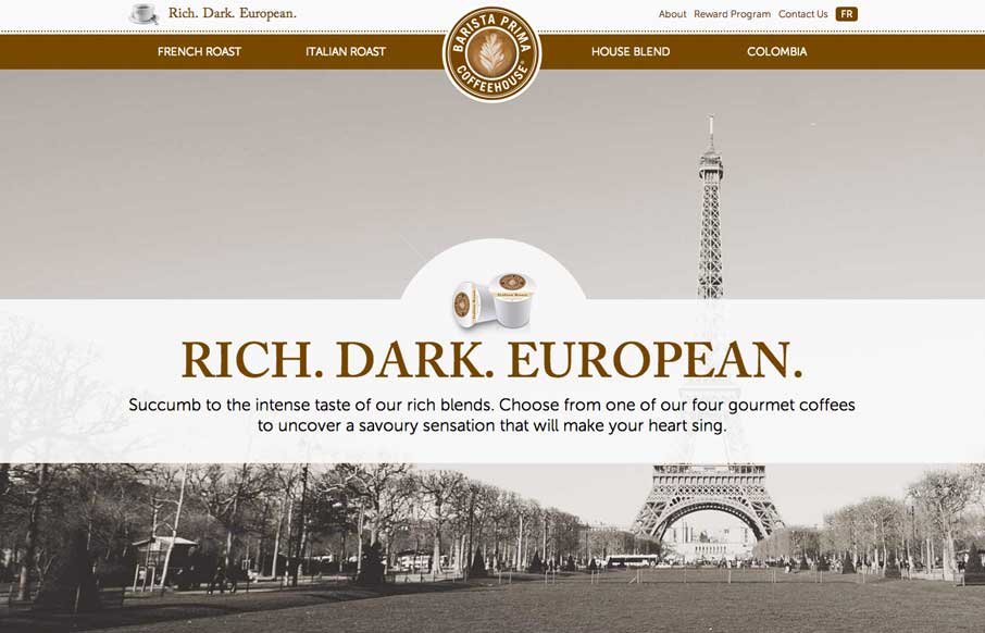
by Aaron Griswold | Mar 11, 2014 | Food and Beverage, Gallery
So… as soon as I saw this site, I fired up the Keurig. The black, white, gray and coffee brown immediately put me in a mood to enjoy coffee. The entire site is centered around the brand’s tagline: “Rich. Dark. European.” The background images,...
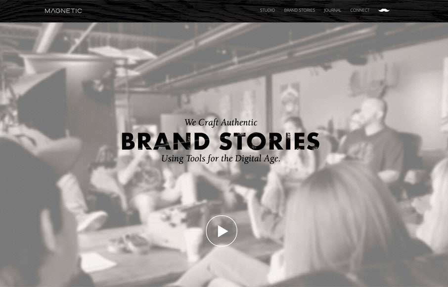
by Gene Crawford | Mar 10, 2014 | Design Firm, Gallery
Really cool looking mix of tight straight edges and hand made type treatments, mixed with the sepia colored imagery. This site has a nice hand made feel but also very high end. The slight movement of the images behind the type overlays add that extra little dimension...