by Gene Crawford | May 29, 2013 | Design Firm, Gallery
Pretty cool look with the scroll effect (dare I call it a parallax?). I also like the monochromatic palette for the layout with the full color images blocked in.
by Gene Crawford | May 23, 2013 | Gallery, Portfolio
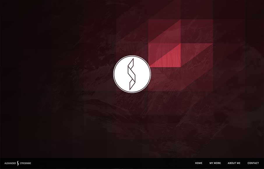
I’m seeing a few new design trends like this one, where there’s basically a splash page but it’s executed as an oversized header area. Pretty clever, like this one, which reminds me of a cylon’s eye for some reason. That alone is enough to make...

by Giovanni DiFeterici | May 15, 2013 | Gallery
Hopskoch is joyful and simple. It’s subtle animations are perfectly appropriate for selling the brand and pair nicely with the easter color palette. I really dig how the main product image scrolls up a little and fades out as you scroll down the page and the...

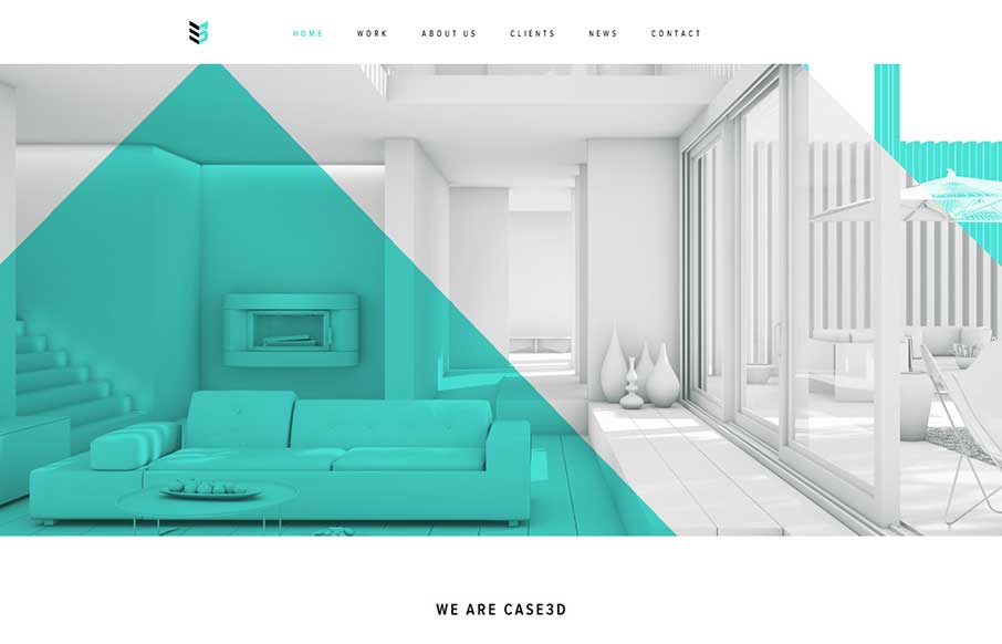
by Gene Crawford | May 14, 2013 | Design Firm, Gallery
There is a lot of good looking design scattered across this website. Each page looks like it has had the same amount of love and attention paid to it as the home page has. I love it when I come across a site design like that, that’s so thorough and finished...

by Gene Crawford | May 8, 2013 | Gallery
There’s a lot going on with this website design. There are so many different nav items and little things that you can click on, in a lot of ways it suffers the same issues that most big product websites do: too much stuff. They do a good job with keeping the...