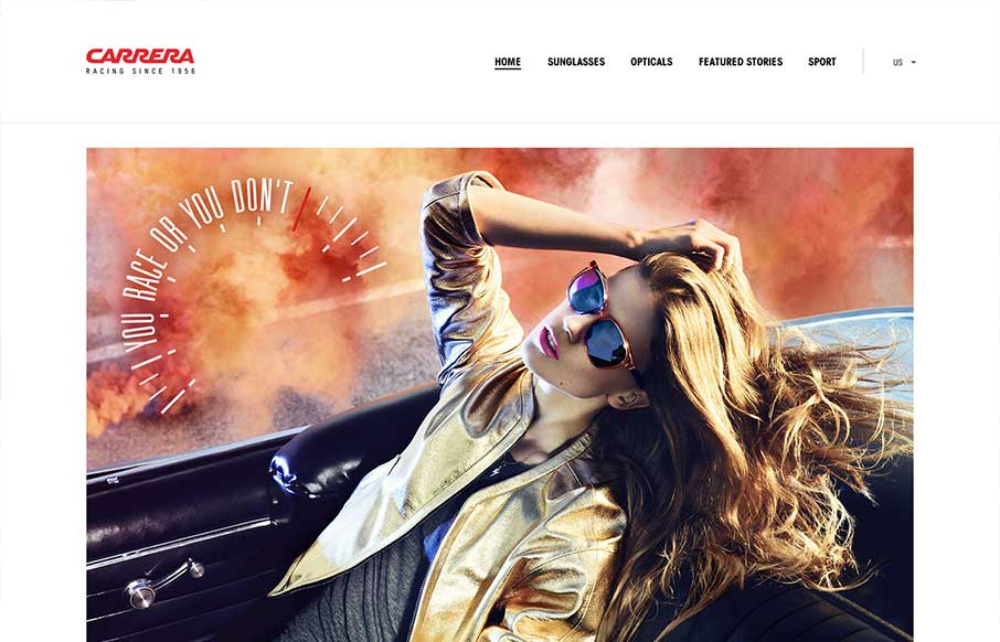
by Giovanni DiFeterici | Jun 18, 2013 | Gallery, Shopping
I really like how carreraworld has broken the grid. The site is well structured, but has loosened the hard lines of the grid it uses to create a more free flowing and energetic design. Nothing feels static. Even thought the design is wildly varies throughout the...
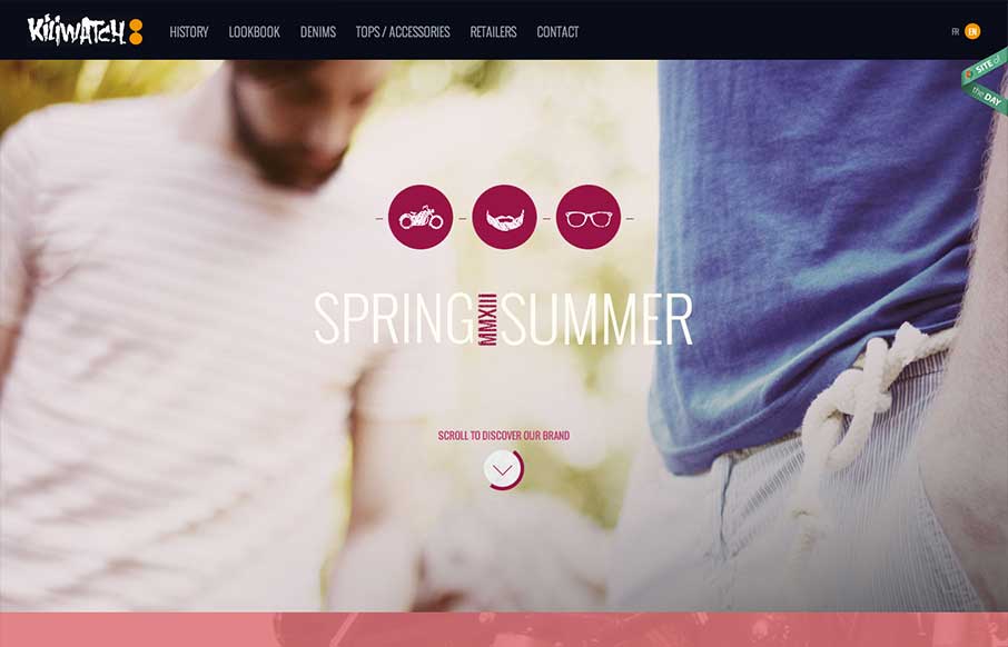
by Giovanni DiFeterici | Jun 13, 2013 | Gallery
Yet another beautiful product site, strongly driven via amazing photography. Can’t say enough about how beautiful I find the mix of colors, imagery and typography. I’m a little worried about all of the loading screens we’ve been seeing lately, but...
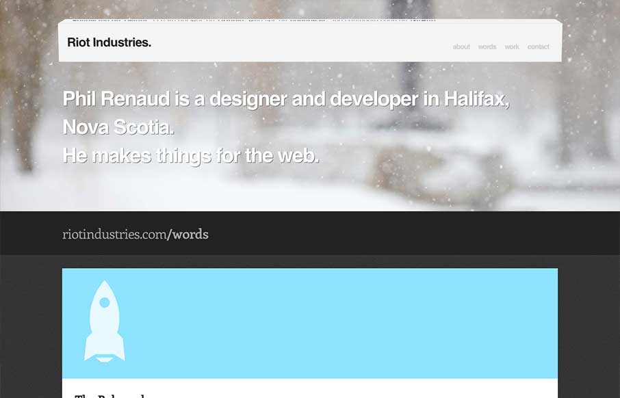
by Gene Crawford | Jun 11, 2013 | Gallery
Some really nice fun subtle design stuff in the header of this site: riotindustries.com— Chris Coyier (@chriscoyier) June 4, 2013 I couldn’t agree more with Chris. The header is a beautiful example of adding a dimension of animation/interactivity and not...
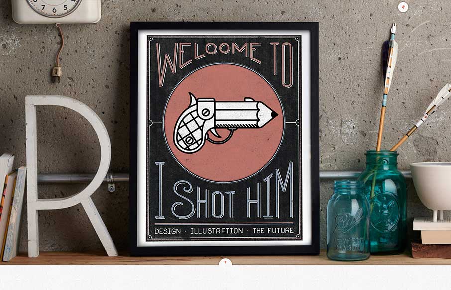
by Giovanni DiFeterici | Jun 10, 2013 | Gallery
I pretty much love everything about this site. The art, the colors, the subtle type sensibilities and spacing. The site’s architecture is interesting as well with beautiful landing images for every project and content area. Truly inspired stuff. Plus, the...
by Gene Crawford | Jun 5, 2013 | Gallery
Nice clean design. I like the hard angles across this design mixed with the cool colors that make it up. This layout feels very high end which is clearly the character this company is trying to portray – they nailed it.