by Gene Crawford | Nov 18, 2014 | Gallery, Portfolio
I’m digging how this page scrolls, the way you go from the black background to the white with an angle down the page. Good stuff. Submitted by: Zulficar Ali @zulficar Role: Designer & Developer
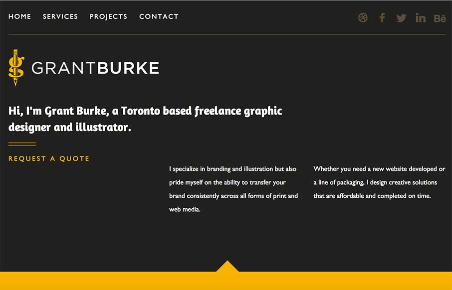
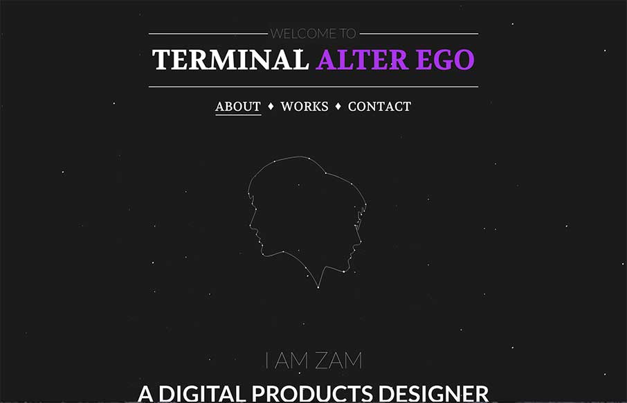
by Aaron Griswold | Nov 7, 2014 | Gallery, Portfolio
This website is clean, modern and easy to use. It features responsive design that allows for an solid experience no matter what platform or device you are using to view it. Submitted by: Grant Burke Role: Designer Twitter: @GBDesigns1

by Aaron Griswold | Nov 4, 2014 | Gallery, Music
Really cool and (for me) fast loading site. I had to go back and read the description (below) about what it’s used for – but cool way to present music / videos for this record label. Like how the videos and the site seem to mesh well too. Responsive...
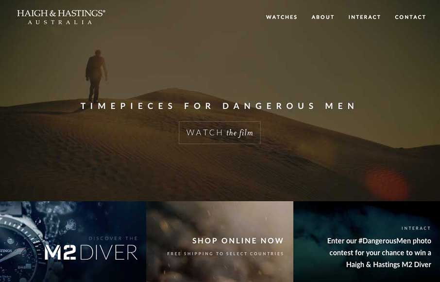
by Gene Crawford | Oct 30, 2014 | Gallery
Very different vibe than what i’m used to seeing with the Haigh And Hastings website layout. I really like how the overall layout changes for the different screen widths. There’s some dramatic layout changes – check it out.
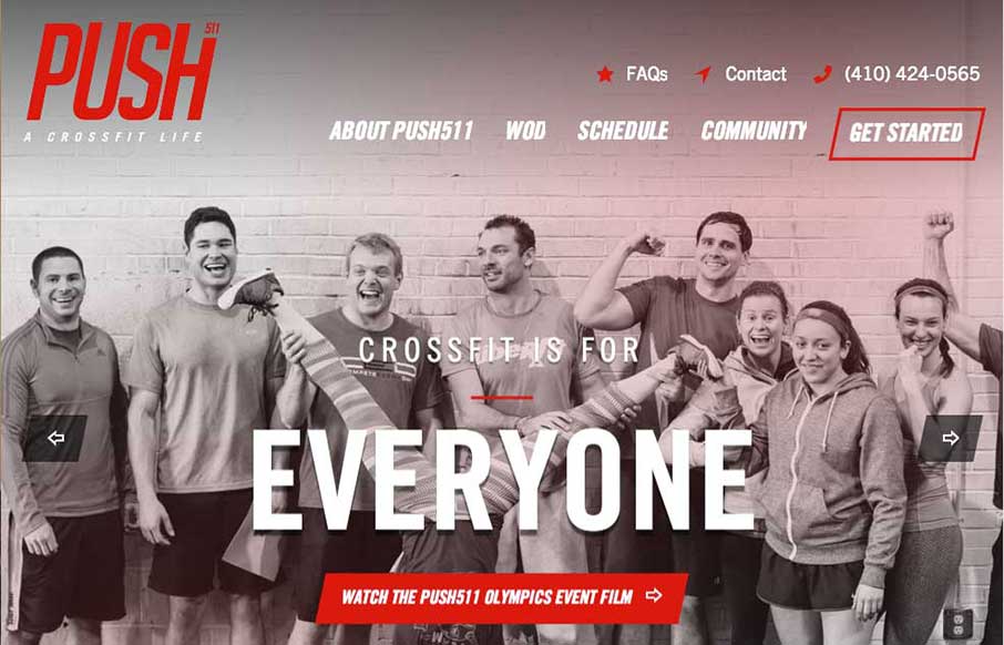
by Gene Crawford | Oct 30, 2014 | Gallery, Sports/Recreation
Nicely designed gym website for Push511 – most of the time websites in this category are just awful. This one however is one of nicest i’ve seen across many categories. Great work on almost all of the elements that make up a top-notch site here.