
by Aaron Griswold | Jan 21, 2015 | Entertainment, Gallery
Cool video background site from a company that produces videos… and therefore video backgrounds.. The FilmArtist Productions site, out of Toronto, Canada, is a very simple showcase of their work. I like how the video background is persistent throughout the page...
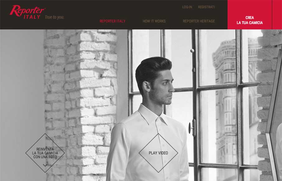
by Aaron Griswold | Jan 20, 2015 | Gallery, Shopping
I don’t wear custom fitted dress shirts – who am I kidding, I’m wearing a Kickball.com tee on top of a Captain America compression shirt while at work… last week when my in-laws spent the night, on Monday morning asked me “And what are...
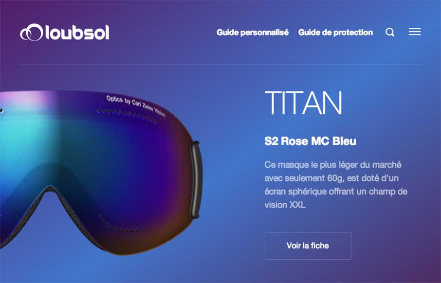
by Aaron Griswold | Jan 19, 2015 | Gallery, Product, Shopping, Sports/Recreation
We’ve started to see a lot of good work coming out of France to Unmatchedstyle lately. The Loubsol (ski googles) site, done by the NOE Interactive agency from Lyon, is shiny, with great coloring for each of the products on the home page. I like the filtered...
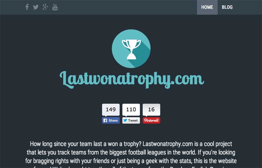
by Aaron Griswold | Jan 16, 2015 | Gallery, Sports/Recreation
We admit it – sometimes we don’t just review sites for their aesthetic beauty – sometimes we review sites that are submitted because we can see there is love behind it. The LastWonATrophy site by Digital Zoo out of the UK looks like cool and fun side...
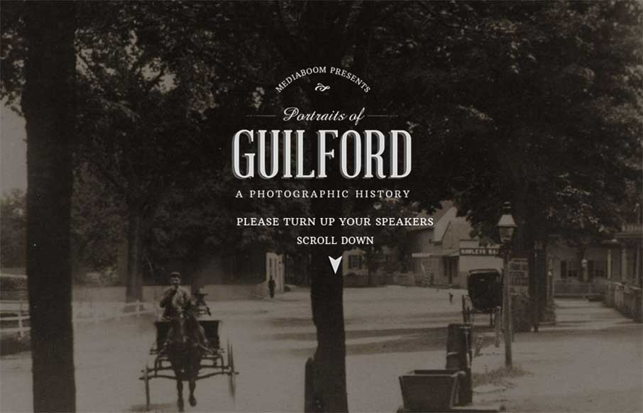
by Aaron Griswold | Jan 15, 2015 | Gallery, Nonprofit
I really like what mediaBoom has done with Portraits of Guilford (Connecticut) – a historical / social photo sharing site for the town. I’m a history buff, so love to see the progression of the photos over time. Also like the sticky footer, and how when...