by Gene Crawford | Apr 1, 2013 | Gallery
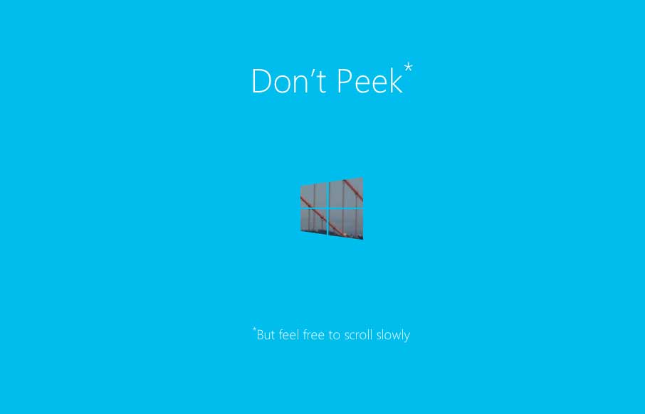
I really dig this splash page for the Build Windows conference series. It’s simple and straight forward but there is also a little magic baked in with the mask like parallax design. We work on a lot of similar type work here at UMS for our conferences and this...

by Gene Crawford | Mar 26, 2013 | Gallery
I love how this site puts just what’s needed out for you to see. Just a single headline at first but then you notice the fixed header and built for mobile navigation design. The entire nav slides down to give you an easy to take in navigation design, just main...
by Gene Crawford | Mar 26, 2013 | Gallery
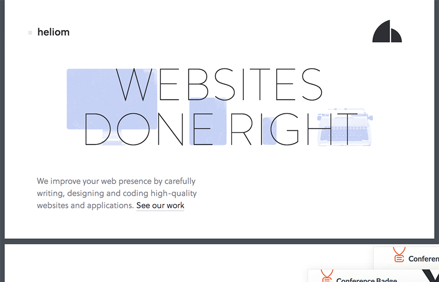
There are a ton of really great interactions both for desktop and mobile worked into the Heliom website design. The thing I love most about it is it feels very new, like new interactions for me. As I make my way through the different experiences on this site, from...
by Gene Crawford | Mar 25, 2013 | Gallery
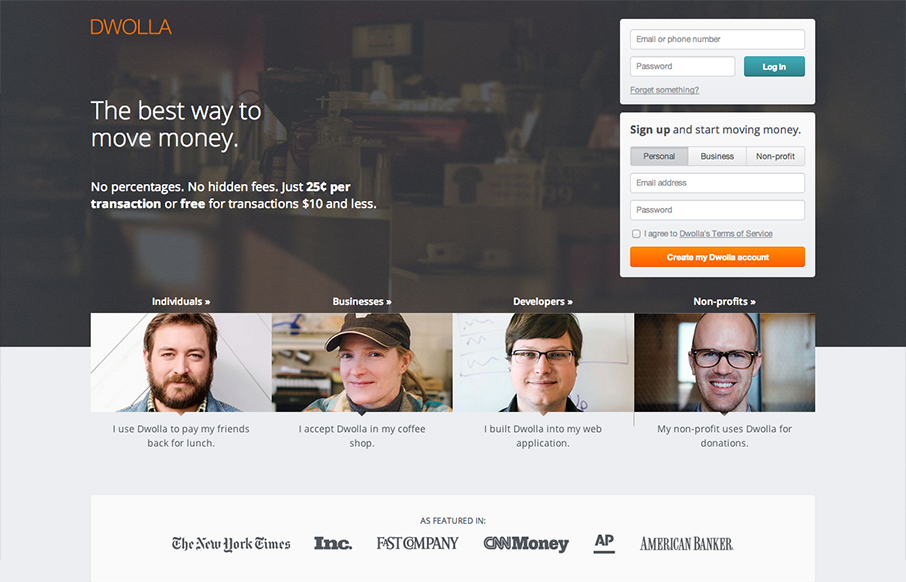
The Dwolla site design is of good quality and execution. I like the different configuration and stacking of the elements on the page as you scale the page down to smaller screen widths. What I like most of all is the use of negative space between the main/topmost copy...
by Gene Crawford | Mar 25, 2013 | Food and Beverage, Gallery
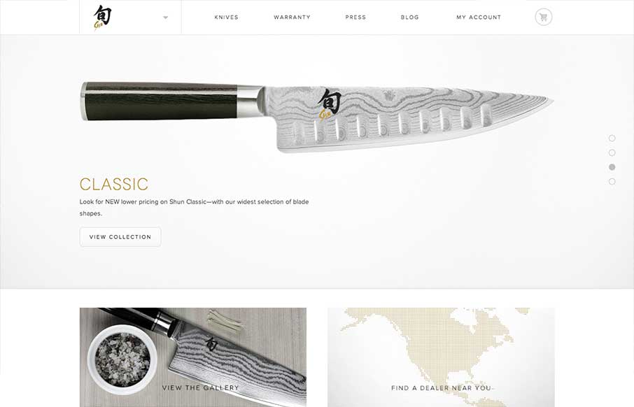
Submitted by: Jordan Sowers @jordanpsowers Role: Designer A great responsive ecommerce experience for Shun Cultery. Inspired by the blade-making traditions of ancient Japan, today’s highly skilled Shun artisans produce blades of unparalleled quality and exquisite...
