by Gene Crawford | Jan 8, 2014 | Gallery
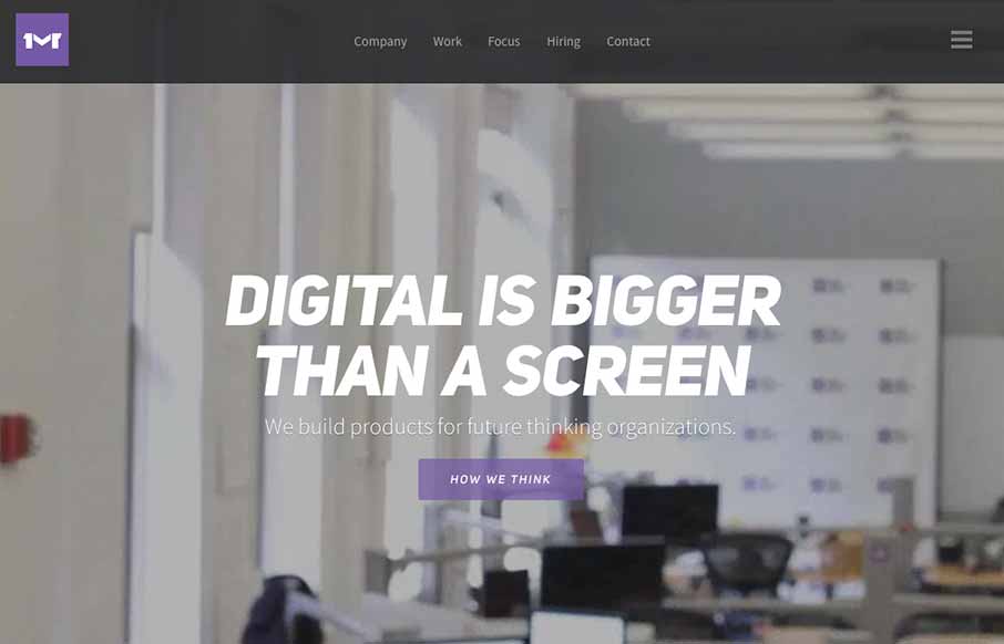
I like the first pass minimal look to the One Mighty Roar website. However once you start to click through the site you find that the pages are lengthly and deep with content and imagery. I also like how they’ve used the hamburger icon to show you what’s...

by Gene Crawford | Jan 6, 2014 | Design Firm, Gallery
The new Adaptive Path website is “as always” a thing of beauty. There really is a lot going on here when on the surface it looks like a simple design. From the slight movement of the top header/navigation, to show you it’s there, down to the overall...
by Giovanni DiFeterici | Dec 16, 2013 | Gallery
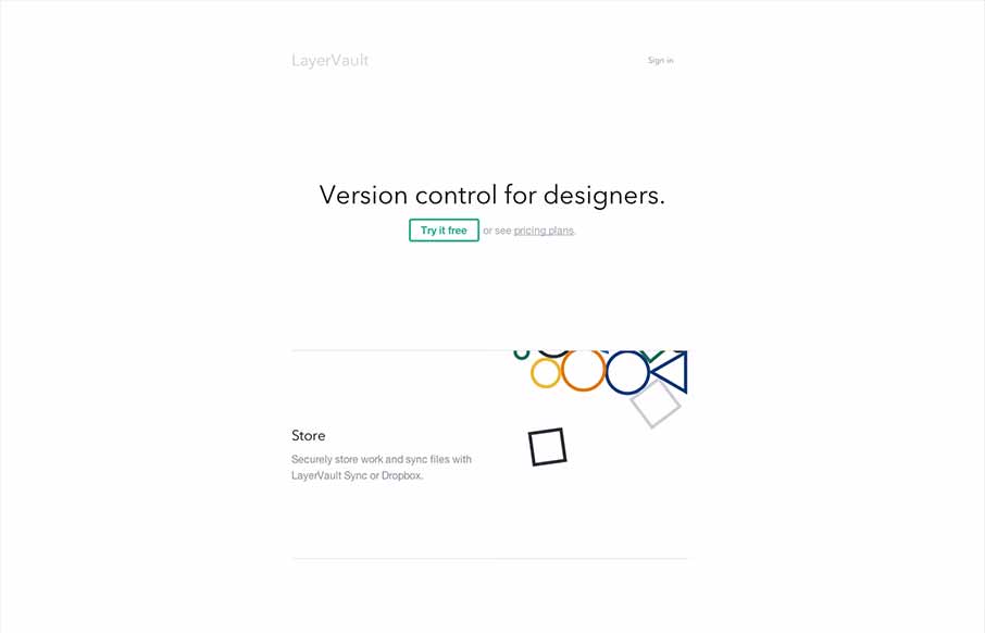
Layervault has some crazy awesome animations. I love how each of the animations intuitively relates to the idea that they are trying to convey. It’s visually minimal, but conceptually complex. So simple and so effective. Nicely done.

by Gene Crawford | Dec 12, 2013 | Gallery
I really dig the new Skookum website design. It’s very clean and professional feeling but also has a vibe that is counter to an overly technical appeal. There is just enough movement and little surprises tucked away here and there to keep a level of dynamism in...
by Gene Crawford | Dec 12, 2013 | Gallery, Screencast Review
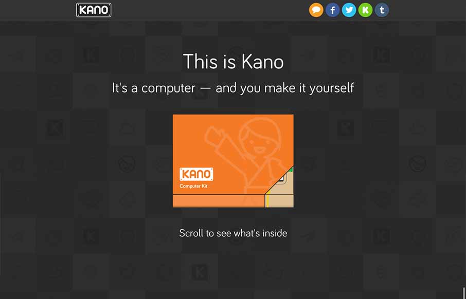
The Kano page is really just a “splash” or advertising page for the kickstarter campaign. But boy does it work, the way they take you from concept to showing the build out of the computer as you scroll down has you pretty much ready to buy the thing as...
