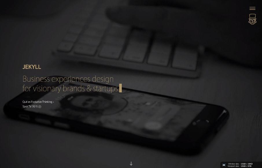
by Gene Crawford | Jul 7, 2015 | Gallery
I’m not always a huge fan of super dark websites like these, but in this case there are some pretty great parts. I like the gold mixed in with the dark vibe. I like the second section, under the hero/video area a great deal. I really like how it loads in....
by Gene Crawford | Jul 6, 2015 | Gallery
Very interesting take on “pages” for a website. I do like the concept here, I also like the fact that the designer is willing to push the limits visually with this and actually use it in production. Bravo and good stuff. From the Designer: I think this...
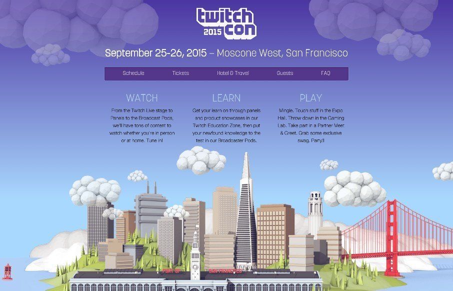
by Aaron Griswold | Jun 25, 2015 | Conference, Gallery, Gaming
Earlier this year, we reviewed Twitch’s Year in Review of 2014, and really liked it. TwitchCon 2015, is their video game video broadcaster / fan-fest conference. Dig the home page – simple, but a little complex behind the scenes. If you “view...
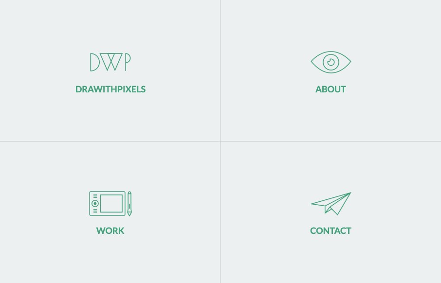
by Aaron Griswold | Jun 23, 2015 | Gallery, Portfolio
Good portfolio site from Gabriel Mnt out of Romania. I haven’t seen a site like this in a few months, the kind that uses the 4 blocks on the home page as main nav. It’s still a cool concept if you can categorize everything well – and I think Gabriel...
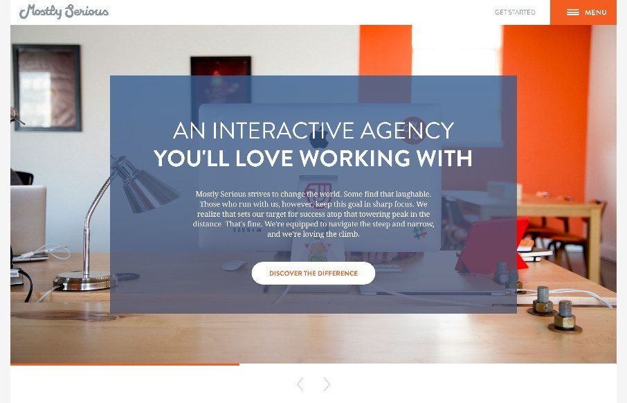
by John David Hunt | Jun 23, 2015 | Gallery
Many agency sites use large photos to bring out the human nature of their company and give us a glimpse to their habits and personalities. Others showcase their skills heavily and give no hint of who or how their work is done and practiced and whether there are humans...