
by Gene Crawford | May 13, 2013 | Gallery
Website by Viget The Paint Drop is a paint store on wheels offering color consultation, paint and supplies on site. Whew! What a finely crafted visual design and executed website for Valspar. I love the responsive design decisions and how that’s been executed....
by Jay Barry | May 10, 2013 | Gallery
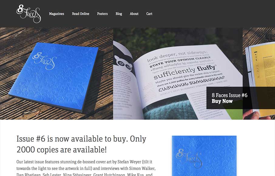
The whole point and appeal of 8 Faces is the tactile, printed objects that they produce, so much so that the website might seem like an afterthought regardless of how well it’s designed. Luckily it’s a great example of simple, effective design. The purpose...
by Maria | May 8, 2013 | Gallery
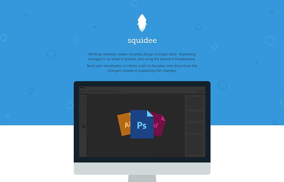
Squidee helps designers send PSDs to frontend developers. The aesthetic of this site is pretty nice. There’s a very clean use of shape and color which is balanced nicely with the amount and prominence of the type. I like the progression of content, and I dig the...
by Giovanni DiFeterici | May 7, 2013 | Gallery
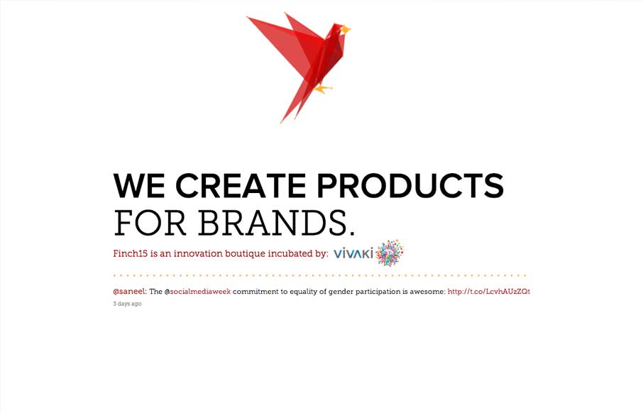
Oooooo, lovely morphing/animating logo on Finch15 finch15.com Make sure ya scroll. (thx @themaninblue) — Daniel Burka (@dburka) April 16, 2013 Okay, so. lovely little site. I like pretty much everything about it (except, maybe, a slight overuse of the word...

by Gene Crawford | May 7, 2013 | Gallery
I like how the site is designed to be deceptively simple. It starts off with what looks like just a big head shot of Nathaniel but then as you click around you notice it’s intricacies and how the side nav is design. Then you start to scroll and notice the load...