
by Gene Crawford | Apr 8, 2014 | Gallery
Pretty cool interactions to review on this site. First I like how the nav goes transparent when you scroll and reappears when you start to scroll back up. Then there are little movements on important buttons to show you where your attention to should be placed next....
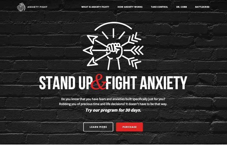
by Gene Crawford | Apr 8, 2014 | Gallery, Medical
Strong visual language backs up a nice solid design and layout. Sometimes you can see there’s good content that the designer has to work on, this site is a good example of that. Good content backed up with good design.
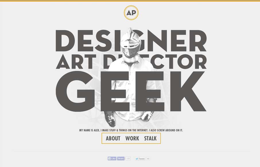
by Gene Crawford | Apr 7, 2014 | Gallery
I love it when a person’s personality comes through in their design. Now this is a personal portfolio site for Alex Pierce and yeah, his personality should show through. Boy does it. In the specific words and phrases and most of all there’s a shot on the...
by Gene Crawford | Apr 7, 2014 | Gallery
Love the minimal color palette. Smooth transition between the topmost section and the main nav load too. Then plenty of little visual interaction pieces across the page as you scroll to keep things interesting. Lovely site.
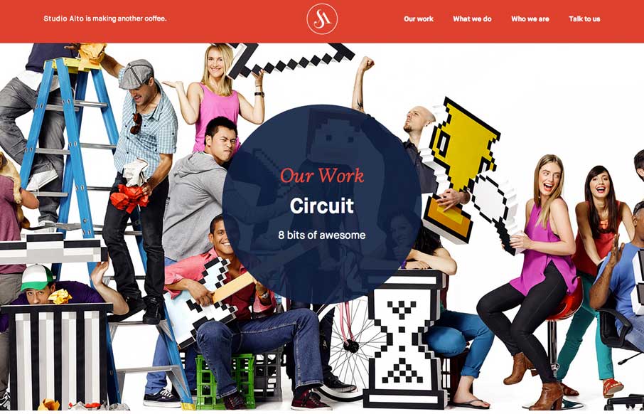
by Aaron Griswold | Apr 3, 2014 | Design Firm, Gallery
Pretty slick movement on the site as you scroll. I like the way the colors flip around too on interaction with the main nav. Clever stuff here.