
by Gene Crawford | Apr 10, 2014 | Gallery, Travel
Very interesting experience traversing this website. I love the scroll and fly feeling. Very slick execution.

by Aaron Griswold | Apr 10, 2014 | Gallery
I like the use of the video in the header on the Pamlico Capital site. All of the slider interactions across the home page are nicely done too, they’re subtle enough and effective at the same time. I don’t think i’ve seen a site’s navigation...

by Gene Crawford | Apr 9, 2014 | Gallery
Beautiful icons across this site. Really elegant layout and type work too. I sense some technical issues every now and then on images loading but overall it’s a gorgeous site design.
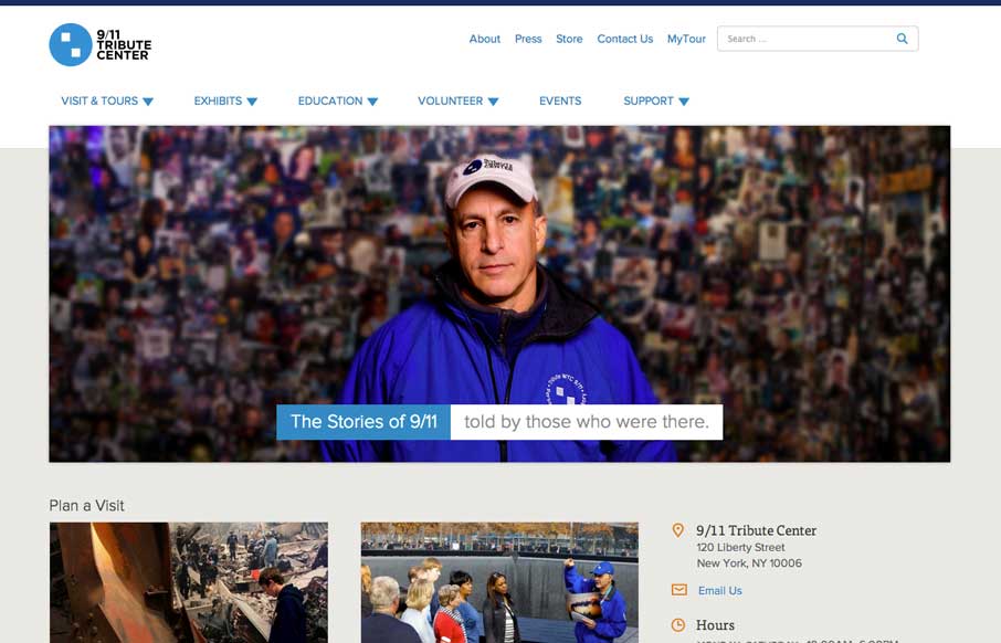
by Gene Crawford | Apr 9, 2014 | Gallery, Government
Great new site for the 9/11 Tribute Center by the Bearded Studios gents. My favorite part is the navigation design. I really like how most of the site’s nav is represented in the drop down and keeps it easily accessible on the desktop. While it’s more...
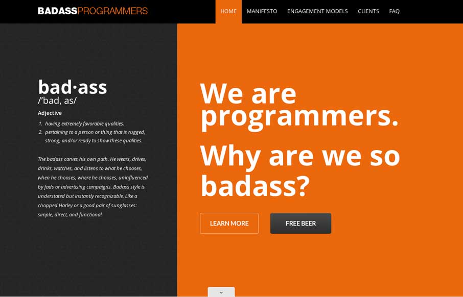
by Aaron Griswold | Apr 9, 2014 | Design Firm, Gallery
Nice scroll down/in movement on the main graphics. That kind of thing can hit home right away when you first visit a website. Claws, Jimi Hendrix… dern fellas.