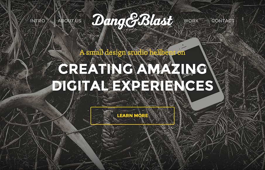
by Aaron Griswold | Oct 7, 2014 | Gallery
“Live Free or Dang (and Blast)” – ok, living in New Hampshire for six years, I saw a joke there… just sorry it was a bad joke… But Dang and Blast’s agency site is neither of those. It’s a good, clean site that is modern,...
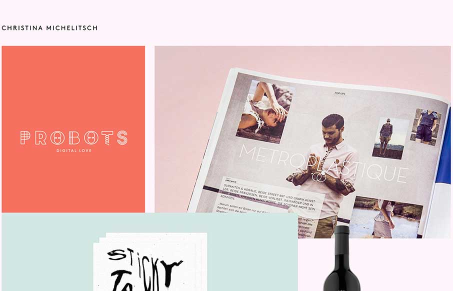
by Aaron Griswold | Oct 6, 2014 | Gallery, Portfolio
The beauty of this site is less in the home page, but more in the portfolio pages of Christina’s work. Each page has a different feel to go along with the different branding work she has done for her clients. Really like the work on Probots, and like the idea...
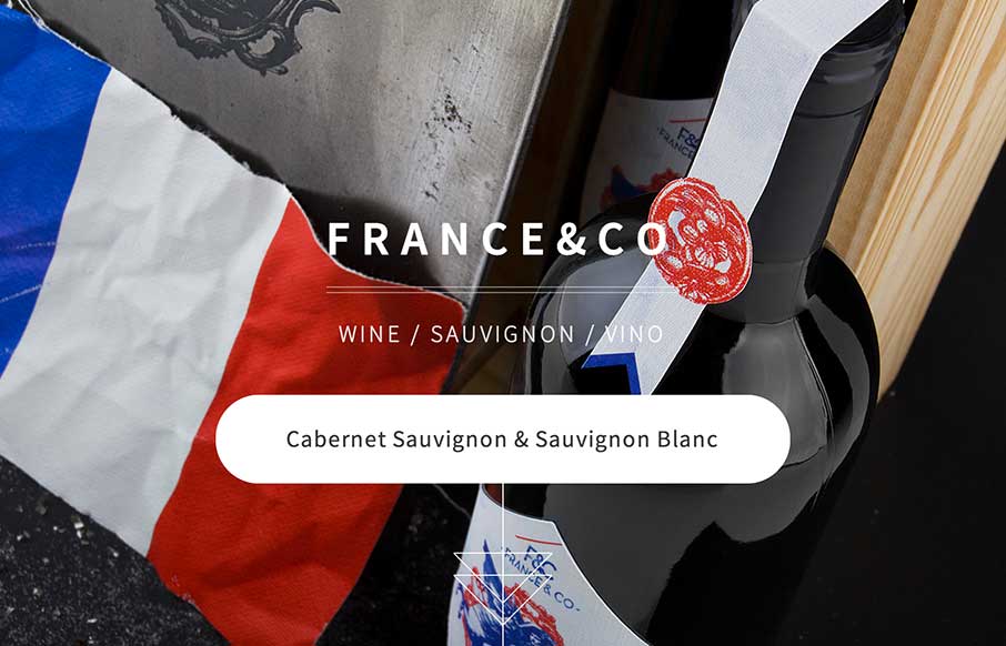
by Gene Crawford | Oct 6, 2014 | Food and Beverage, Gallery
Looks like a simple site – but some nice background image, slight parallax feel in the scroll. A little confused on the copy translation and repeats, and the social icons that go nowhere. But the design itself is vibrant, and seems to get the brand’s image...
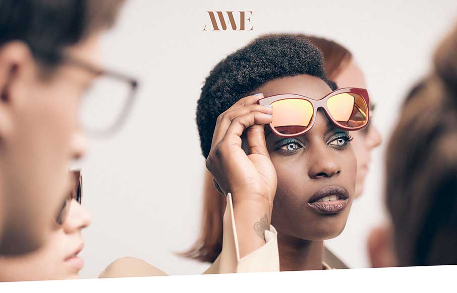
by Aaron Griswold | Oct 6, 2014 | Gallery, Medical
Crazy and cool… I get in trouble at family gatherings for doing bug eyes with raised eyebrows for, well, every picture. AWE’s site uses that look, figuratively (as well as literally), to pull off a slick and slightly irreverent site to sell cool hipster...
by Gene Crawford | Oct 3, 2014 | Entertainment, Gallery
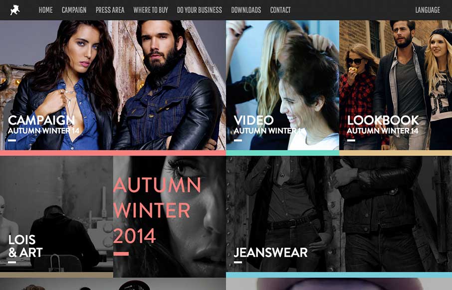
Pretty cool to see a page for a campaign, something that’s part of something larger and possibly offline to boot. Good stuff. This site is wild and has all sorts of stuff going on but at the same time it’s easy enough to get into. Submitted by: Raul Ortiz...