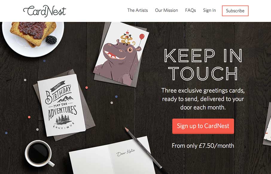
by Gene Crawford | Oct 3, 2014 | Gallery
Very nice all around design for CardNest. I love the simple approach but attention to detail. Great responsive design too. Submitted By: David Robinson @hypeandslippers Role: Designer & Developer The team at Hype & Slippers (www.hypeandslippers.com) have...
by Aaron Griswold | Oct 3, 2014 | Design Firm, Gallery
This is a case of the ubiquity of the internet. Maybe it’s because I live in a place that has a lot of “first-world” problems, but I was pleasantly surprised when I saw that Fiasam is based out of Pakistan. Besides the fact that this is a simple,...

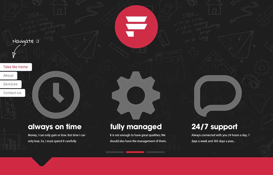
by Gene Crawford | Oct 2, 2014 | Gallery
I like a lot about this website. It’s simple, single page, minimal color palette. But it communicates what they do and has some bells and whistles to show off to potential clients. Submitted by: Pedro Thomaz @PTthe13 Role: Designer Clean and modern single page...
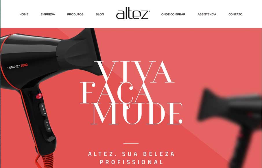
by Aaron Griswold | Oct 2, 2014 | Gallery
I like the trend that Altez follows – sites associated with the beauty industry have the hi-fidelity of slick industry magazines. It plays well for this site. My only suggestion is on the map – since the site is full-width (which adds to it’s...
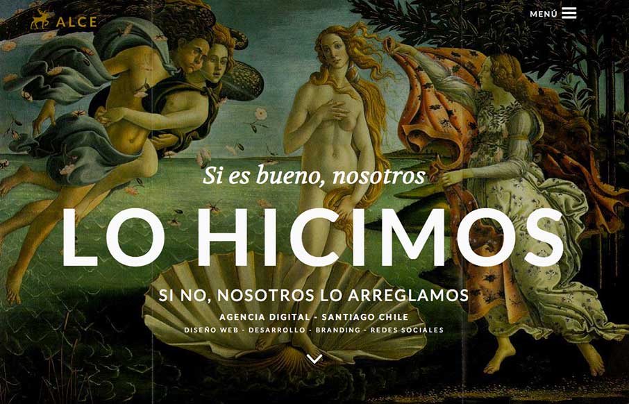
by Gene Crawford | Oct 2, 2014 | Gallery
Super rich visual design. I love the slight movement on each section as you get to it based on how you’re scrolling. The nice big services list and descriptions is nice. You don’t typically see that and I like it here, it’ll help educate new people...