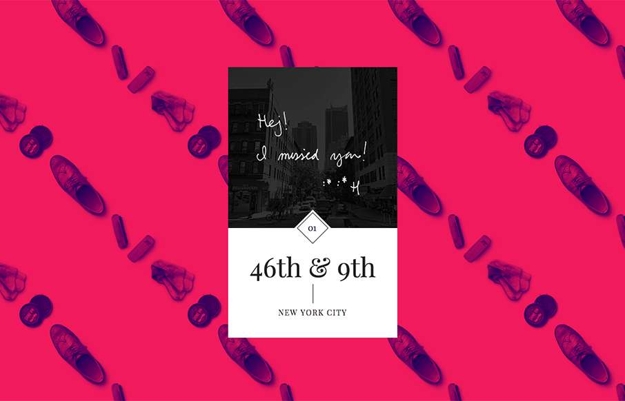
by Aaron Griswold | Aug 3, 2015 | Gallery, Portfolio
I hope John Karlsson keeps this site up – Notes I Kept is a quick site, but really love the look of it. Cool backgrounds and love the depth. From the Designer: A collection of notes written by strangers and close ones. The site is a result of nostalgia and a...
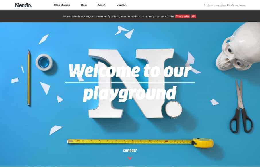
by Gene Crawford | Aug 3, 2015 | Gallery
Really fun website here. It’s fairly straight forward in it’s layout and execution but it’s chock full of animation work and clever pieces that keep you engaged. Win!
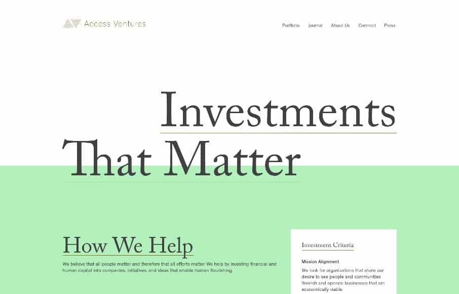
by Gene Crawford | Jul 30, 2015 | Gallery
I love the strong typographic approach to this website’s design. It’s quite nice and feels very unique to me. I especially like how it retains it’s asymmetrical layout in the header area. From the Designer: The site was designed by Fuzzco, and Access...
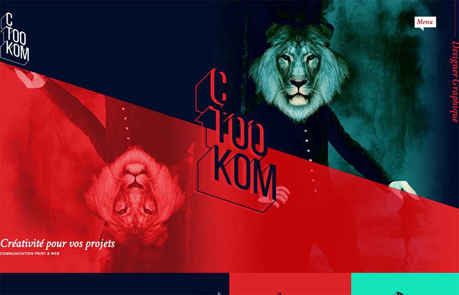
by Gene Crawford | Jul 29, 2015 | Gallery
Man, this site blows me away visually. I love that logo/display type and the colors, man. I love the header and how it slides away from being a large hero area and keeps itself there in the fixed header, but still has that slight parallax slide vibe. Strong stuff....
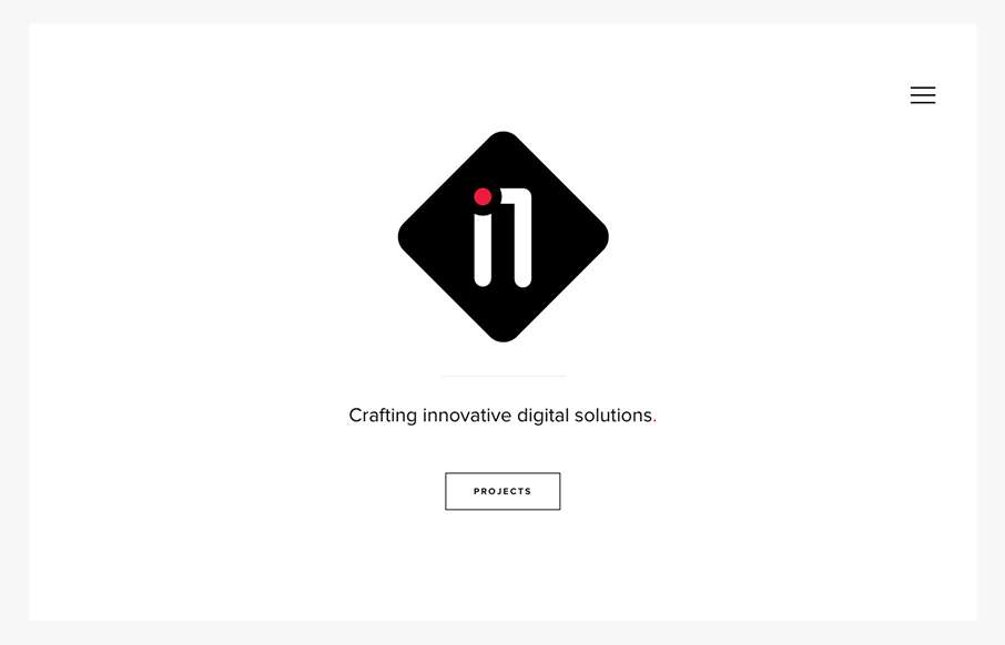
by Gene Crawford | Jul 28, 2015 | Gallery
Very nice minimal approach. I’d say it’s “minimal” done right. I love that there’s a singular focus on that “projects” button, then you can explore from there, but that’s the main thing. It’s very clean and clear...