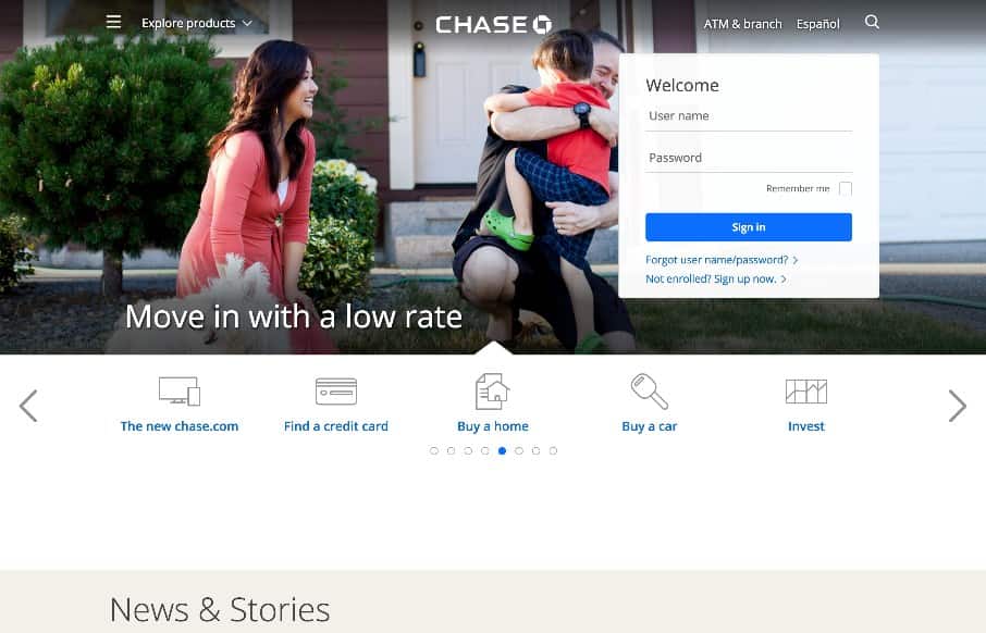
by Gene Crawford | Jul 28, 2015 | Gallery
A fairly clean experience for a big credit card website. The Chase site is responsive and has some nice open space throughout that really helps with the large amount of “stuff” they’ve put on the screen. I like the navigation design, using the...

by Aaron Griswold | Jul 27, 2015 | Gallery, Shopping
If you’re going to rebuild Amazon – might as well do it cleanly and organized – Jet seems to do that. Like the flat design / icons coupled with real products – interesting combo. Reminds me a little of the iPod ads ala way-back in 2003.

by Gene Crawford | Jul 23, 2015 | Gallery, Travel
I think the airbnb site continues to get better. We reviewed the site right after the redesign in July 2014. It was good then, and one of the first real sites to use use video backgrounds. Well, that continues, but they now have block and card designs that really...

by Aaron Griswold | Jul 21, 2015 | Gallery
Nice portfolio site from Vito Salvatore out of London. Love the big images and especially love the iconography on the “About Me” section – kind of wish there was more. Submitted and reviewed before in 2012… ...
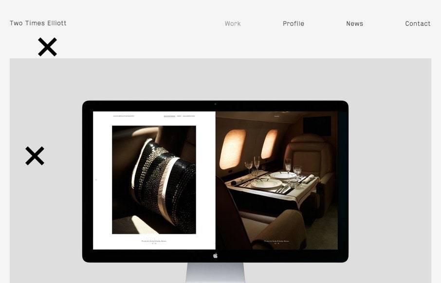
by Aaron Griswold | Jul 20, 2015 | Design Firm, Gallery
Good start to the week with Two Times Elliott out of London. Like the mixing up of the different client work images as you go down the page. I’m a little hesitant on the 2 x’s that are on the page that you just seem to click on to make them disappear...