by Aaron Griswold | Oct 27, 2015 | Gallery, Shopping
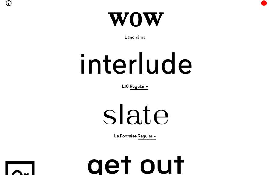
Best Font / Type site we’ve seen in a long time. Or Type’s site, out of Iceland, is live – you change the words for the example fonts, it changes it for everyone viewing the site – instantly. Then, you can either do a rewind of all of the...
by Aaron Griswold | Oct 26, 2015 | Fashion, Gallery, Shopping
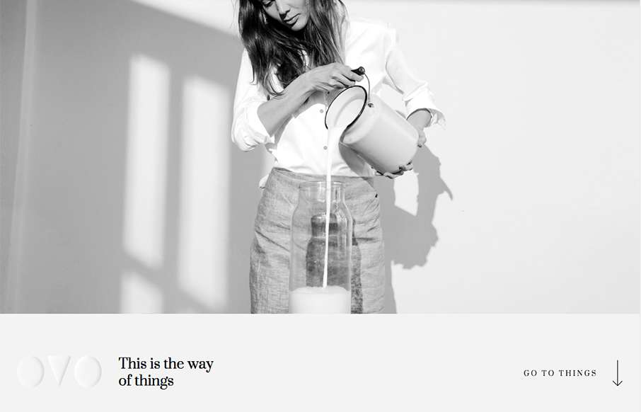
We’ve started to see a couple of good sites coming out of Lithuania lately – and I like this one from OVO. I really like the transparent logo, and how it plays on different pages – also like the fact that they are willing to partially cover up the...

by Aaron Griswold | Oct 26, 2015 | Gallery, Portfolio
For being a seemingly minimal portfolio site from George Leonardo out of Brazil, it has some good, subtle pieces that add to it being a strong site. I was about to say today was black and white site day, but George had some hidden color in his tags leading to the Work...
by Aaron Griswold | Oct 26, 2015 | Gallery, Marketing Company
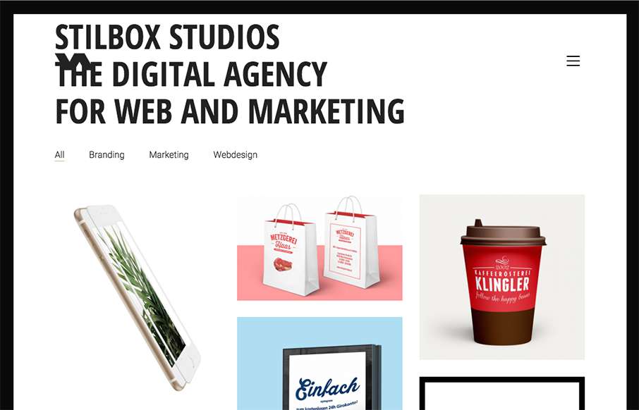
Good looking black and white agency site by Stilbox Studios out of Germany. Very simple – focuses on their portfolio – and I like how the foot unveils. From the Designer: stilbox studios is a Web & Marketing Agency – Consulting. Strategy....
by Aaron Griswold | Oct 22, 2015 | Gallery
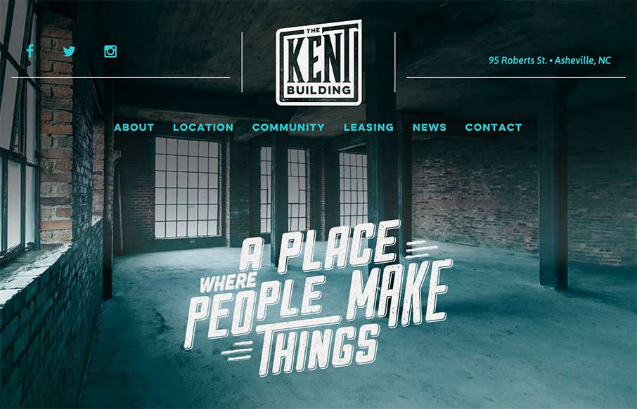
Excellent site from Open Door Design Studio out of Asheville for The Kent Building. Yes, normally I would say – “compared to other real estate sites…” – but we’ve seen really good growth in the real estate niche of awesome looking...