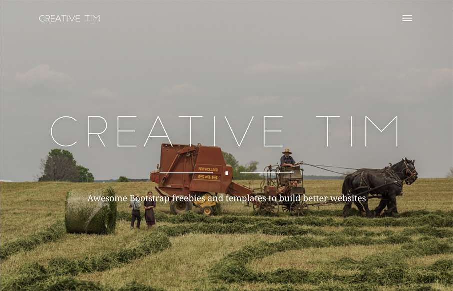
by Aaron Griswold | Oct 29, 2015 | Gallery
I like that Creative Tim, the design team out of Romania that brought you the “Get S*** Done” Bootstrap UI Kit, has added a layer to their normal site. While their main site is a clear shopping site for themes / kits / etc, the “presentation”...

by Aaron Griswold | Oct 28, 2015 | Gallery
Really like the full screen/page video background as an intro the the AdorableGeeks site (out of Singapore). Also like how they carry that concept to their work detail pages under Showcase – it may be another click downstream, but the full screen/page image that...
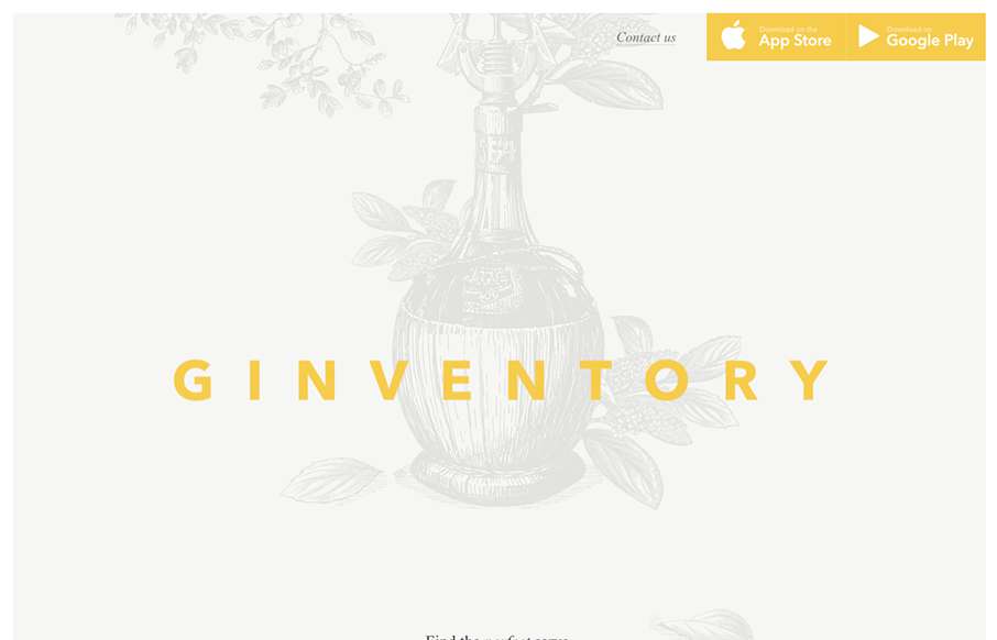
by Aaron Griswold | Oct 28, 2015 | Gallery
Ok… throw out your old, stodgy, bootstrapped App Product Pages… Ginventory out of Brussels just broke the mold. Cool transitions and great video capture of the app itself, all in a beautifully designed container.

by Aaron Griswold | Oct 28, 2015 | Gallery, Portfolio
Solid and simple portfolio from Emma Lawler out of San Francisco. I like the movement when you click a work sample – also like that there are only three work examples (as not to clutter the page), but that each example has a nice quick narrative, so you get a...
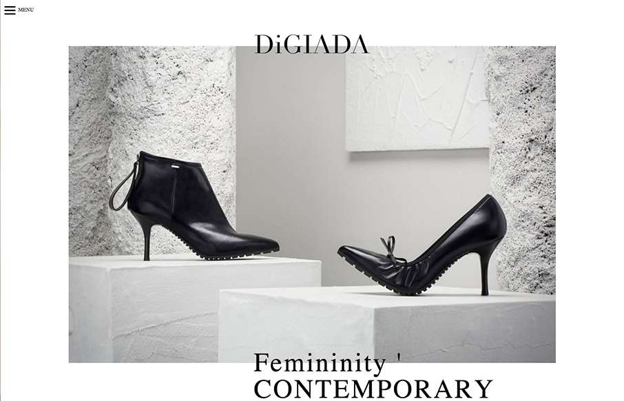
by Aaron Griswold | Oct 27, 2015 | Fashion, Gallery
Pretty sweet minimal site from Marco Amato out of Italy, for Digiada Shoes. It’s clean and has really good slight movement as you move down the page. Submitted by: Marco Amato Role: Designer Country: Italy