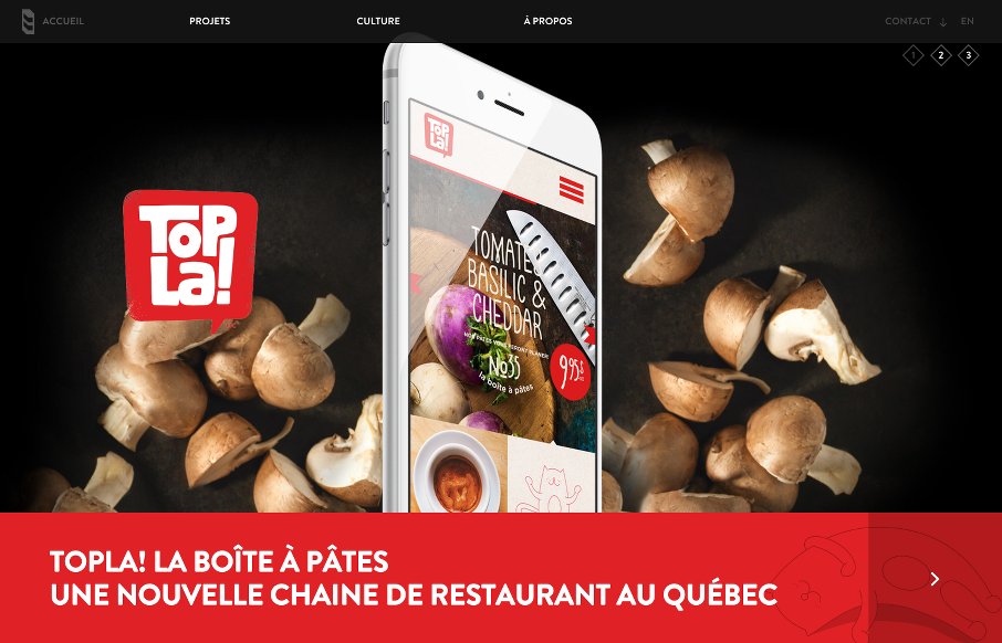
by Aaron Griswold | Apr 14, 2015 | Gallery
Dig the full-width, parallax slideshow on the home page of the 8 Bis Branding site out of Montreal. Found it interesting that they went for filtered search on two pages – Projects and Culture – but the categories on each make sense. There’s also some...
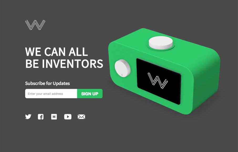
by Aaron Griswold | Feb 17, 2015 | Gallery
Good site and great idea from Wattage.io out of Toronto. Like the integration of the video demos to give you a feel for how the app really works – this is a case where showing your app on your one pager is actually a good thing. Simple, clean, and useful –...
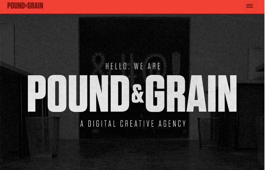
by Gene Crawford | Feb 16, 2015 | Gallery
I really like the movement of the Pound & Grain site, out of Toronto. The subtle use of parallax with background shapes and colors, coupled with the images and copy make for a great experience. Also like the little vibrance of the animated gifs hero images, that...

by Gene Crawford | Feb 5, 2015 | Gallery, Music
Pretty dang nice website for a classic band. I love the header/logo and how it moves a bit as you scroll. It stays “maximized” as you make your way past the hero image area and then gets much smaller as you go past it. Smart stuff. There’s other...
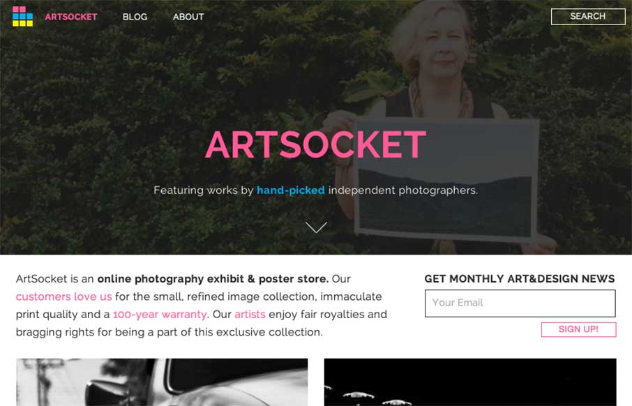
by Aaron Griswold | Jan 22, 2015 | Gallery, Photography, Shopping
It’s kind of nice when the designer reviews the site for you. It helps when they’re right in their assessment of their work – Dmitri Tcherbadji did that for me here with talking about ArtSocket. From the Designer: “This is a three-year...