by Aaron Griswold | May 28, 2015 | Gallery, Portfolio
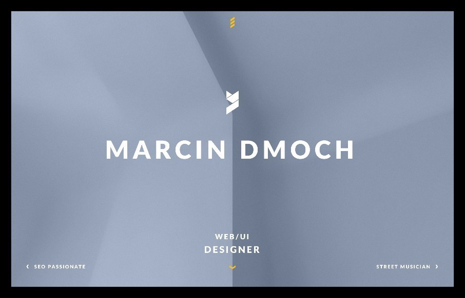
i first looked at Marcin Dmoch’s portfolio site on my phone – and really liked the quick interaction with swiping, instead of just using the menu. Like the different look of the Work pages too. From the Designer: “Marcin Dmoch – WEB/UI Designer...

by Aaron Griswold | Mar 18, 2015 | Gallery, Portfolio
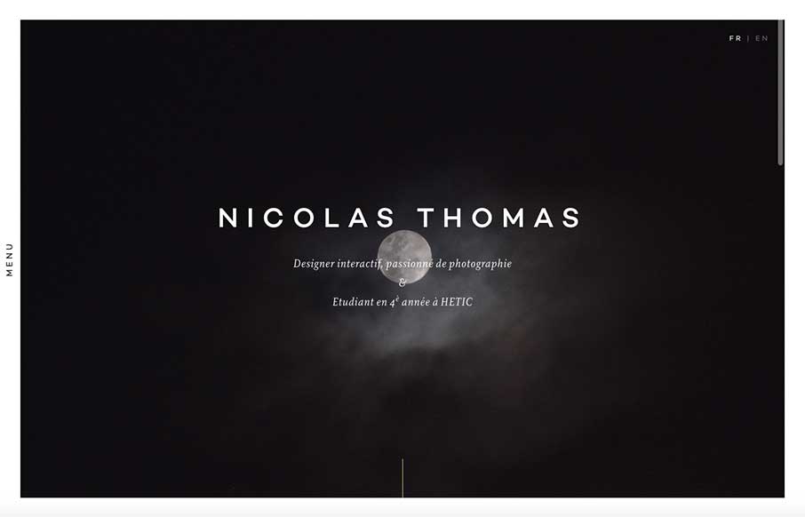
Like this portfolio site from Nicolas Thomas out of Paris. At first look, above the fold – it’s extremely crisp with the contrasting black and white of the image a copy, but the moon and cloud gives it something extra that I can’t describe right now....

by Aaron Griswold | Jan 26, 2015 | Gallery
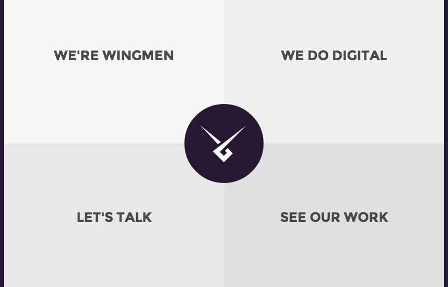
I’m really starting to get into sites that use their home page as their main navigation (maybe it’s because we did that with our new ConvergeSE site). I like Wingmen’s site (out of Helsinki, Finland) because it’s simple, direct, uses that home...

by Gene Crawford | Sep 12, 2014 | Food and Beverage, Gallery
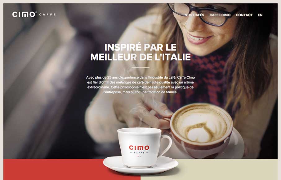
Really nice use of contrast. I’m not just talking about colors, but the way they contrast the photos and real imagery of coffee bags with flat areas of color and blocky bold type and icons. Really gives this page a nice rich visual feel. Love it, now for some...

by Gene Crawford | Aug 29, 2014 | Gallery
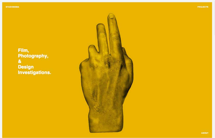
I love beautifully simple stuff. Like the Studiobema site design. Simple and satisfying. Love it.
