I’m really starting to get into sites that use their home page as their main navigation (maybe it’s because we did that with our new ConvergeSE site).
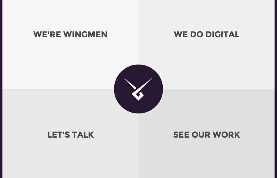
I like Wingmen’s site (out of Helsinki, Finland) because it’s simple, direct, uses that home page as nav, but also finds a good, quick way to get you back to the nav / or next section when you’re done reading the “page” you’re on. The fact that the way back to the nav changes from corner to corner, might be a little confusing, but the animation of the circle, to quarter circle should clue a user into that “click here” moment – let me know what you think.
From the Designer: Simple and elegant web agency website design.
Submitted by: Jussi Kaijalainen
Role: Designer & Developer
Twitter @wingmenltd


0 Comments