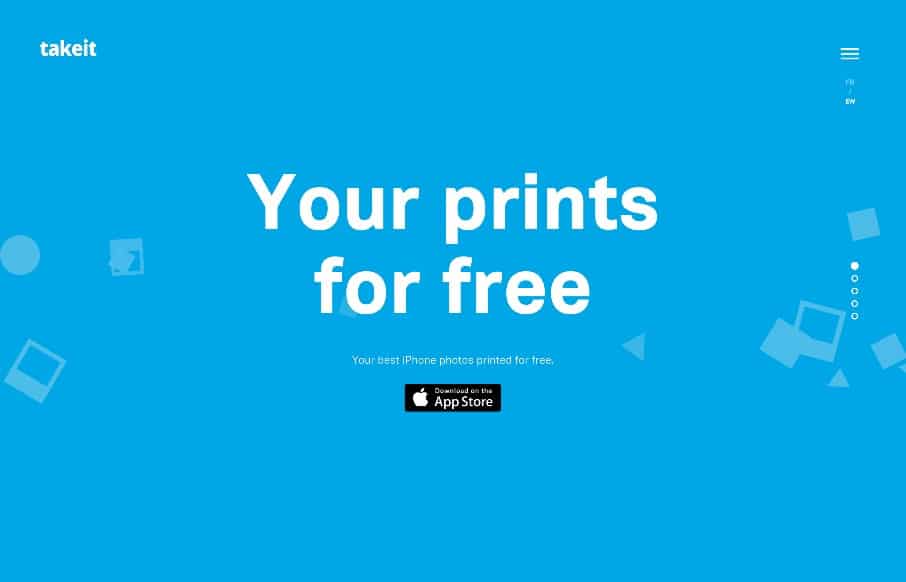
by Aaron Griswold | Jul 24, 2015 | Gallery
Love the on-scroll and CSS animation on the TakeIt app site. Just a great “simple” site that get’s the product / app’s concept nailed down so a potential user get’s it. Would be nice if more sites could do that… Happy Friday! ...
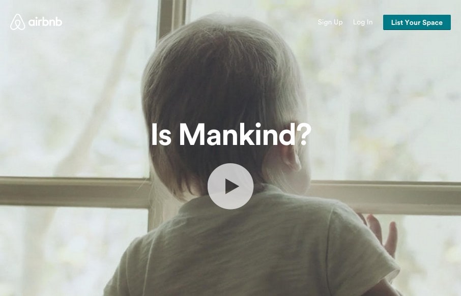
by Gene Crawford | Jul 23, 2015 | Gallery, Travel
I think the airbnb site continues to get better. We reviewed the site right after the redesign in July 2014. It was good then, and one of the first real sites to use use video backgrounds. Well, that continues, but they now have block and card designs that really...
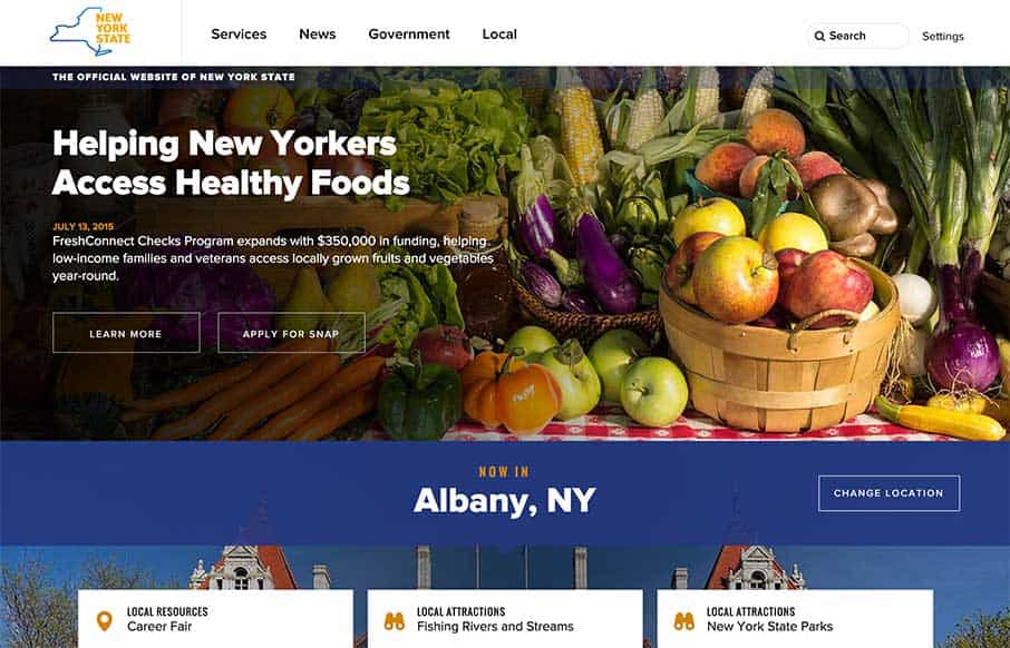
by Aaron Griswold | Jul 14, 2015 | Gallery, Government
Finally – really good state government website for New York (I hear RFPs being typed out for other states as you read… well we can dream right?) Great organization and really visually established sections. I’m curious about the billboard, cardish...
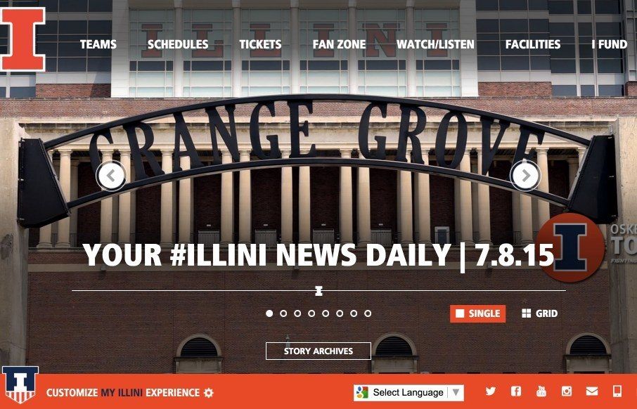
by Aaron Griswold | Jul 8, 2015 | Gallery, Sports/Recreation
Love to see sports sites being redesigned over the past couple of years – like this one for the Fighting Illini, in, well, Illini country. It’s device sensitive, and looks big and bold on both desktop and mobile. I’m not a big fan of sticky headers...
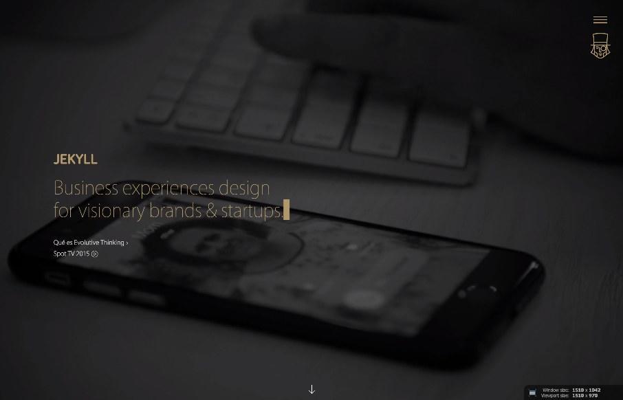
by Gene Crawford | Jul 7, 2015 | Gallery
I’m not always a huge fan of super dark websites like these, but in this case there are some pretty great parts. I like the gold mixed in with the dark vibe. I like the second section, under the hero/video area a great deal. I really like how it loads in....