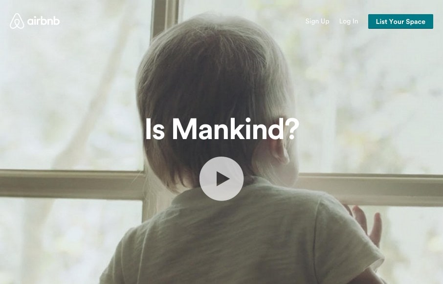
I think the airbnb site continues to get better. We reviewed the site right after the redesign in July 2014. It was good then, and one of the first real sites to use use video backgrounds. Well, that continues, but they now have block and card designs that really bring attention to major themes they want to promote. The site is even more social and interactive with their community – which is kind of the point of people opening up their homes for you to rent.
Glassmorphism: The Transparent Design Trend That Refuses to Fade
Glassmorphism brings transparency, depth, and light back into modern UI. Learn how this “frosted glass” design trend enhances hierarchy, focus, and atmosphere, plus how to implement it in CSS responsibly.


0 Comments