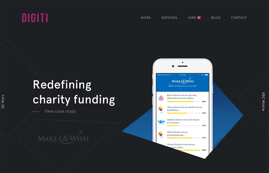
by Aaron Griswold | Nov 18, 2015 | Gallery
Slider / carousels are dead right? Not if they are done well, with a dash of novelty – like in this agency site by Digiti out of Belgium and New York. (as an aside, I’ve noticed a lot of good development work on websites out of Belgium this year) I admit,...

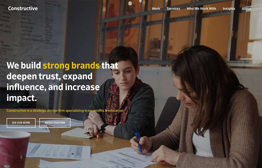
by Gene Crawford | Nov 12, 2015 | Gallery, Marketing Company
I love the “vibe” of this website. The way the main section changes across screens is smart and subtle. I also love the way they used the fixed background image as you scroll to keep a nice rhythm going for you. The play between muted and strong colors...

by Gene Crawford | Nov 11, 2015 | Gallery
I really like this website design. It’s very straightforward and we’ve all seen similar layouts, but they’ve managed to just execute it really cleanly and visually strong. I like the details and the solid approach. Things like spacing and timing are...
by Gene Crawford | Nov 10, 2015 | Gallery
Some real neat visual/interaction stuff going on here. It’s cool and works well and I think users who are not web designers will kind of dig it. The rest of the website from content to execution is top-notch as well. Good stuff and worthy of checking out. From...
by Gene Crawford | Nov 4, 2015 | Gallery
It’s a fairly standard approach to a layout but I dig it. I like the way the large splash image blends on top of the modular boxes below it. It feels fluid this way. Add in some decent responsive design and it makes for a great site.