
by Gene Crawford | Feb 3, 2016 | Gallery
We’ve seen this hero/image area pattern before, but I like the animation used in this one, it stands out to me. I also really dig the tight illustration work used down the page here. It’s also a single page layout which I like much for this application....
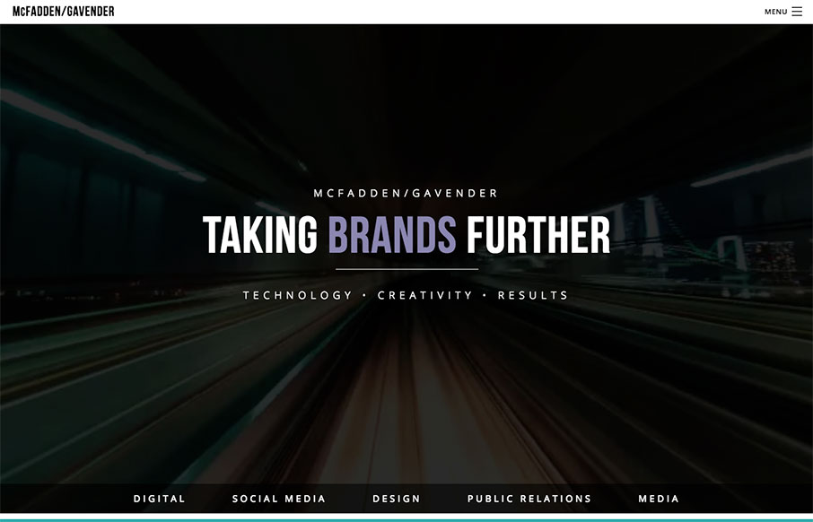
by Aaron Griswold | Jan 11, 2016 | Gallery, Marketing Company
We really like this one from McFadden Gavender out of Tucson because of the awesome video background off what looks to be a elevated train (where though?) – and the good use of muted image / color backgrounds too on the home page. Great first step into their...
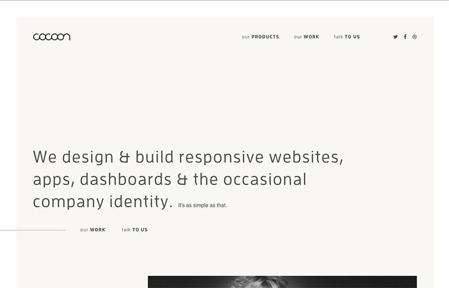
by Aaron Griswold | Jan 5, 2016 | Gallery
I like the simplicity of this site by Cocoon out of the UK – I kind of like that they don’t do images until later in the page. Then they keep it clean past that. The project detail pages are nice too – images can be large, and don’t know how...
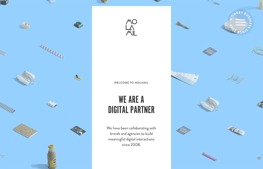
by Aaron Griswold | Dec 17, 2015 | Gallery
Fun, fun, fun. I like this site from Molamil out of Denmark – even if the wack-a-mole heads of the employees are a little creepy… Great transitions into other pages – and fun vibe all the way through! Submitted by: Joakim Norman Twitter: @molamil...
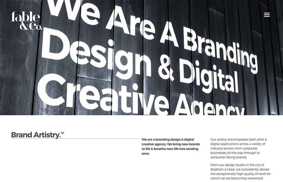
by Gene Crawford | Dec 8, 2015 | Design Firm, Gallery
I really love the big images used on the home page for the work samples, I also love the way the images slightly zoom in as youm mouse over them too. Overall the design has a such a great vibe and comes off feeling very cool. There’s a rather interesting visual...