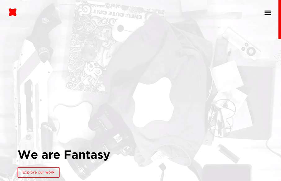
Newly updated (not sure how long) design for Fantasy Interactive. It's amazing to me to see this design, i've followed Fantasy for the entire time they've been around. You can almost track the times in design from their websites over the years. this iteration is a...
magicrm
Mostly posting this for the navigation pattern. I like how when you simply mouse over the hamburger icon it loads a small set of icons for the nav. Yes, we can probably pick that apart, but i've never seen that before. I like it as a design pattern as a way to combat...
UAC Studios
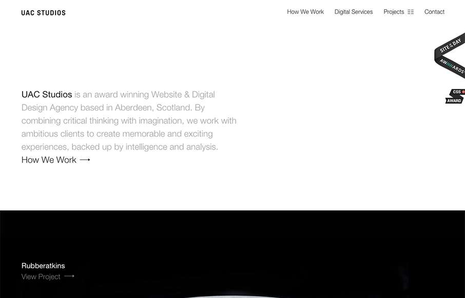
Beautifully simple design for UAC Studios. I really like the large imagery used for the project sections. I also like how it's pretty much all about the work, that's just about all I ever care about when I check out another company's website that do what I do. 🙂
Lauren Wickware
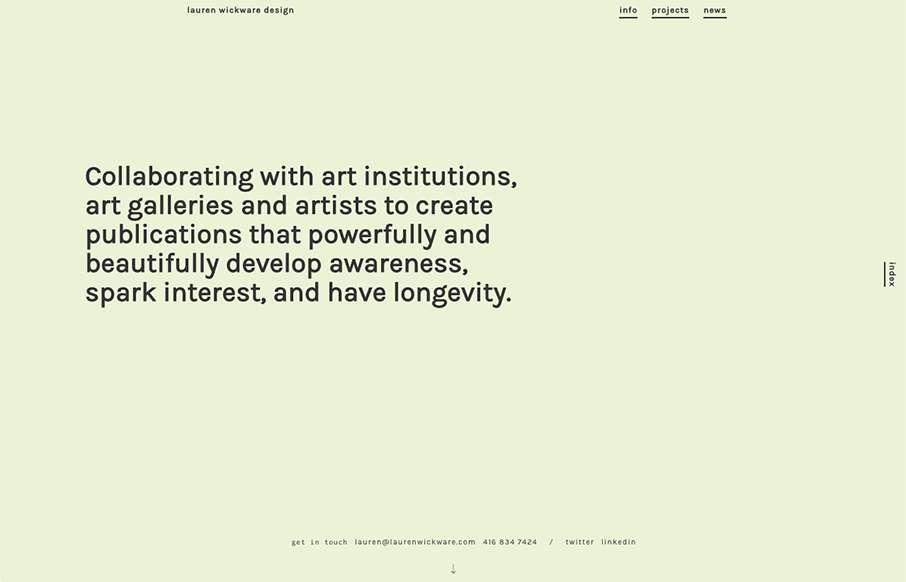
I love, love, love the way the scrolling works on this website. It's smooth and very unique to experience. Very memorable experience here.
Radar #108
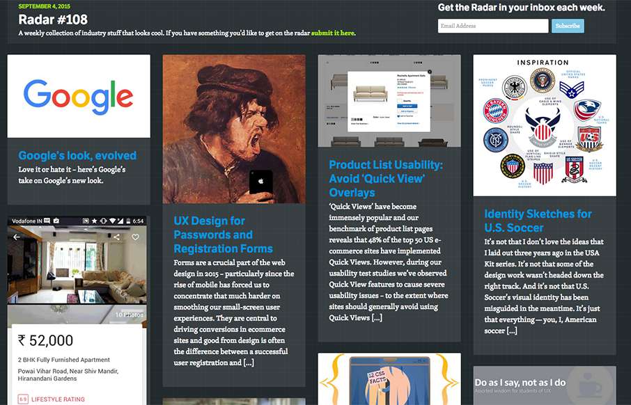
In this week's 108th Radar: Google's look, evolved UX Design for Passwords and Registration Forms Product List Usability: Avoid 'Quick View' Overlays Identity Sketches for U.S. Soccer Designing Photostories 12 Little-known CSS Facts - The Sequel Do as I say, not as I...
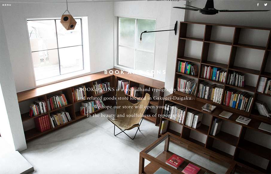
Book & Sons
Pretty tidy layout for Book & Sons. I dig the large imagery and the simple nature of the grid at work here. I'm not too happy with the big background images and the white text overlaid on them, sometimes the copy is impossible to read. Fixing that up would leave this...
Eginstill
Really cool way to start up a page of content. That large image that loads down to a smaller version and then the grid layout around it is pretty hot. Really digging this site right now.
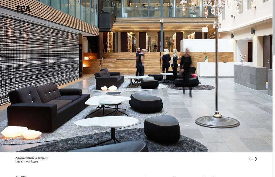
TEA
Ahhh, that Swedish design. I love it so much. The crisp photography and the thin lines on the typography layered on top of a sharp grid. Wonderful stuff.
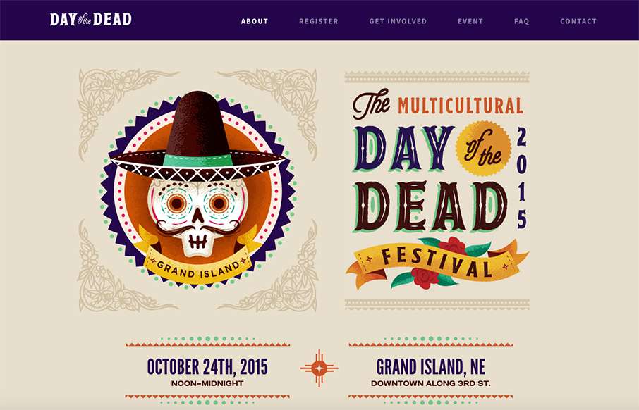
Day of the Dead
Beautifully illustrated website for the Day of the Dead festival. I love the bold colors and stuff. My favorite is the "skull menu" that you get on mobile screen widths. Skulls beat Hamburgers every time.
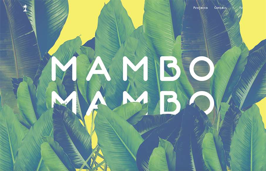
Mambo Mambo
Simple approach to this website, but I love it. I love the big header image, it's fun and feels fresh. Then the rest of the content is really straight forward but probably all you need for a site like this.
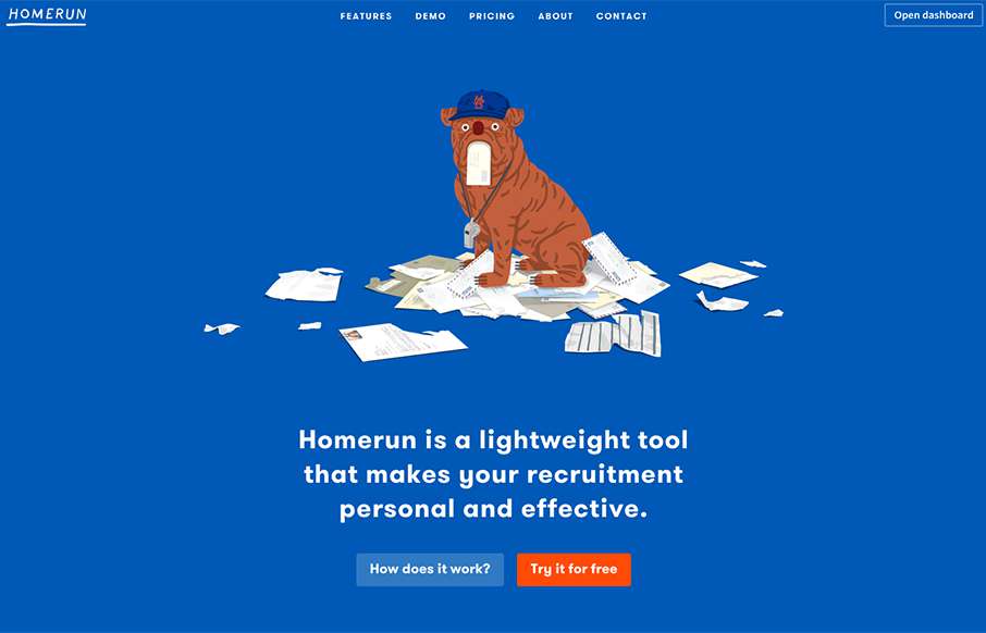
Homerun HR
Love this simple site with some cool bulldog (kind of) flat illustrations. Besides liking the site - I really like the way the actual app looks and works - there is a Bootstrap element to it - but it's clean and makes sense - even has some Trello elements to the...
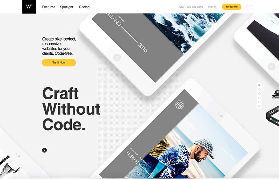
webydo.com
Pretty nifty visual narrative on the home page of the webydo.com website here. I like how the photos follow you down the page through the various processes you'll go through in editing a website with this product. The overall design is slick too. Much like.
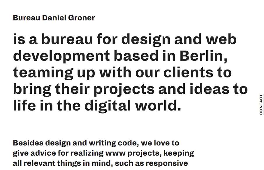
Bureau Daniel Groner
The vibe of this site design is very unique feeling to me. I like that it's 90% copy as you first load the thing then the layout of the elements are unique. I like the mouse over effect on the main images as you move around on the page too.
Fondation de la Haute Horlogerie
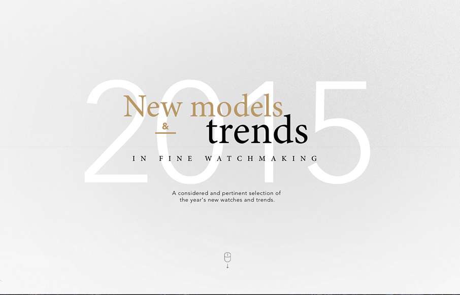
Superbly crafted interactions and typography for the web here. I really enjoyed scrolling through this section and reading through it. They enabled timed load-ins and animations but didn't hamper my ability to scroll and read.
Drimba Filho
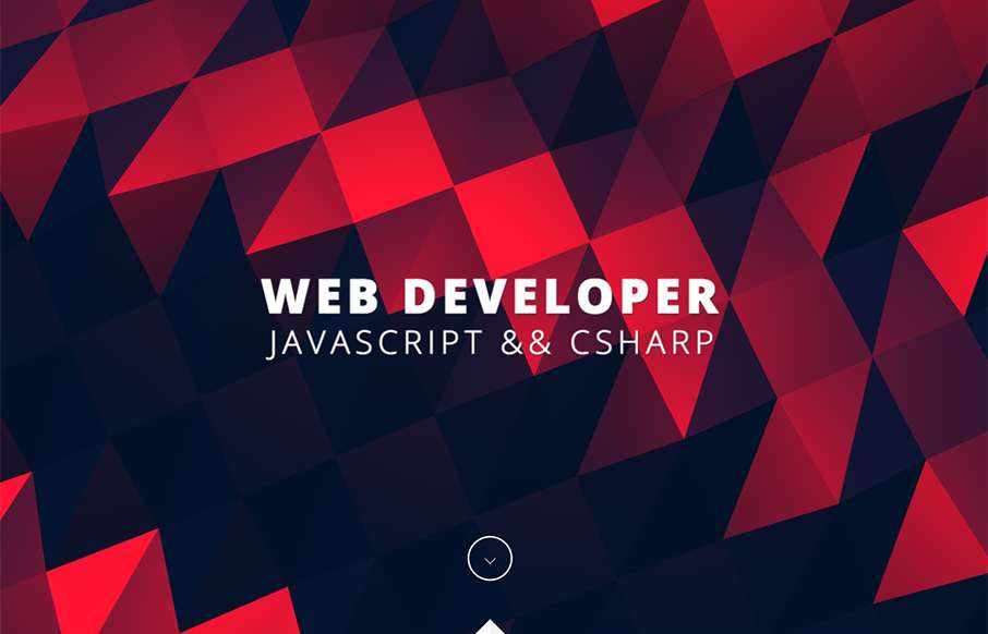
I love, love, love that header/hero area background. I dig the way the rest of the page loads for you too. It's just a simple portfolio/resume website and it's just that, simple. But still powerful feeling.
Baobab
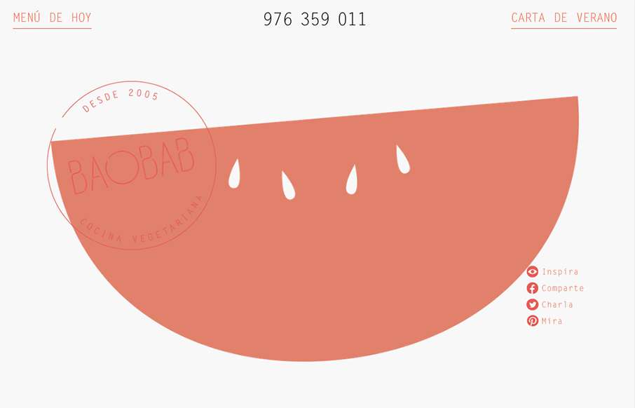
I really like the open feel to this design. The typography and the way it interacts with the white space is also pretty nice in that it feels vibrant and not just minimal. Love the colors and implied simplicity behind the visual layout too.
LJB Studio
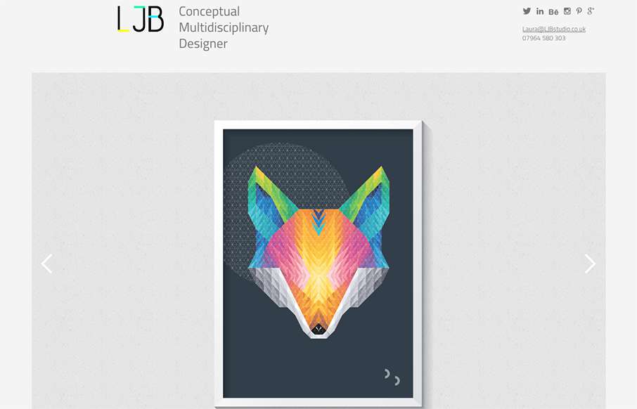
Cool portfolio design from Laura Boast of LJB Studio out of Manchester (UK), built by Nine Sixty. One thing I really like is how the home page has no nav in order to draw more attention the work in the slideshow - but nav comes up in the sticky header when you dive...
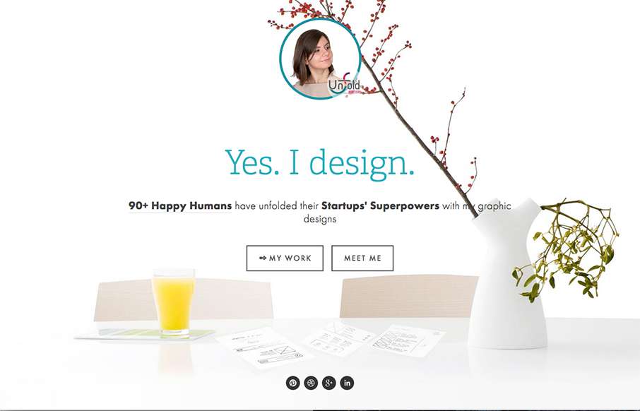
Unfold Ateier
Good, clean, functional site from Raluca Comanescu out of of Romania for her Unfold Ateier site. It has a ton of detail on the content side, and I like the fact that there are different types of nav for a lot of content, instead of doing some type of filtered masonry...
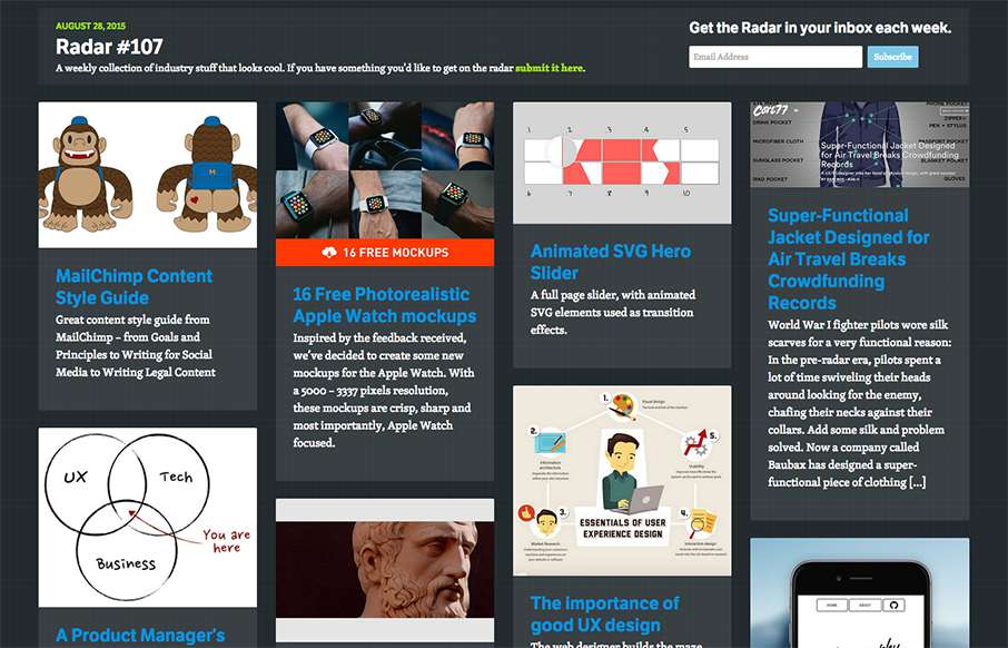
Radar #107
In this week's 107th Radar: MailChimp Content Style Guide 16 Free Photorealistic Apple Watch mockups Animated SVG Hero Slider Super-Functional Jacket Designed for Air Travel Breaks Crowdfunding Records The importance of good UX design A Product Manager’s Job UX Is a...
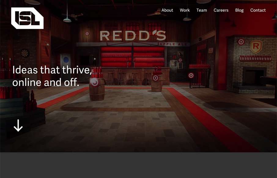
ISL
Way to pull a user in to your site - great video backgrounds - great pop to the rest of the site too - love this site from ISL out of DC! From the Designer: This website was a labor of loved, designed and developed over 6 months. We're a digital agency in Washington,...
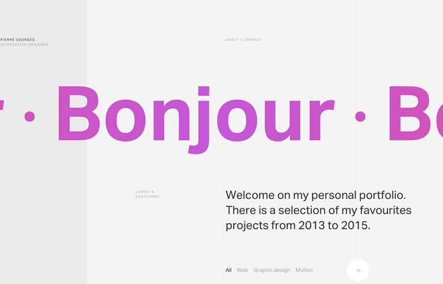
Pierre Georges
Super sleek grid based layout. I love that he's using the grid visually and structurally. I also love the way it plays with the typography and then the interactions feel perfectly placed. The layout of the work samples get kind of tedious as you scroll down the page,...
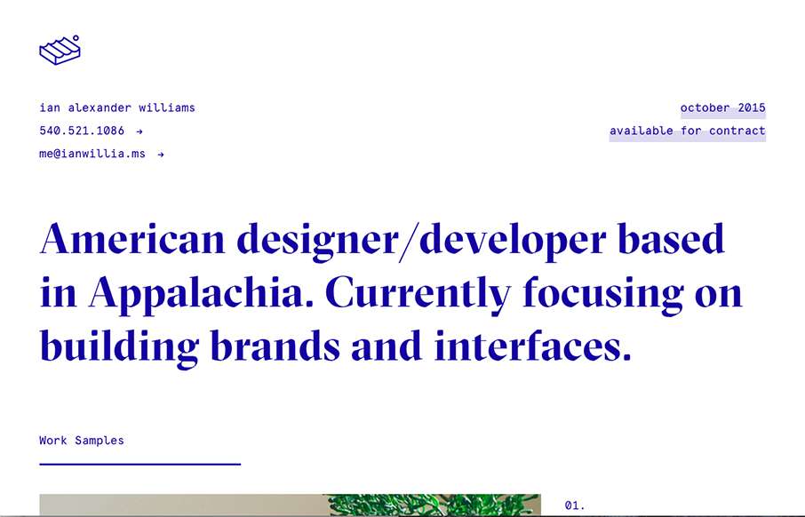
ian alexander williams
Ian Williams out of Virginia - love it. I've seen other sites like this- "looks" liked stripped out design - but they've been pretty, well not good. Ian's is an excellent example of how to. It's different without being over the top - and works well too. But WTFreak...
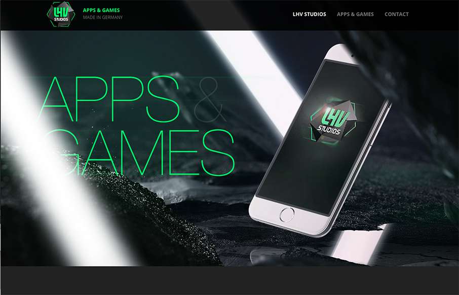
LHV Studios
Good quick design from LHV Studios out of Germany - looks to be an iOS app company. Detail is in the product pages - good stuff. Comedy in the copy the Beer "game" - I think this game is probably only legal in Germany... funny though. From the Designer: Website to...
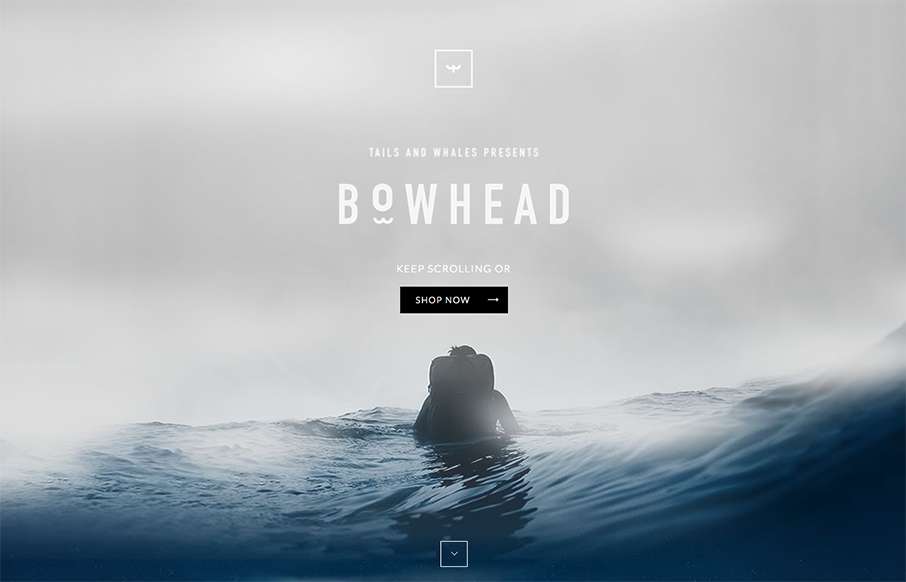
BowHead
Well - we're back to a product that as we say around here "me want." Sweet looking backpack for active types / surfers especially - from Tails & Whales out of Portugal. Like the look and feel as you scroll down - good water associations for their potential customers...
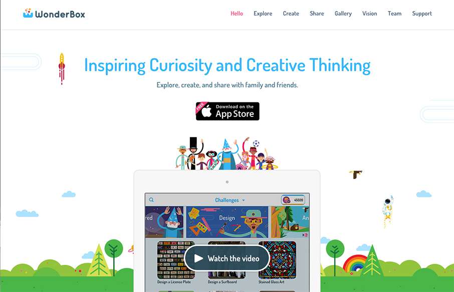
WonderBox
Well - I guess I found something cool, and non-cracked-out-candy-crushed to let my kids look at on my phone: WonderBox, an educational app made by Duck Duck Moose out of San Francisco. Looking forward to the app - but the site is pretty good too. It's bright, and...
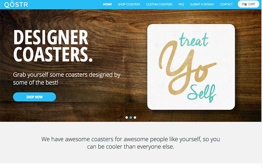
QOSTR
Qostr out of Arkansas, was built by Matchstick Studio (well Qostr was, not Arkansas...sorry) - thought this was a pretty cool concept - and can see the applications for the product and platform for photographers / artists / weddings / etc. It's been awhile since we've...
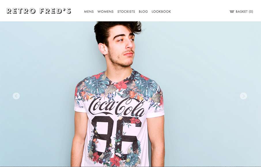
Retro Fred’s
I like the simplicity in the grid for this ecommerce site. It's clean and simple and driven by the photography. I really like the way the main navigation is displayed open when you load it up on the mobile site width like that too. Smart stuff.
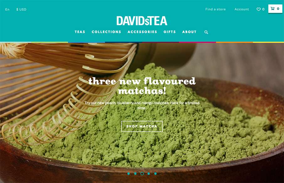
David’s Tea
This is a bright and lively site from David's Tea out of Quebec. It's incredibly detailed throughout the shopping part of the site - it looks like hundreds of items on the site - and all are beautifully done. My wife is a huge fan of Rooibos Chai - looks like it's...
emota
Great clean site from emota out of San Diego (made by Bumbli also out of San Diego). They do video - and it's pretty powerful stuff. Good use of actual client work for the video background to draw you into the site, and good use of it in the case studies too....
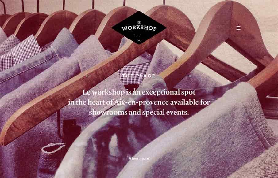
Le Workshop
It's not often you see a website that really matches the physical location that it's representing quite like this site does. Based on the pictures I really feel like the vibe of the space and the vibe of the website design and layout matches fairly asynchronously....

