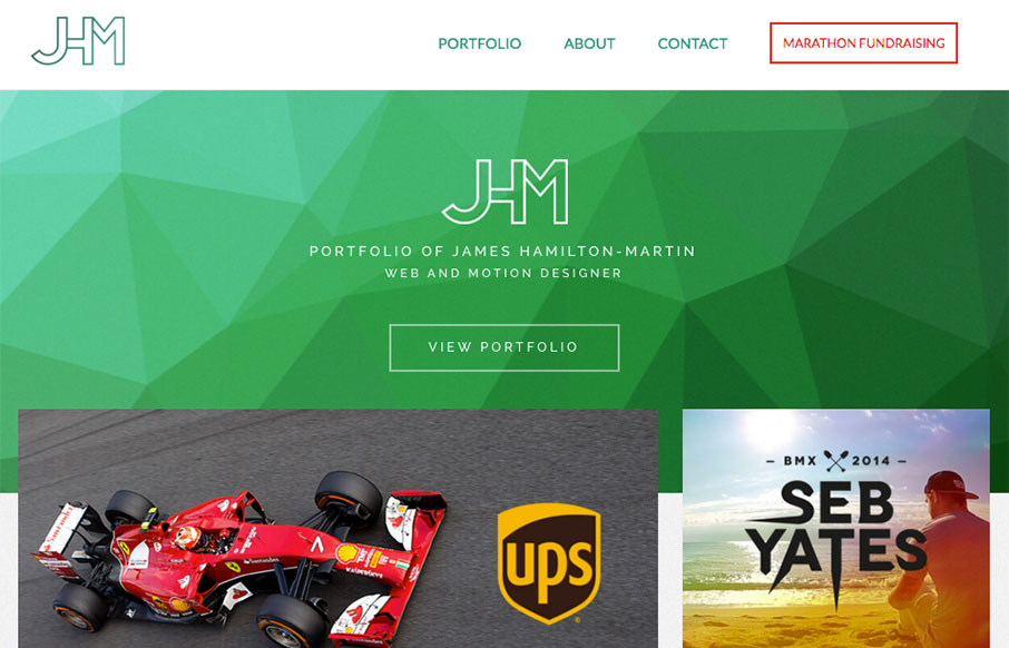
Nice portfolio site for James here. I love the green background/shapes and the way the portfolio pics overlap slightly. Very clean layout and I loves it! Also, he's running a marathon, so give the man some support! From the Designer: A responsive portfolio website...
LivX
Some pretty slammin' loading animations in the hero area of this site. Then some here and there down the page as you scroll. Simple layout and straight forward copy make it easy to take in everything about LivX. We are a tightly-knit team of passionate people,...
How do you Hug?
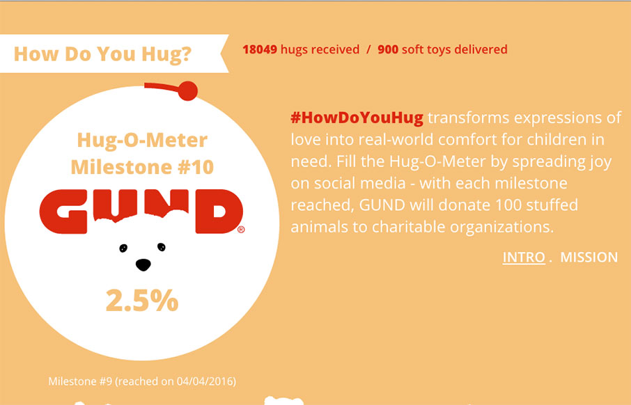
Pretty neat idea for Hugs. 🙂 I really do like the way the main three columns are setup, centered around the core content of the website. The bears are a nice central theme element too. Lovely. From the Designer: HowDoYouHug transforms expressions of love into...
Radar #139
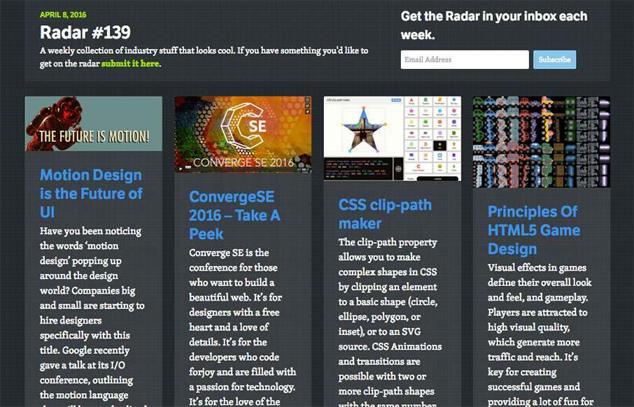
Each week, we do a round up of curated "stuff from the interwebs" that we call Radar. In this week's 139th Radar: Motion Design is the Future of UI Have you been noticing the words ‘motion design’ popping up around the design world? Companies big and small are...
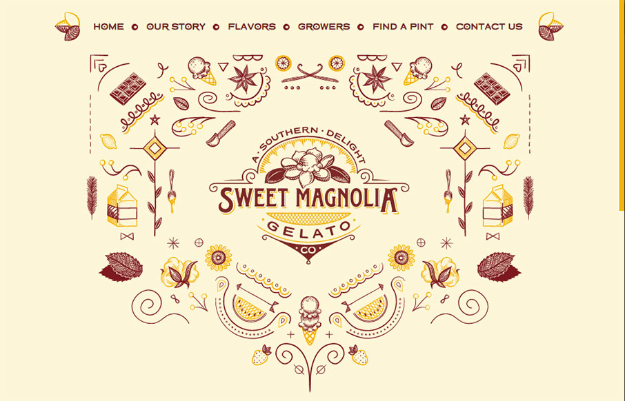
Sweet Magnolia
A lot of fun for this website for Sweet Magnolia gelato. The illustration is top-notch and made extra fun with the animation. The execution might leave something on the table but I don't care. GELATO! From the Designer: Sweet Magnolia Gelato Co. makes gourmet gelatos,...
MYF Web Designer
It's sort of your standard affair in terms of "stuff" on the page, but it just feels nice. I like the dark colors and cool shapes that you start off with. Overall nice design. From the Designer: I'm Bren, a reliable, efficient and motivated web programmer and premium...
Mobilunity
Pretty unique looking layout. I dig the colors a great deal and the non-traditional way the content loads up on the home page as you scroll down. A little scroll-jacking but I can get over it. Solid mobile views too. Submitted by: Anastasiia Role: Marketing Officer...
Chris McNally
Really cool pacing on the content blocks as you scroll down the page. Also some really clever interaction points, like the email link/icon that pulses in the corner and the side navigation that appears as you move down the page. Solid stuff there, worth a good long...
Lakewood Design + marketing
Strong graphically. I dig the overall vibe of this website, I extra like the way the two main sections are presented in the "middle" of the home page. I am not a fan of waiting through the loading % bar thing, but I suppose that can't be helped to a far extent....
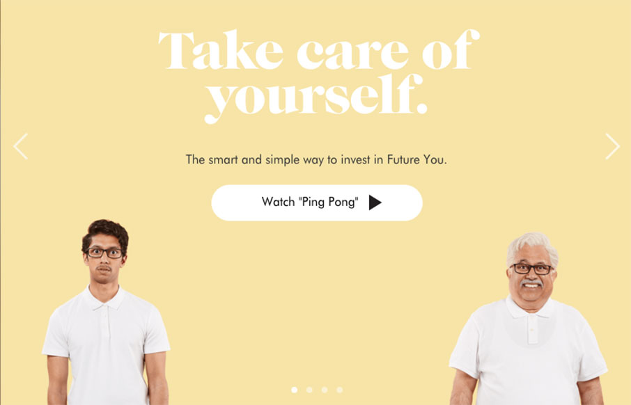
Wealthsimple
Wealthsimple doesn't look like any other financial website i've seen before. Ditching the status quo corporate colors for a softer more non-traditional vibe they really get it right. Playing up the personalization feel to the tee. I love the typography on this site...
Sheridan Life
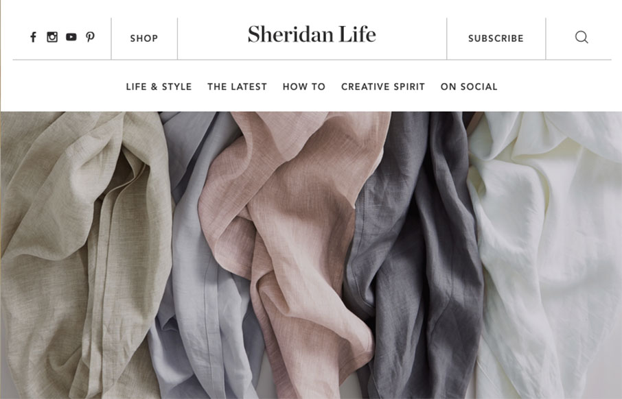
The Sheridan Life life page of the Sheridan website is a super sweet page design buried inside the overall corporate website. It's beautiful, great typography and great rhythm, I loved discovering this. My favorite interaction points are the header and the page...
Arts Access Victoria
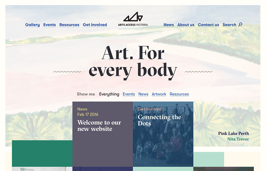
Generally intriguing and thought provoking layout to me. I love the asymmetry inherit in this layout. Balancing out a design with an offset approach like this is difficult but when done well is just beautiful. I think I actually love the simple blue + underlined links...
Fit Radio
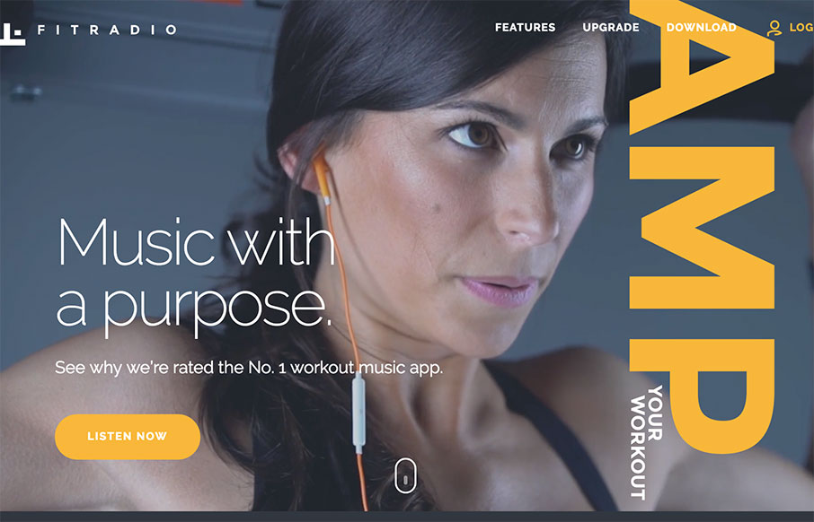
Good mixture of sleek design details, trendy(ish) design elements and good old fashioned solid design work. I love it. Reminds me a lot of rdio's design aesthetic too. Good work, pretty cool product too. Give it a listen and see. The Fit Radio app brings an addictive...
theory11
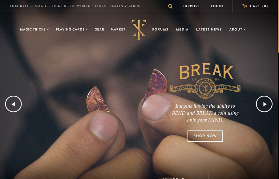
Love this site from Theory 11. There is so much going on, but it still stays organized (good for shopping) - and has some fun pages too (like the About page). Done by @Forefathers - who has a great site themselves - and looks like it's a custom Shopify theme. More...
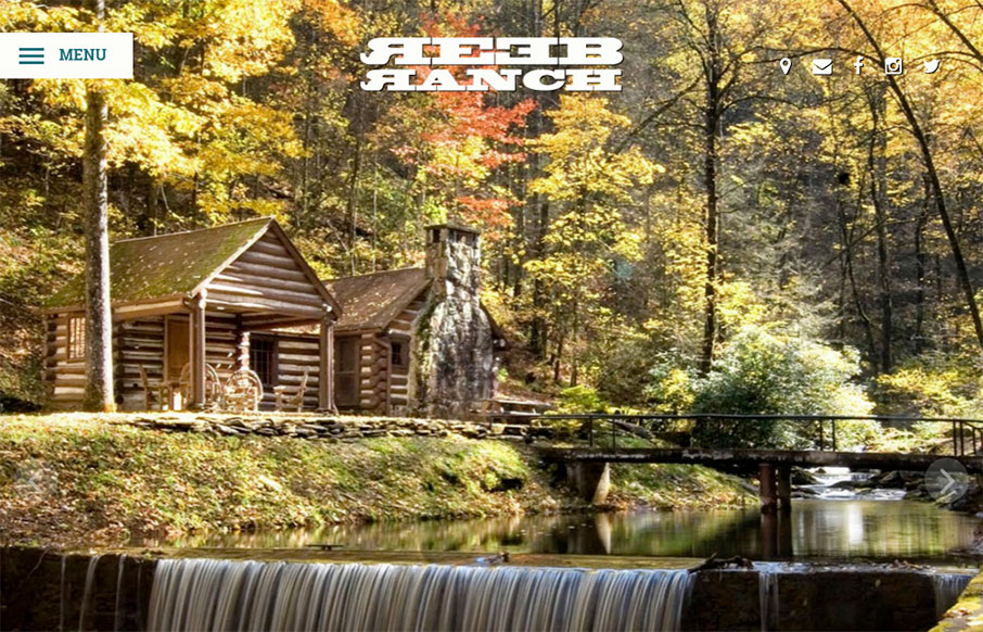
REEB Ranch
From our friends in Asheville, NC - Open Door Design Studio - is the site for REEB Ranch. It's clean and vibrant, and really emphasizes the event nature of the facility. More from the Designers below: From the Designer: Born from the love of beers, bikes and beautiful...
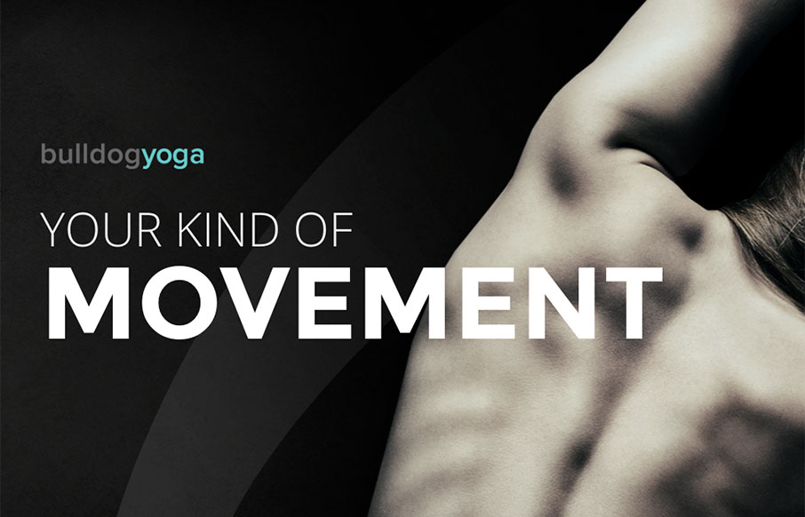
Bulldog Yoga
I am not going to say something like "a little namaste for your morning"... but I did. We're big believers in yoga in our family - and most yoga studio sites we've seen are... not in line with the rest of their flow. Bulldog Yoga, out of Pennsylvania, has a great site...
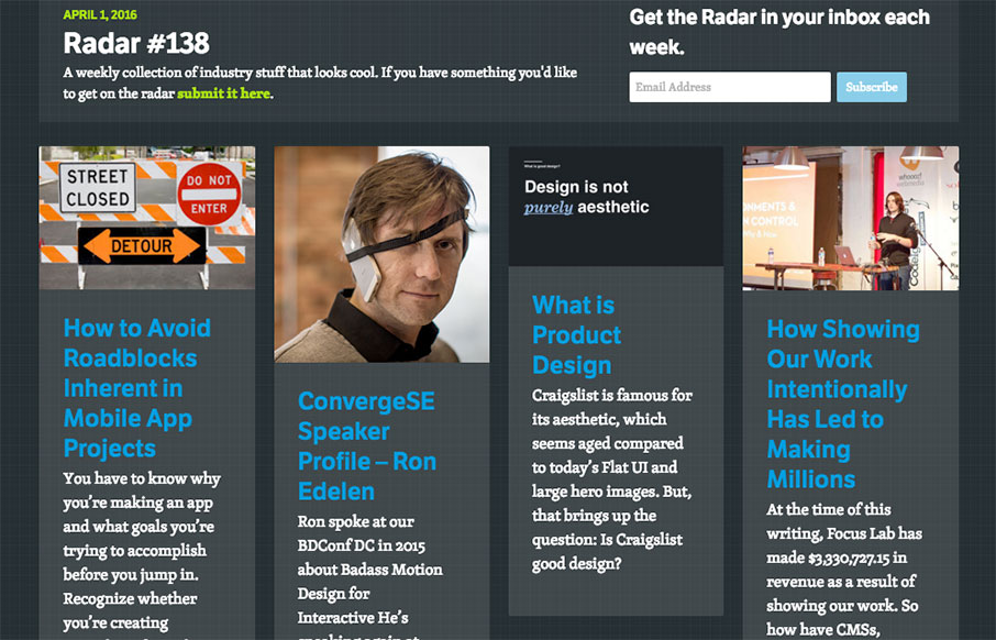
Radar #138
Each week, we do a round up of curated "stuff from the interwebs" that we call Radar. In this week's 138th Radar: How to Avoid Roadblocks Inherent in Mobile App Projects You have to know why you’re making an app and what goals you’re trying to accomplish before you...
Collserola
It's a simple formula, the design for the Collserola site. Nice fade in interactions and a solid simple grid make this design rock solid IMHO. I'm not wild about the splash area but since the overall production is simple and straight forward it works out. From the...
RINS
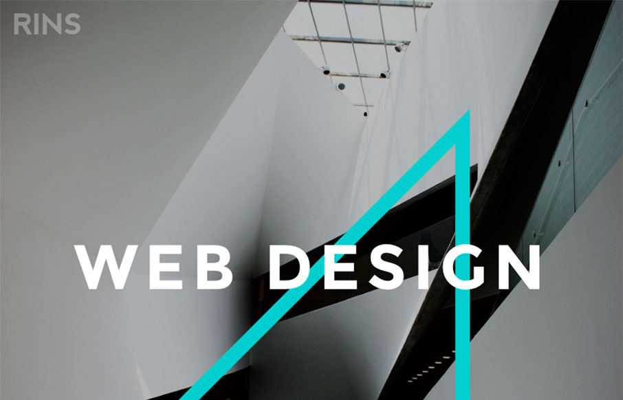
Amazingly simple website layout with some pretty solid simple design work. I love the photos and the interactions on the letters, it draws you in and makes the simplicity work. From the Designer: We don't just create beautiful designs but also functional and usable...
Designkwartier
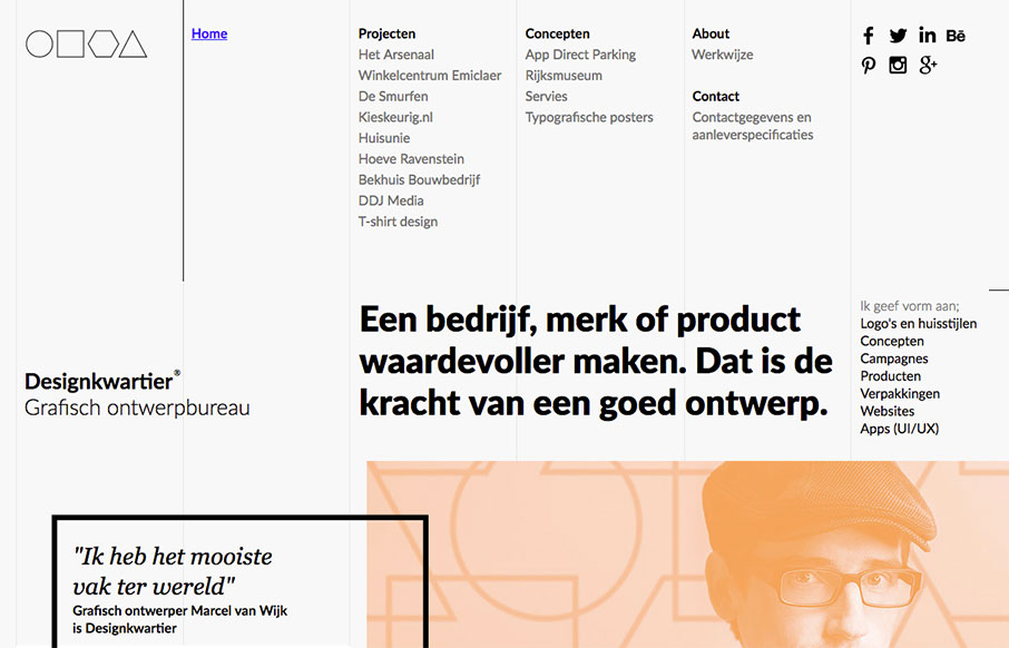
Super strong grid based design. The layout and details feel very scandanavian to me. I love it so much. It's not responsive, which is a shame but I still love it. From the Designer: Graphic design agency Designkwartier aka Marcel van Wijk one-man-designstudio based in...
Blackbox Design
Really cool full width layout with a strong grid based. It's made up of largely squares and the grid, it really is a strong layout, it feels kind of "traditional" to me but the type and colors make it look really futuristic. Real solid design here. From the Designer:...
Make Your Money Matter
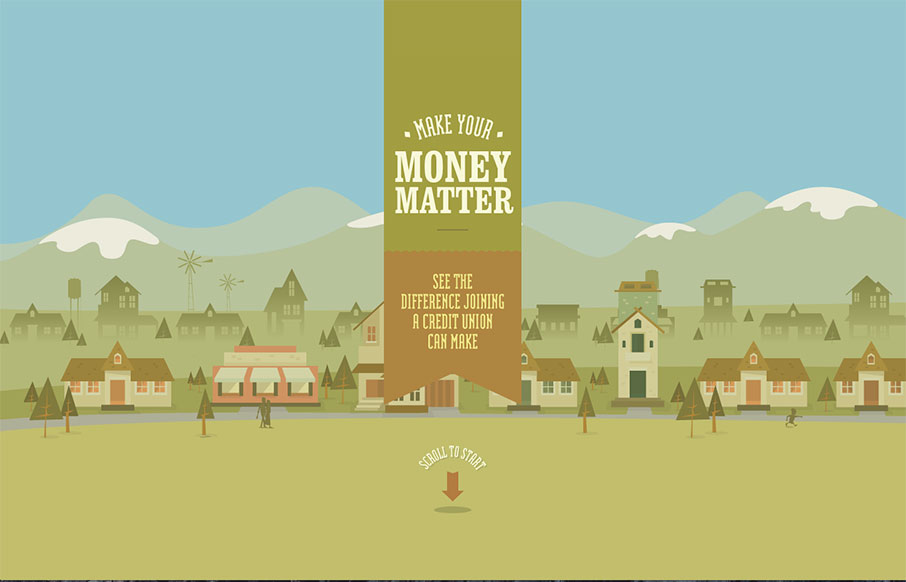
Excellent story-driven intro to the Make Your Money Matter site - a "brochure" site for using credit unions over banks. The flat illustrations are great as you scroll through the intro - and the final resting part of the site is very smartly done from a marketing /...
Milk Magazine
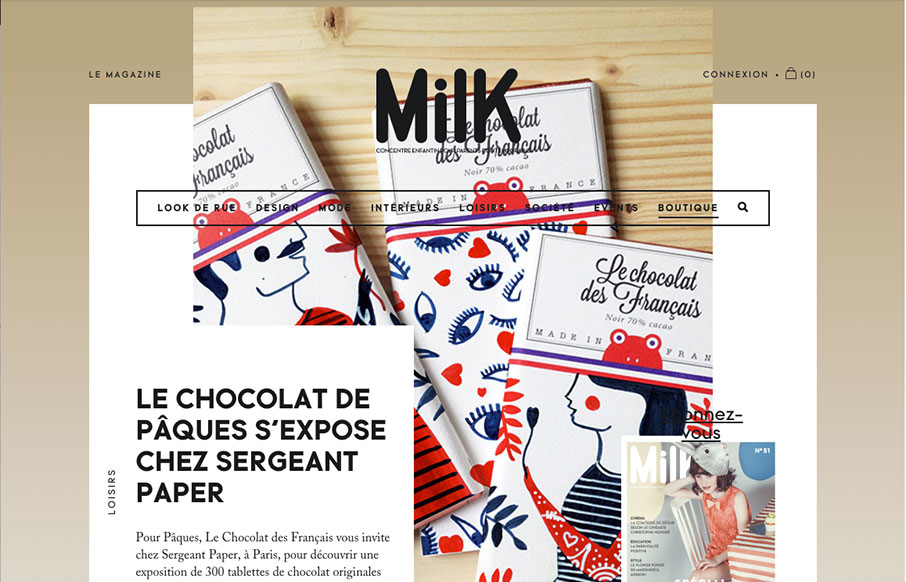
Slick yet simple approach to the layout for Milk Magazine. I love how the main/top section has some overlapping elements like that, then the nav slides up and locks into place as you scroll down. It all fits together and "feels" very purposeful.
The Met
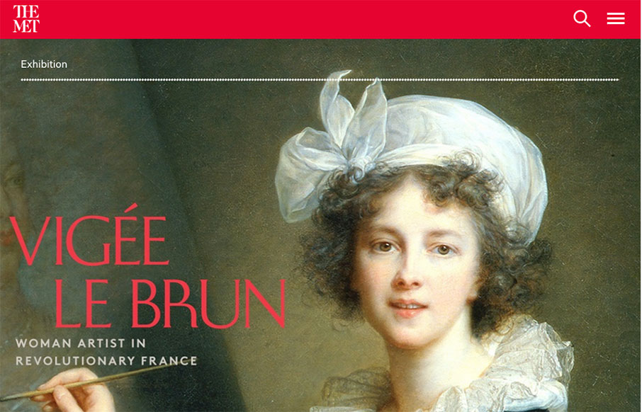
Holy cow, where to start. Really, it's a huge website with tons of content and the designers have done a superb job of getting you at it. All the while maintaining style and vibe that matches the Met. Spend some time going through this site okay, you'll dig it.
Maria De La Guardia
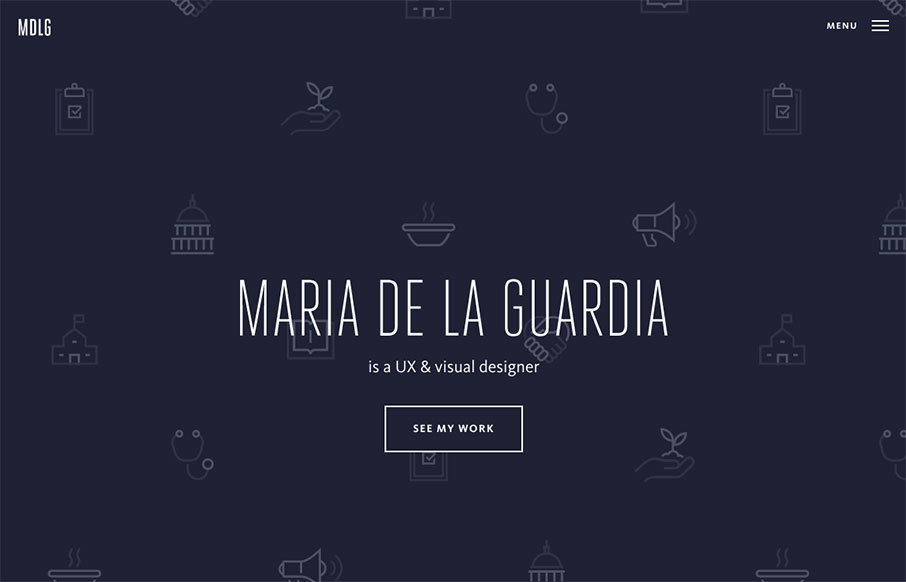
Pretty cool, basic, Material Design based portfolio site for Maria De La Guardia. I dig the icon/illustration work on the hero/splash are and then how it kind of "dives" straight down into the work like that. Strong work.
Elespacio
Very nice splash/hero type layout for the main page on Elespacio. My favorite section is the portfolio though. The way the image/photos are done to really pop off the page like they do. Solid.
Spring Summer
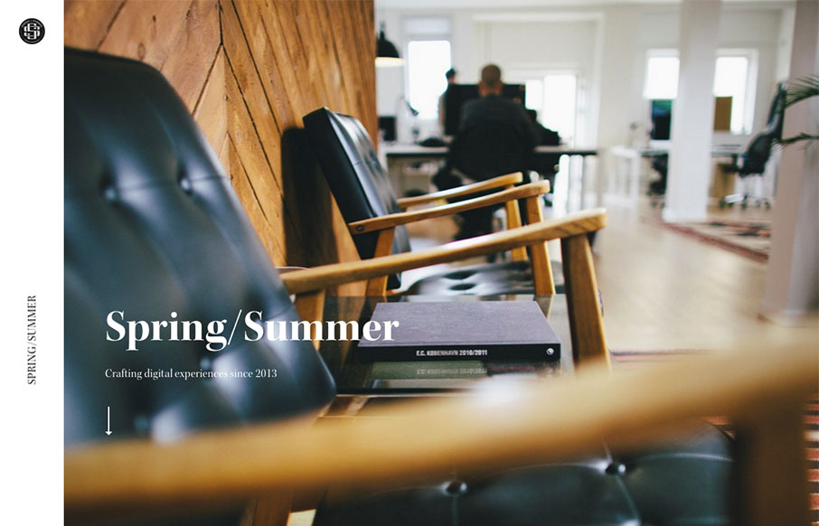
The first thing that hits you is the photography, it pulls you in. Then there's some superb typography everywhere. Solid rhythm implied with the layout as you scroll down the page, it almost sings to you as you take it in.
Radar #137
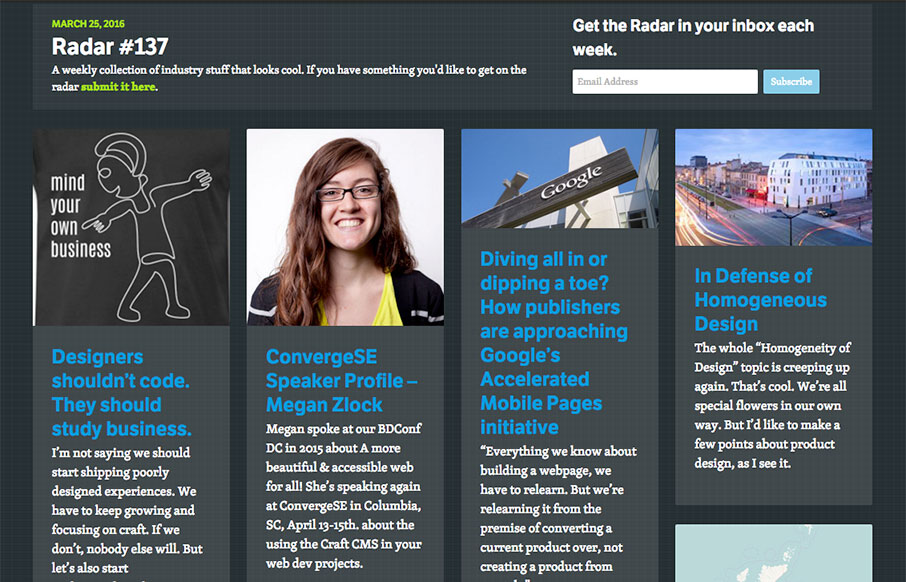
Each week, we do a round up of curated "stuff from the interwebs" that we call Radar. In this week's 137th Radar: Designers shouldn’t code. They should study business. I’m not saying we should start shipping poorly designed experiences. We have to keep growing and...
Kodo Nishimura
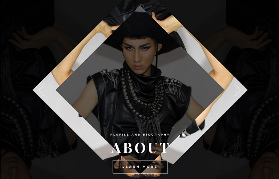
Pretty cool scrolling interaction/animation here. I like the menu design too. It's kind of set for a lot of pogo-sticking for it's navigation interactions but I suppose that's all well and good for this specific site.
Perth Device Lab
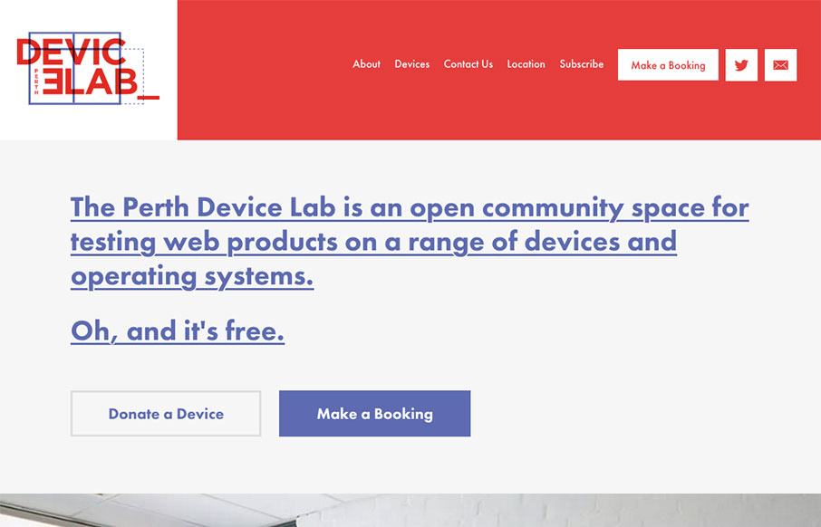
Damn! Super nice website for the Perth Device Lab. And also, Damn, I want one of these... Seriously, pretty swank site.

