Web Design Inspiration Curated
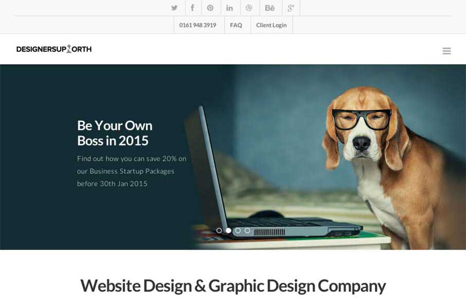
Designers Up North
Like these folks, their energy, and philosophy: "The only thing we take seriously is your work. We are a collective of creative freelance professionals." And their work is good. Their site scrolls down easily, with subtle fly-ins to help punctuate the copy. It's...
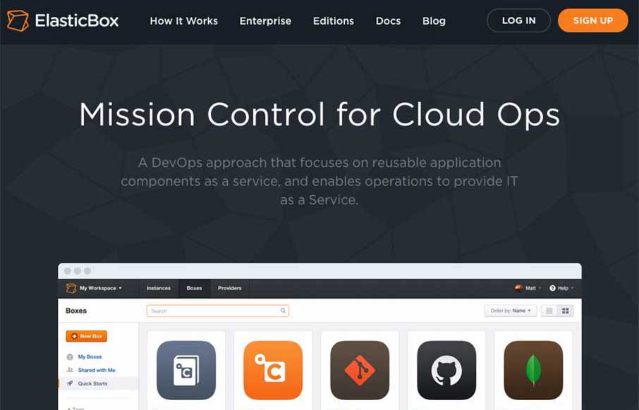
ElasticBox
Your App Product Page is broken. You only have some icons, copy, and an image of someone staring at their smartphone with a happy smile.... What you haven't done is to take your prospective client / user, and given them a clear path that explicitly states: This our...

Booking.com 11:59 NYE
I'm sorry I saw this site a little too late for the contest, but Booking.com's 11:59 NYE site on it's own merits is a pretty cool microsite / landing page(s). In the site, you get to: "Explore 24 time zones, showcasing the world’s most beautiful locations to find your...
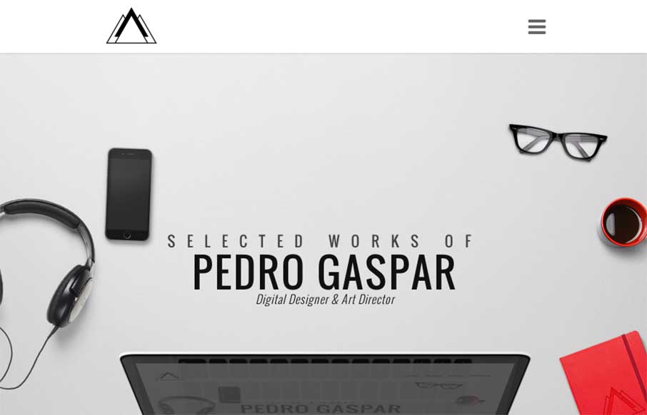
Pedro Gaspar
Maybe it's because a lot of Pedor Gaspar's work has something to do with fast cars, but this designer / art director out of Portugal's portfolio site is sleek and shiny! Make sure you check out the Work detail pages, really has some kick (and good strategy and design...
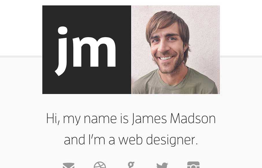
James Madson
Good and "quick" portfolio site from James Madson from Arizona. Again, like the Home page used as the navigation to the portfolio part. Then a simple "left/right" to move between Work detail pages, and his logo to get back to the home page. I know it's a small site -...
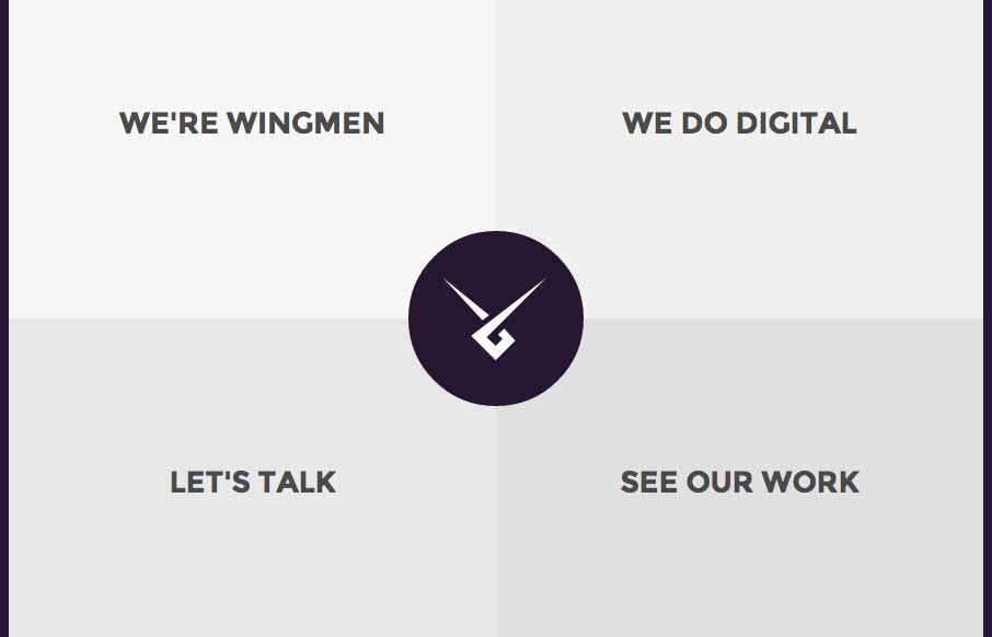
Wingmen Ltd
I'm really starting to get into sites that use their home page as their main navigation (maybe it's because we did that with our new ConvergeSE site). I like Wingmen's site (out of Helsinki, Finland) because it's simple, direct, uses that home page as nav, but also...
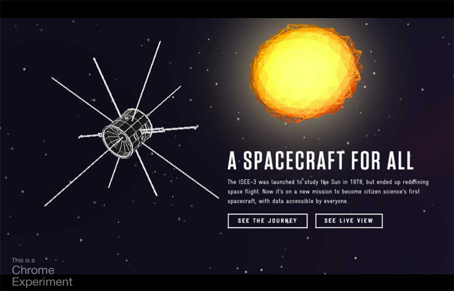
A Spacecraft for All
This Google Chrome experiment by Active Theory @active_theory has won numerous awards in 2014. And we're uber excited to have one of their awesome front-end devs coming to speak at ConvergeSE this year. Rachel Smith @rachsmithtweets , a Venice Beach transplanted...
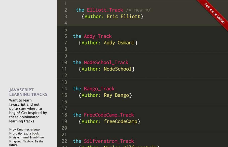
js tracks
So we're going a little different this morning. The look of the site is probably familiar to you if you stare at Sublime Text for 8 hours a day. Yes - a pretty simple site. But I like that Samir has given reference to what he uses and his inspiration. What I also...
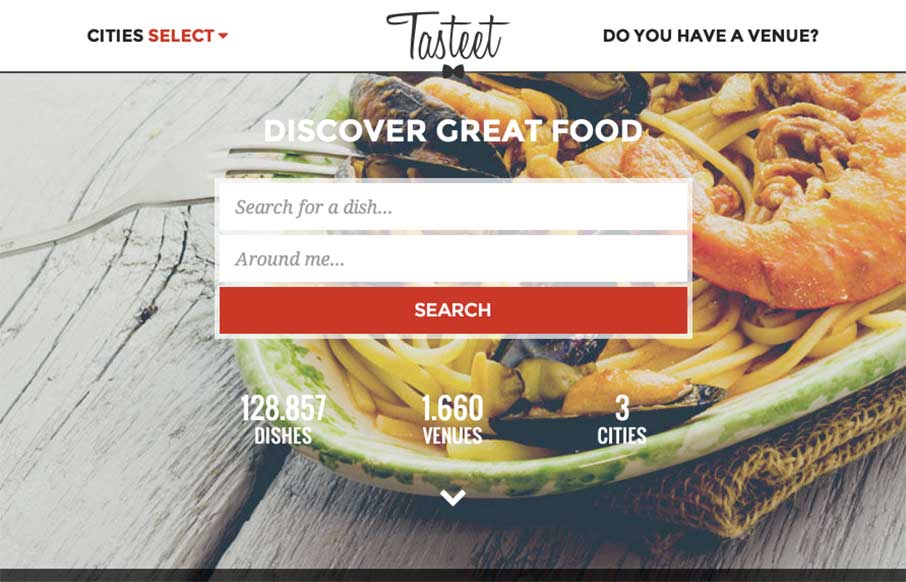
Tasteet – Discover great food
Hope you already had lunch... don't go to this site if you haven't - but if you haven't, and happen to be in Italy, check out Tasteet. Pretty innovative foodie / food finder site. Great design on desktop and mobile. And like the layout of the search result pages...
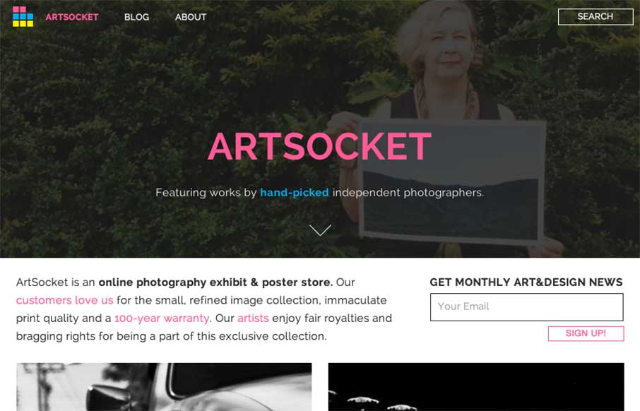
ArtSocket Posters
It's kind of nice when the designer reviews the site for you. It helps when they're right in their assessment of their work - Dmitri Tcherbadji did that for me here with talking about ArtSocket. From the Designer: "This is a three-year e-commerce/community project....
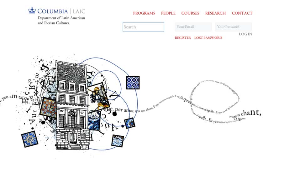
LAIC, Columbia University
Cool canvas work from Miguel Ripoll for Columbia University's Dept of Latin American and Iberian Cultures. The coloring and tiles conveys a specific cultural element that you don't see in most sites - which is very relevant to the client. And the canvas word play...

Liz Hobbs Group
Good responsive work by Root Studio on the Liz Hobbs Group site out of the UK. Has a smart integration with Spotify to give you a taste of their artists, as well as hi-res images and color splashes to set a vibrant tone. From the Designer: "Liz Hobbs Group is a...
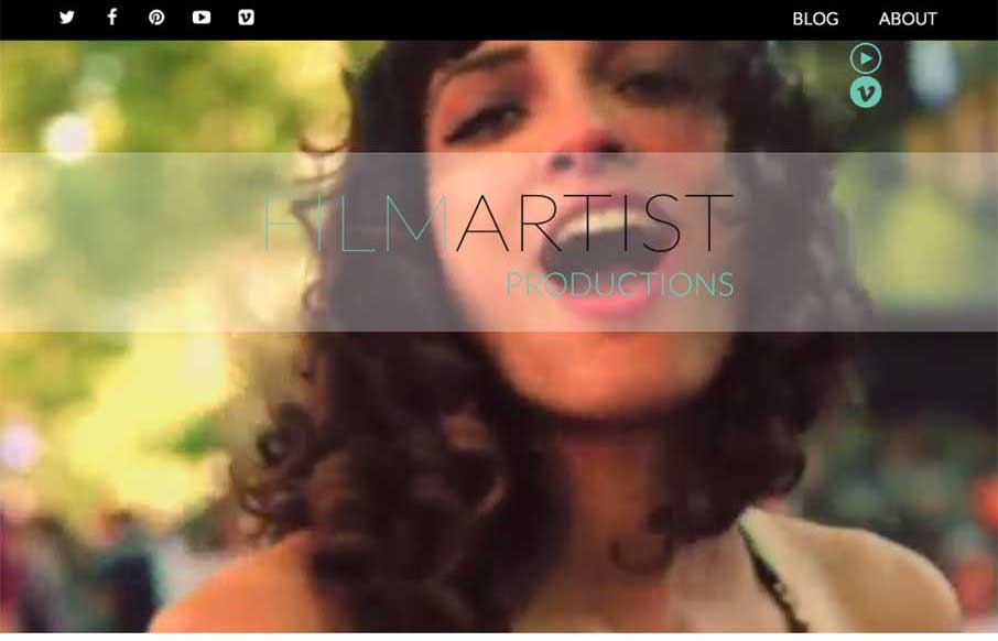
FILMARTIST Productions
Cool video background site from a company that produces videos... and therefore video backgrounds.. The FilmArtist Productions site, out of Toronto, Canada, is a very simple showcase of their work. I like how the video background is persistent throughout the page as...
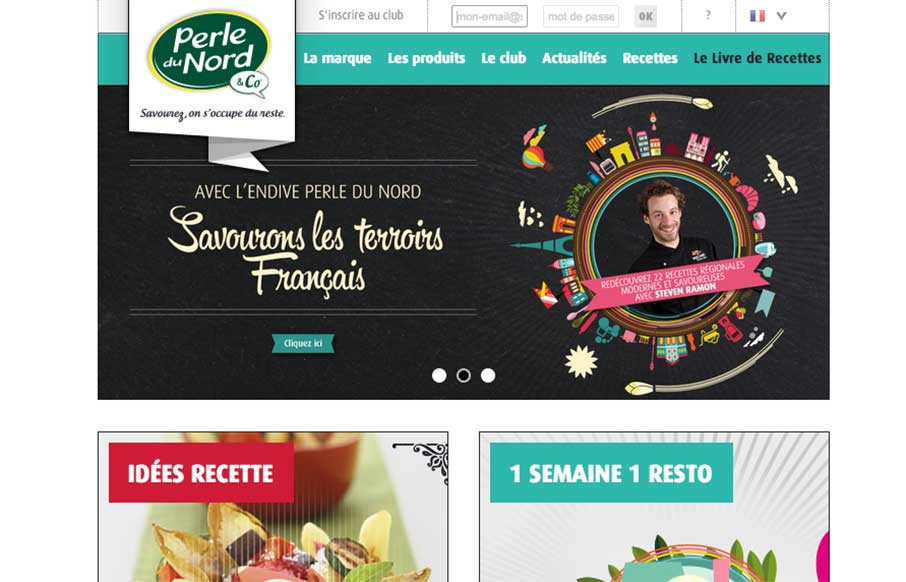
Perle Du Nord
The Perle Du Nord site by the Black Meridian agency out of Paris has good lines, and uses the home page for navigation - which works well for this site. I like the recipe filtered search, but might need more help with the ingredients suggestions. Also, take a moment...
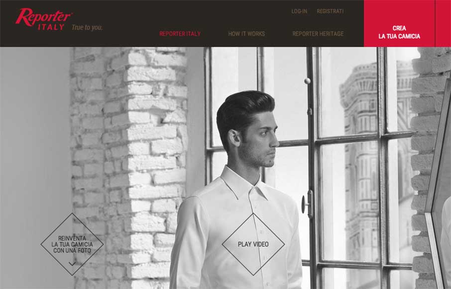
Reporter Italy
I don't wear custom fitted dress shirts - who am I kidding, I'm wearing a Kickball.com tee on top of a Captain America compression shirt while at work... last week when my in-laws spent the night, on Monday morning asked me "And what are you doing today? Working...
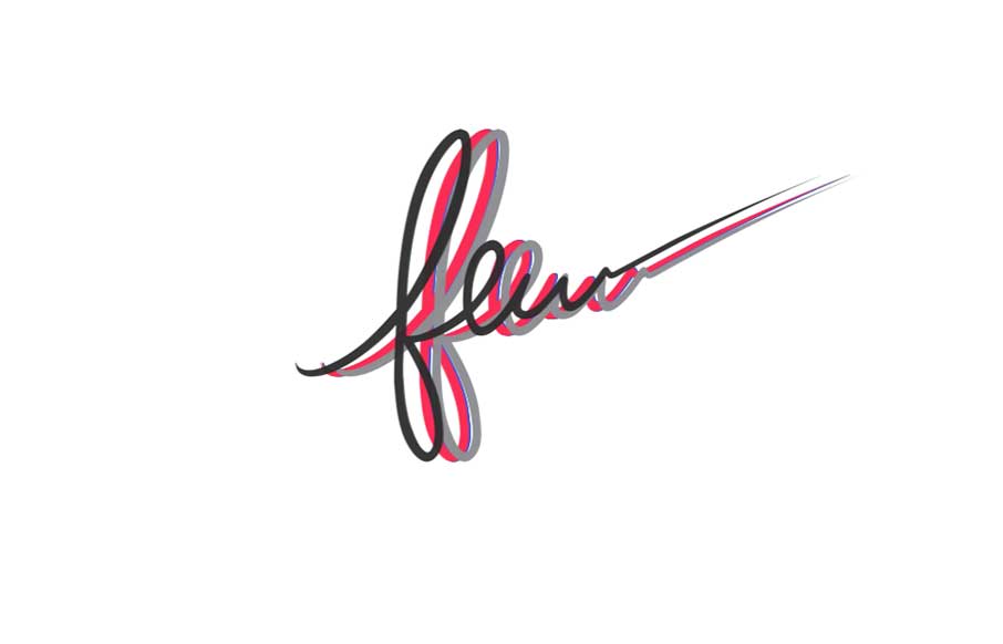
Few
Great colorful on a nice white canvas site from Few, out of Little Rock, Arkansas. Like how you're greeted with the all the colors of the site flying in to make the one black logo for Few. The illustrations of the peeps are cool, and really like how the video...
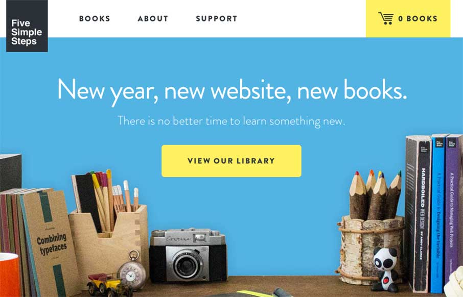
Five Simple Steps
Love the changes to the Five Simple Steps site from when we reviewed them last March. This feels right - it's clean, simple, beautiful, and practical like the books they sell. It looks to be built on Shopify, but doesn't have the feel of most e-commerce sites (yes,...
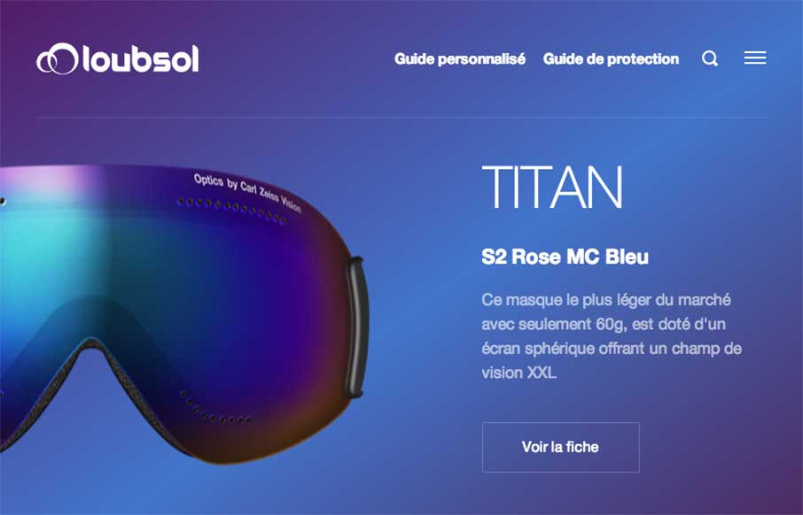
Loubsol
We've started to see a lot of good work coming out of France to Unmatchedstyle lately. The Loubsol (ski googles) site, done by the NOE Interactive agency from Lyon, is shiny, with great coloring for each of the products on the home page. I like the filtered search on...
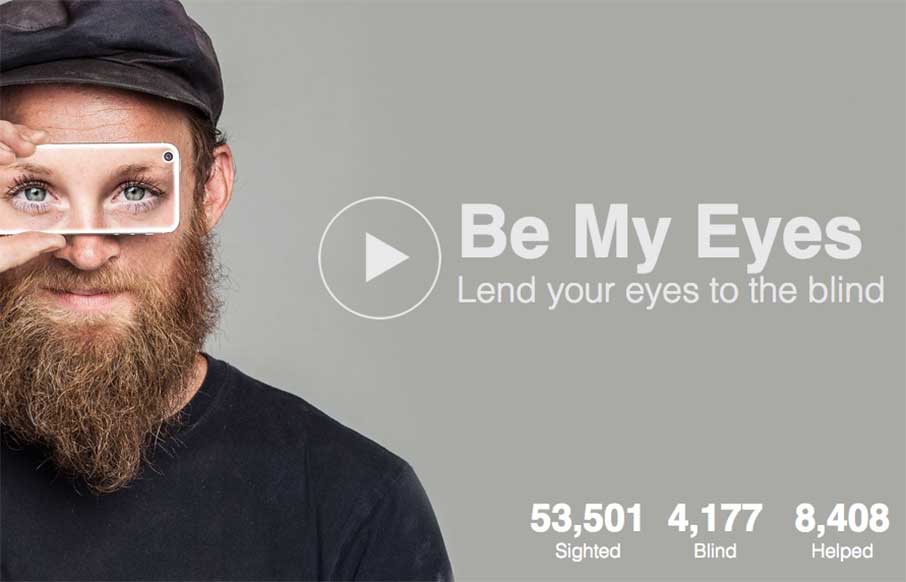
Be My Eyes
Awesome. Robocat out of Copenhagen, Denmark, has an incredible app called Be My Eyes that, "is an app that connects blind people with volunteer helpers from around the world via live video chat. Download now and start helping blind people see." A truly inspired idea:...
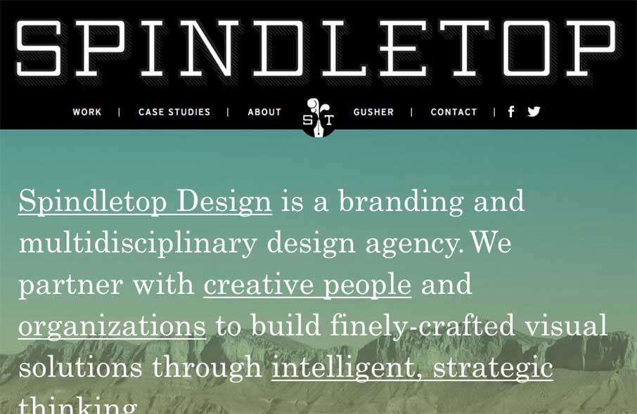
Spindletop Design
Really like the vibe coming from the Spindletop Design site, an agency out of Houston, Texas. It looks like they like to use a lot of text treatments in their site, and in their client work - which is cool, considering the graphic design trend of Lettering (or how to...
EMAIL NEWSLETTER
News & Articles
Chat Session: Christopher Schmitt – InControl Honolulu
 Talking Christopher Schmitt about his upcoming InControl Honolulu and CSS Dev Conf.
Big bunch of updates
 The UMS crew has a few things to tell you about. From conferences, a new book, live podcasts and several speaking gigs.
Creators Chat 01 – Paddy Donnelly
 Talking with Paddy Donnelly about the creative process & his new app Wee Rockets.

HARD WORK. CLEAN FUEL. NO EXCUSES
Use “WARRIOR2023″ for 10% off.