Web Design Inspiration Curated
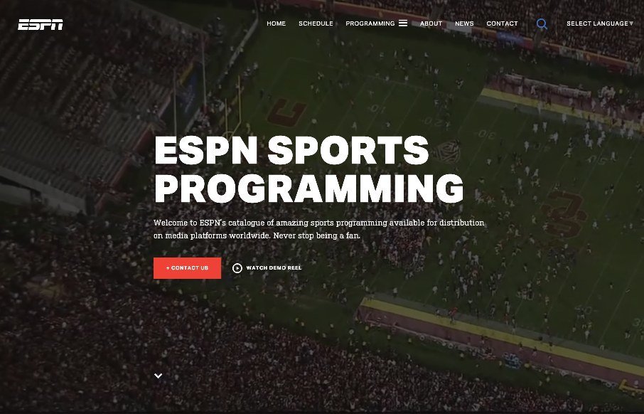
ESPN Sports Programming
Good looking site for ESPN Sports Programming - we reviewed their main site for ESPN.com a couple of months ago - and looks like they've taken a lot of the those design elements, and improved on them. Probably an easier goal since this is a more discrete type of site...
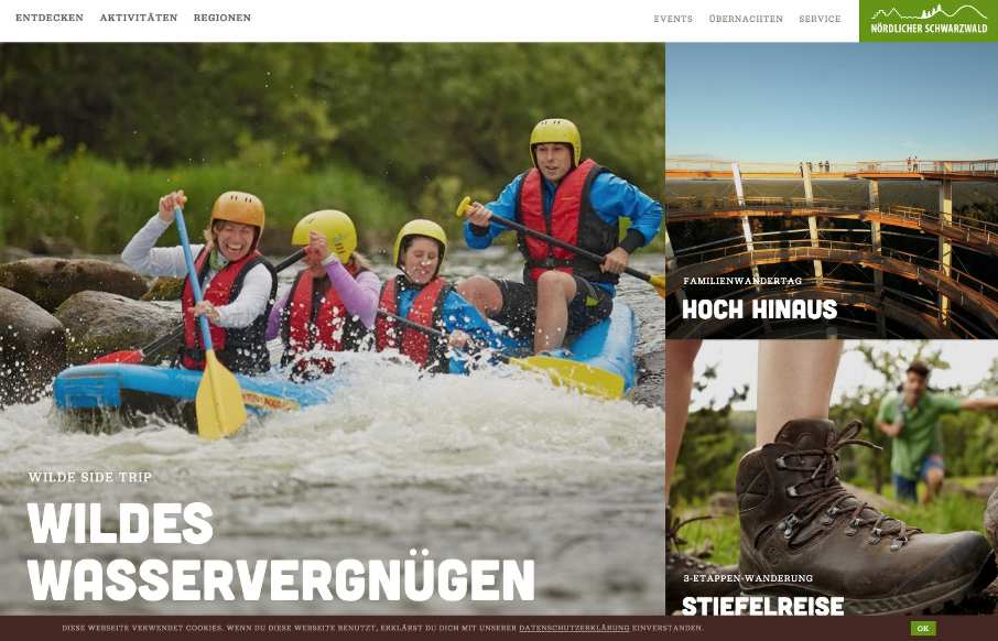
Northern Black Forest
Good site from the @TourismusNordSW - Northern Black Forest tourism site, outside of Stuttgart, Germany. It may be a little heavy in some places (or it could be my connection right now), but the concept is solid - especially in the the detail pages of the different...
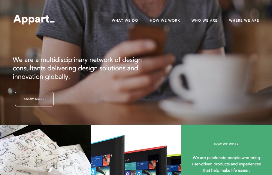
Appart_
Good grid design throughout on this agency/product design site for Appart_ from, well everywhere apparently (distributed company - very distributed it looks like). See below from the designer, but I like the idea of using the grid / box design to be part of the...
Draw With Pixels
Good portfolio site from Gabriel Mnt out of Romania. I haven't seen a site like this in a few months, the kind that uses the 4 blocks on the home page as main nav. It's still a cool concept if you can categorize everything well - and I think Gabriel has. Love the...
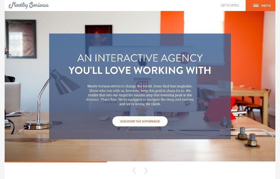
Mostly Serious
Many agency sites use large photos to bring out the human nature of their company and give us a glimpse to their habits and personalities. Others showcase their skills heavily and give no hint of who or how their work is done and practiced and whether there are humans...
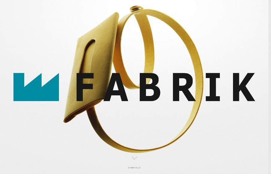
FABRIK
I love the straightforward minimal approach of this site, coupled with it's easy to use interface for filtering by product type and color it brings me closer to the product than most other product pages I visit. The grids of colorful rows are just magical in drawing...
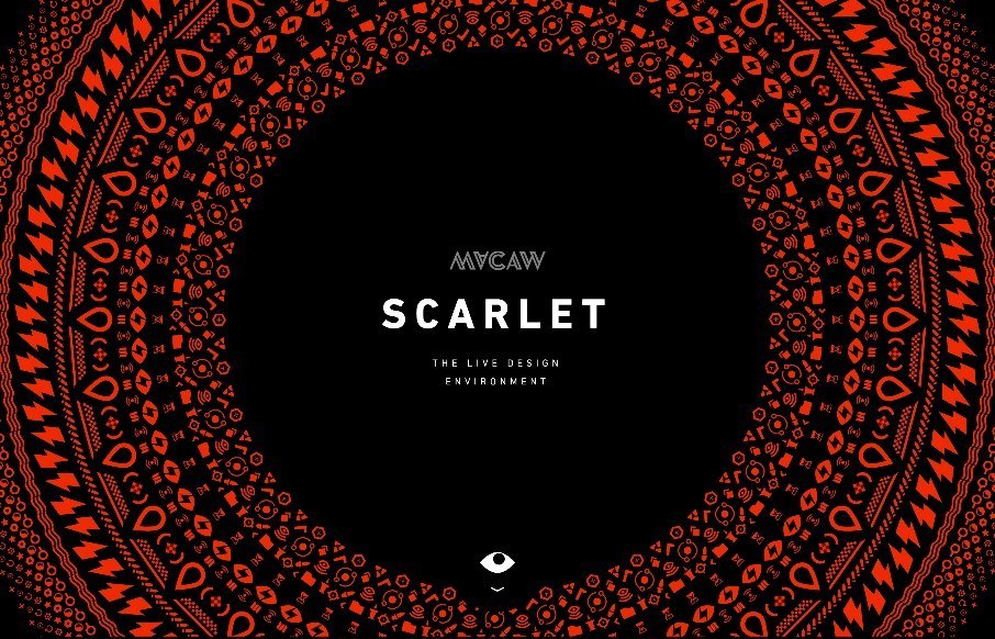
Macaw Scarlet
I met with a VC during ConvergeSE that was meeting with Macaw, and was asking what we as designers thought of something like Macaw's Scarlet - something to disrupt Dreamweaver... I, uh, as someone who builds "by hand" - honestly, I said "I don't get it". Then I saw...
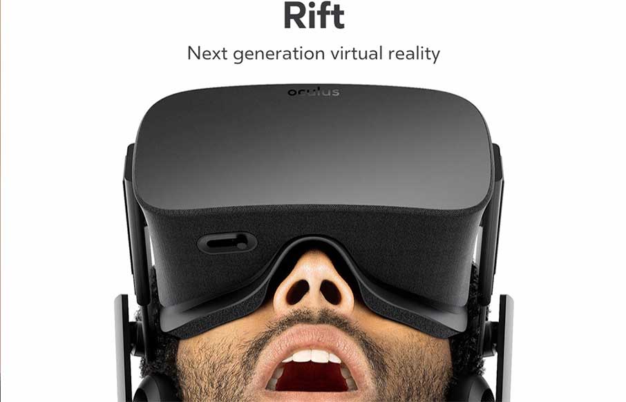
Oculus
Boom. Sometimes that is just what you should say with a site review. Boom.
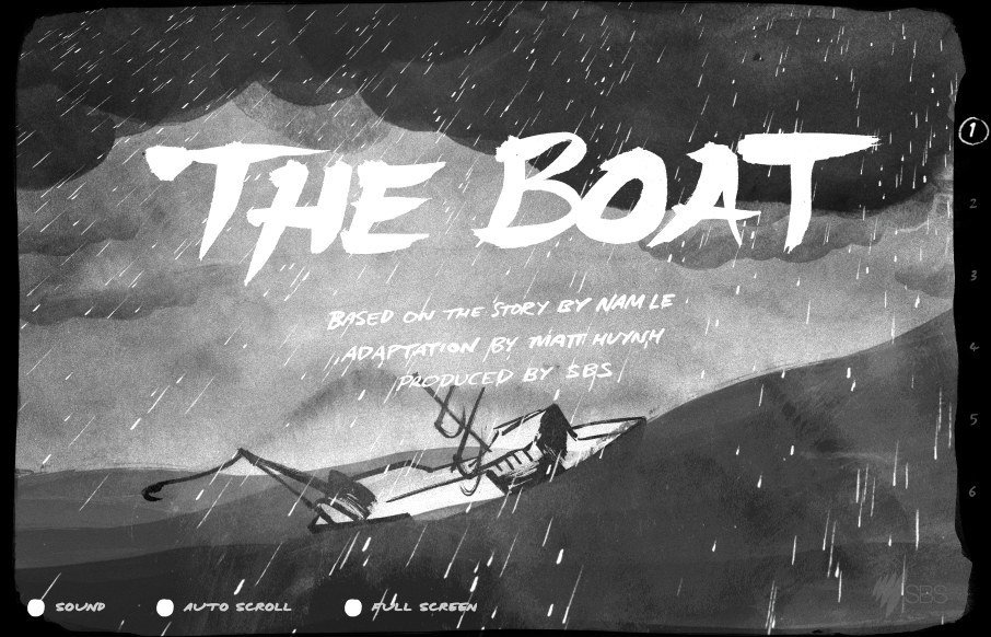
The Boat
SBS out of Australia has produced a website called 'The Boat' - which is an interactive graphic novel about escape after the Vietnam War - based on the story by Nam Le. Incredible use of scroll jacking and on-scroll actions in a parallax web universe. It's complete...
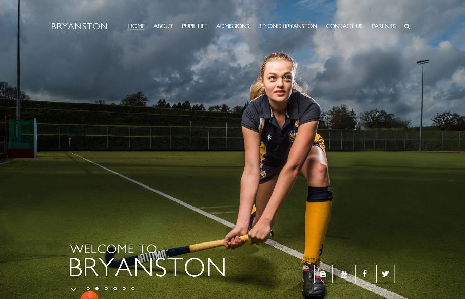
Bryanston
Great images permeate throughout this site for Bryanston School in the SouthWest UK - which is really good. I think the most interesting decision they made of the site was maybe for accessibility - there's a link in the footer to see the "High Visibility Version" of...
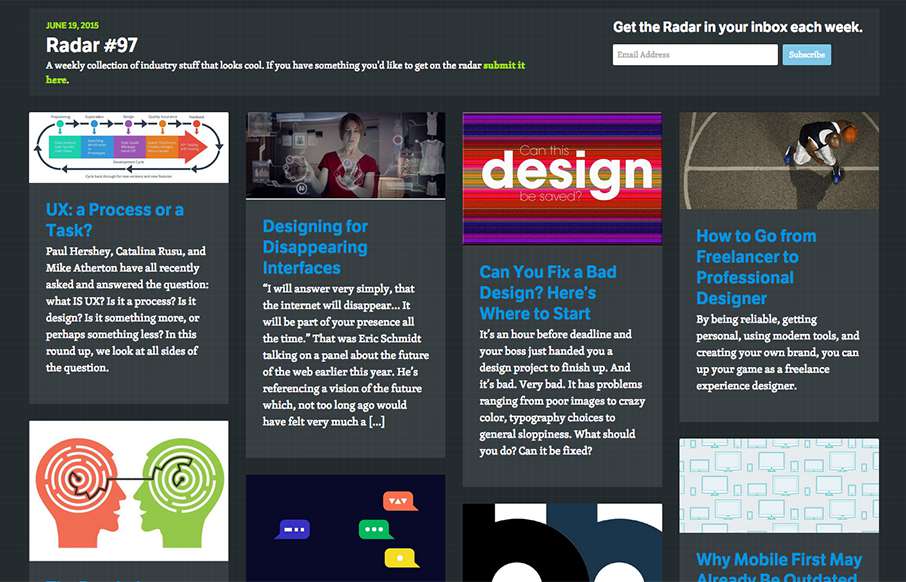
Radar #97
In this week's Radar: UX: a Process or a Task? Designing for Disappearing Interfaces Can You Fix a Bad Design? Here’s Where to Start How to Go from Freelancer to Professional Designer The Psychology Behind a Great CTA Why Mobile First May Already Be Outdated Design...
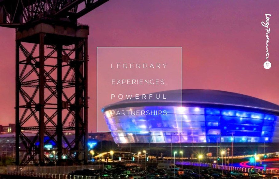
Levy Restaurants
Like the power of the video background on the Levy Restaurants site as you start - then like the hand-drawn fonts and icons. The site looks pretty hip and with it, which seems to be the aim of the restaurants themselves. @UKLevy
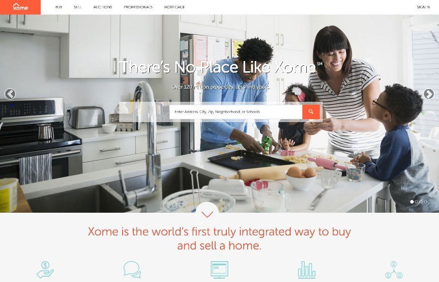
Xome
Pretty cool experience for a search based website. I like how the search is focused on top of the main hero image space. Keeps it front and center. There's very little small screen width experience here but overall for desktop it's tops. Cool form elements to play...
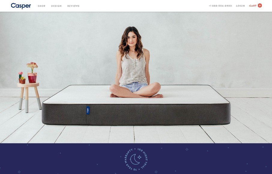
Casper
I just love it when a nice brand has a minimal approach to it's website. Casper is a great example of what a minimal approach can do for you. The messaging is crystal clear and simple and there are still some really great interaction sections on the site to boot....
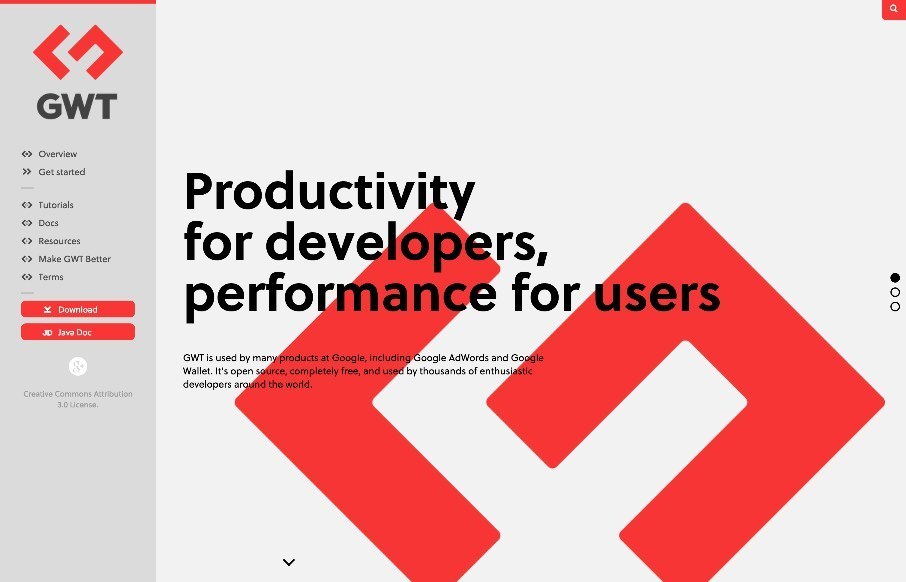
GWT
Fairly straightforward design here. Clearly an informative experience, much like a book. The mobile view isn't that spectacular but it doesn't really have to be. I like the interaction on the search in the top right a lot.
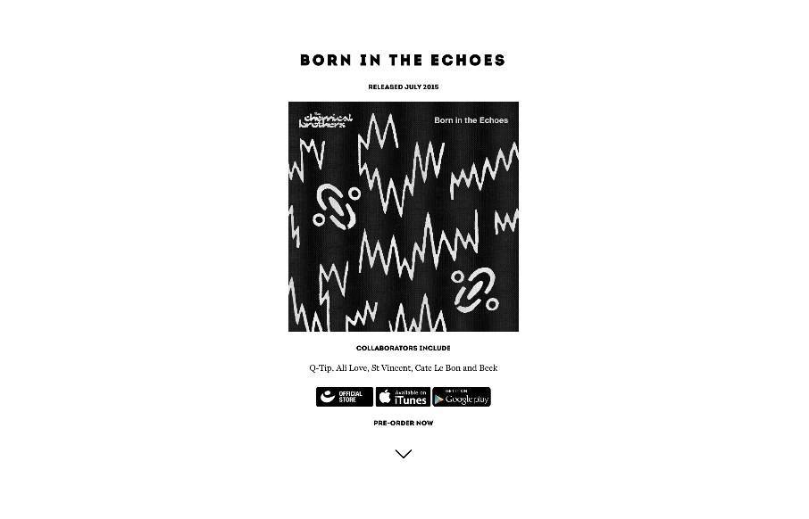
The Chemical Brothers
The Chemical Brothers are back after a little hiatus - and since music is a personal thing, I'll just comment that I like their new stuff - love the new site too. It's wild, and fit's the band's image / music. Exceptional parallax work done on the History Page - don't...
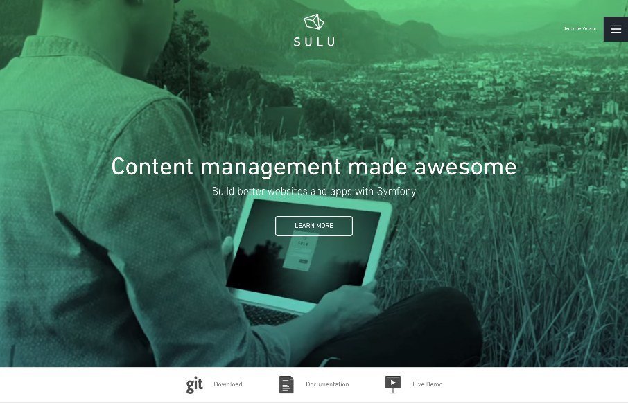
Sulu
Good clean design on Sulu, a CMS built on Symfony. We almost listed it in Radar as a resource instead of the Gallery , but we liked the white space and the little animations that happen on-scroll. @sulu_io : Handcrafted in the Alps Privately funded by...
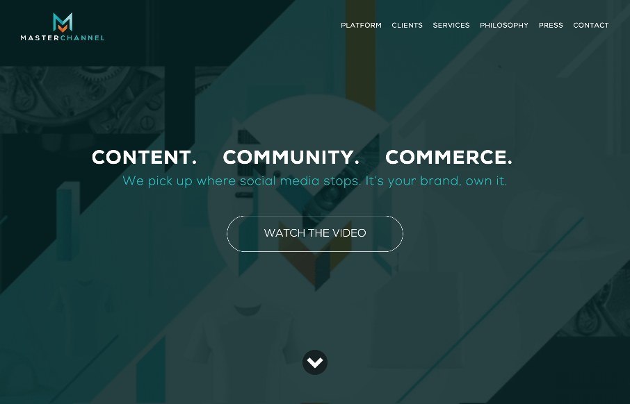
Master Channel
When we were in Nashville last week for BDConf, I walked into a concert for one of Master Channel's clients, (no, not R5 with Ross Lynch from Disney's Austin and Ally... which my kids watch..) but country star, Kip Moore. And yes, I used the website they built to find...
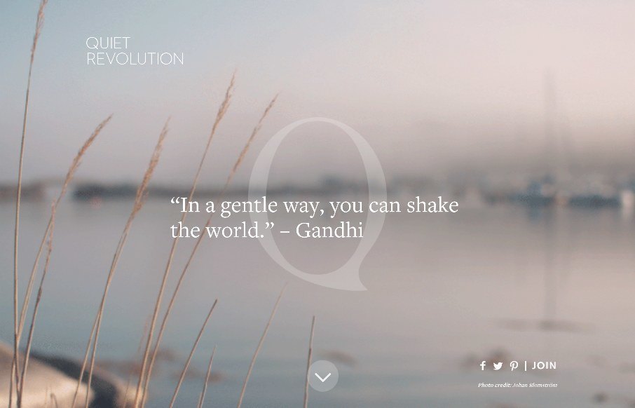
Quiet Revolution
As extroverted as I can be sometimes through my writing, among friends and family, and when I'm acting - I actually have an introverted nature in many social situations. That's part of the gist of the Quite Revolution (from a philosophy standpoint), based off of TED...
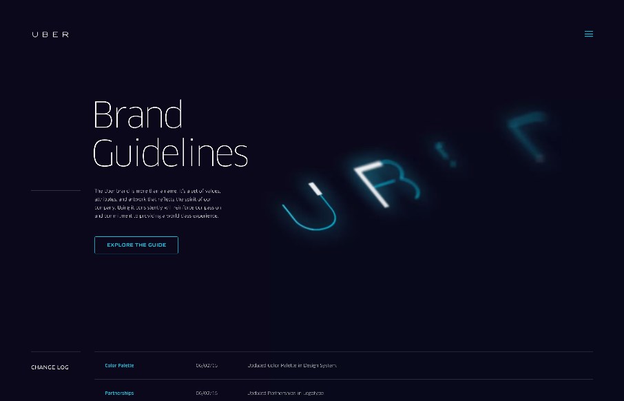
Brand Uber
Always interesting to see brand / design / style guidelines from companies and products you use on a daily basis, like this one from Uber. Very clean and minimal, but with a few little interaction pieces - you can see they've taken time to make this section of their...
EMAIL NEWSLETTER
News & Articles
BizCraft Episode 17: Special Guest Sarah Parmenter
 In this episode of BizCraft we are continuing the discussion of sexism in the industry with special guest Sarah Parmenter.
Draft Episode 17: Windows 8/Metro Interface Gripe
 In this episode of Draft we gripe about the Windows 8 interface, specifically those login “swipe” screens.
ARTIFACT Conference – Austin, TX
 A conference specifically about designing for a multi-device world. Get real world examples of responsive workflows, prototyping strategies, new tools, and deliverables and decide which ones will help you adapt.

HARD WORK. CLEAN FUEL. NO EXCUSES
Use “WARRIOR2023″ for 10% off.