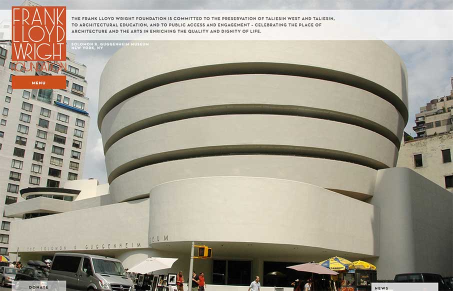
I gotta say, if I thought of a website for Frank Lloyd Wright I’d think of giant oversized images and minimal interface. Welp, that’s what we get here, eh? Pretty nifty minimal vibe which makes things wright…
Glassmorphism: The Transparent Design Trend That Refuses to Fade
Glassmorphism brings transparency, depth, and light back into modern UI. Learn how this “frosted glass” design trend enhances hierarchy, focus, and atmosphere, plus how to implement it in CSS responsibly.


0 Comments