Web Design Inspiration Curated
UX Pin – Knowledge
So I was doing a little reading this weekend, and I stumbled back on to UXPin. They have an e-book of "The Best Web Designs of 2015-2016" which is excellent work. We're actually going to use some of their suggested sites in the future, since between all the...
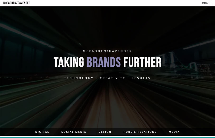
McFadden/Gavender
We really like this one from McFadden Gavender out of Tucson because of the awesome video background off what looks to be a elevated train (where though?) - and the good use of muted image / color backgrounds too on the home page. Great first step into their world....
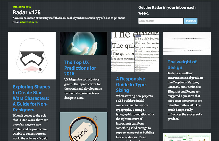
Radar 126
Happy New Year! Each week, we do a round up of curated "stuff from the interwebs" that we call Radar. In this week's 126th Radar: Exploring Shapes to Create Star Wars Characters: A Guide for Non-Designers When it comes to the epic that is Star Wars, there are very few...
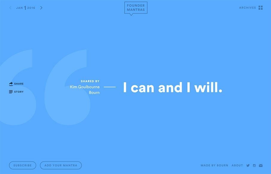
Founder Mantras
As a founder of seven companies over the years - I can say that something like the site Founder Mantras is good, quick inspiration in a pinch. Love the simple design - just load up the content - and let it go - nice.
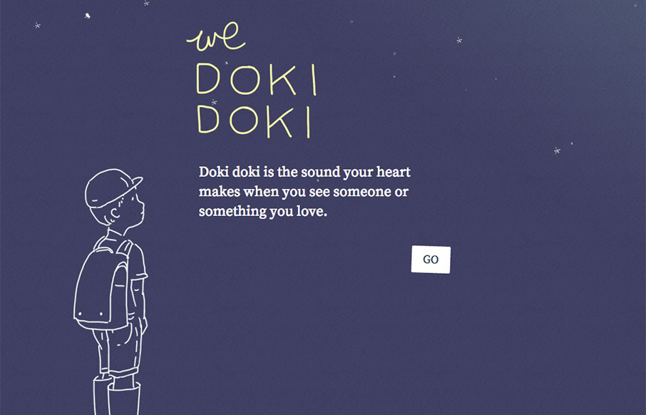
We Doki Doki
Cool site as a build up to a book release later this year, for The Sound of Silence - and the site I think is called We Doki Doki. See more from the designer here: From the Designer: We Doki Doki explores a new Japanese onomatopoeic sound each month and is the...
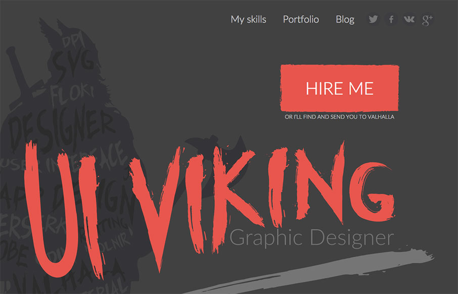
UI Viking
This. Site. From top to bottom I love. It's a great exercise in branding and keeping your message through every single detail. It's also super well done and beautiful. Also, I like Vikings. Seriously, go spend time on the site and enjoy the details. From the Designer:...
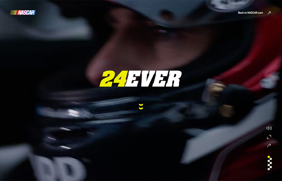
24Ever
I have to admit that when Jeff Gordon came into the sport of NASCAR, I wasn't a big fan (I was an Earnhardt fan) - but I've grown to like Wonder Boy and the Rainbow Warriors over the years. This tribute site to his 24+ year career is pretty sweet - love the use of the...
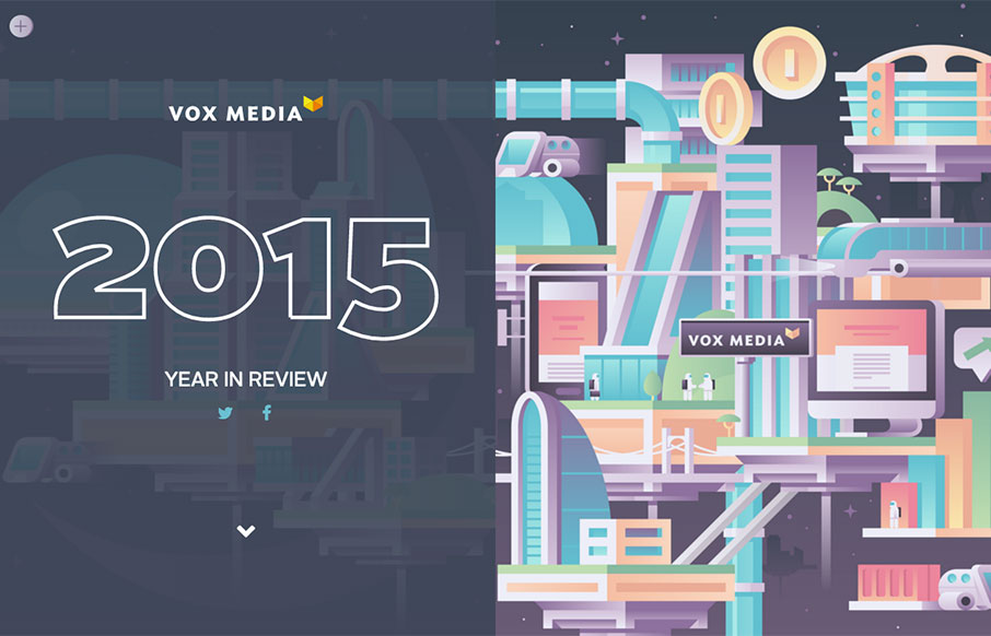
Vox Media 2015 YIR
Cool year in review site from Vox Media out of DC. The split screen, with copy and stats on the left, and representative (fun) illustrations on the right work well. I imagine for other YIR pages for other companies, this is more of a sum up - but I see the pure...
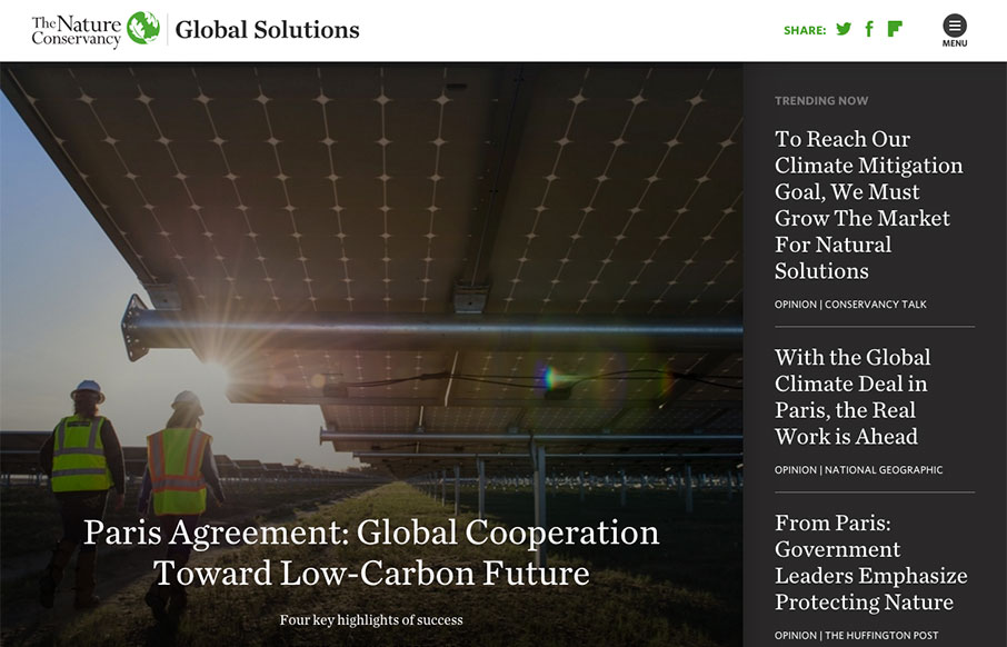
The Nature Conservancy
Love this site from The Nature Conservancy out of Arlington, Virginia. It's their "global" sub-domain, slightly separate from their main site - I kind of hope they change the main site to this format. There's a lot here - but three things I like specifically: - Love...
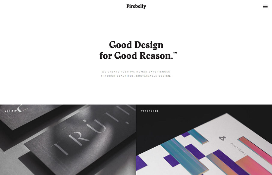
Firebelly
Really dig this site from Firebelly out of Chicago - especially for the hamburger boxes off the About page. They've made a strong decision to emphasize their work (see the home page is the Work page), and allow you to filter the work from the off-screen nav (to not...
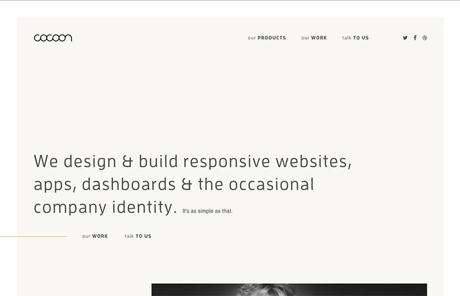
Cocoon
I like the simplicity of this site by Cocoon out of the UK - I kind of like that they don't do images until later in the page. Then they keep it clean past that. The project detail pages are nice too - images can be large, and don't know how quickly they come through...
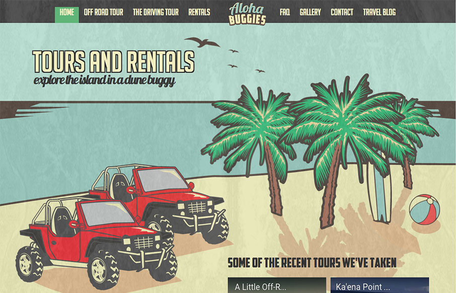
Aloha Buggies
This is a fun site from Aloha Buggies in Hawaii - great artwork throughout. I wish the mobile version was the same as the desktop - but I'm glad there is a mobile version. Working with a travel company for their site, we know organizing all of this - plus the...
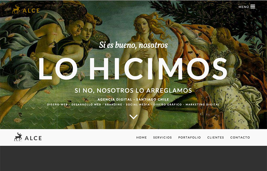
Alce Agencia Digital
This is a cool agency site out of Santiago, Chile from Alce. Love the coloring - I wish it scrolled a little slower so you could see the work done on the parallax. Other than that - pretty decent. From the Designer: Agencia digital en Santiago Chile. Diseño de paginas...
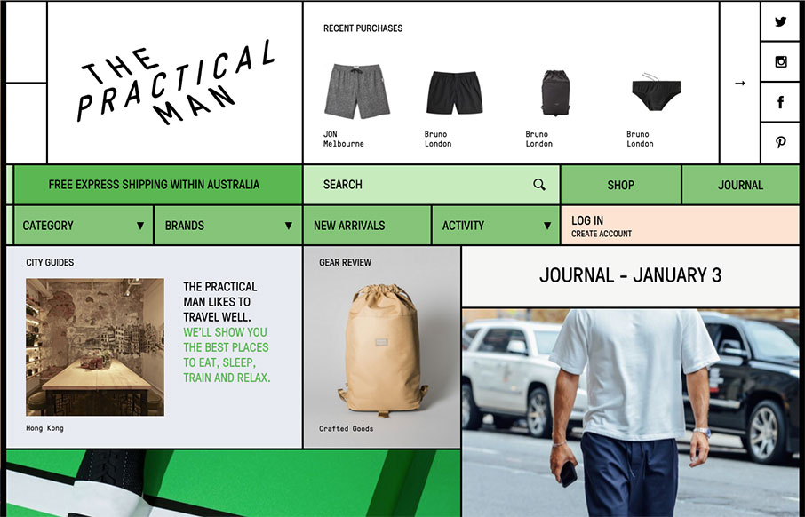
The Practical Man
Cool shopping site out of Australia for The Practical Man. We've seen a couple of sites like this, that has that letterpress, old time order pad patterning - but we haven't really seen it with a shopping site. The product category and brand pages are pretty sweet when...
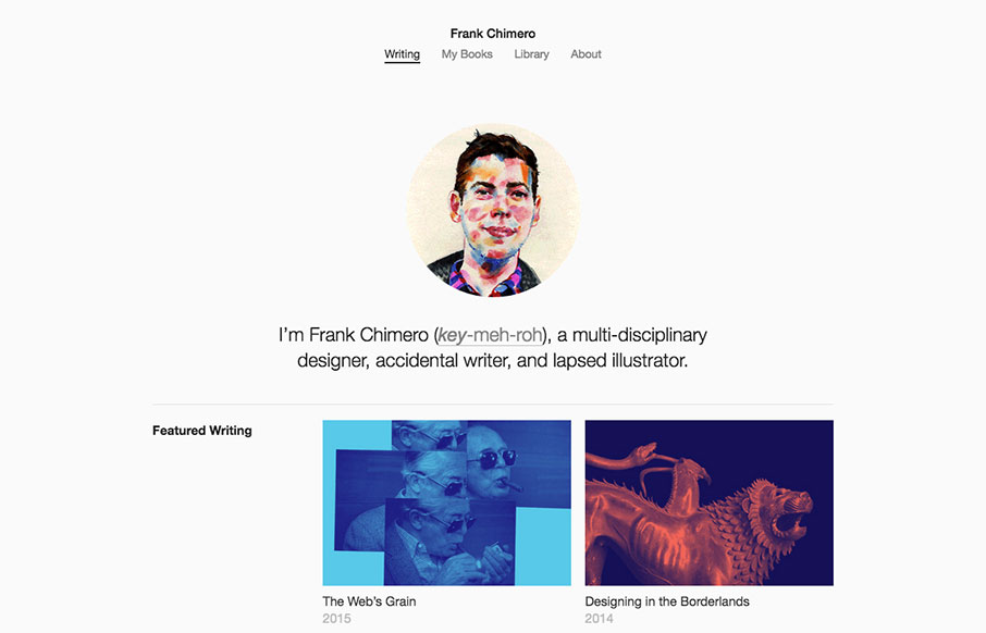
Frank Chimero
I happened to be listening to Beastie Boys while writing this review - shout out to Brooklyn - where Frank Chimero is from. New Year - new Frank portfolio site. It's clean and crisp, minimal, and is featuring his writing. The Library page is a cool idea - and the...
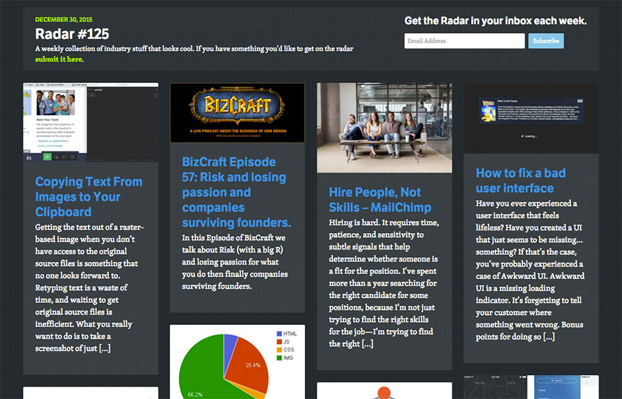
Radar 125
On a side note since this is the last UMS Post of the year - thanks all for a great 2015! See you next year! Each week, we do a round up of curated "stuff from the interwebs" that we call Radar. In this week's 125th Radar: Copying Text From Images to Your Clipboard...
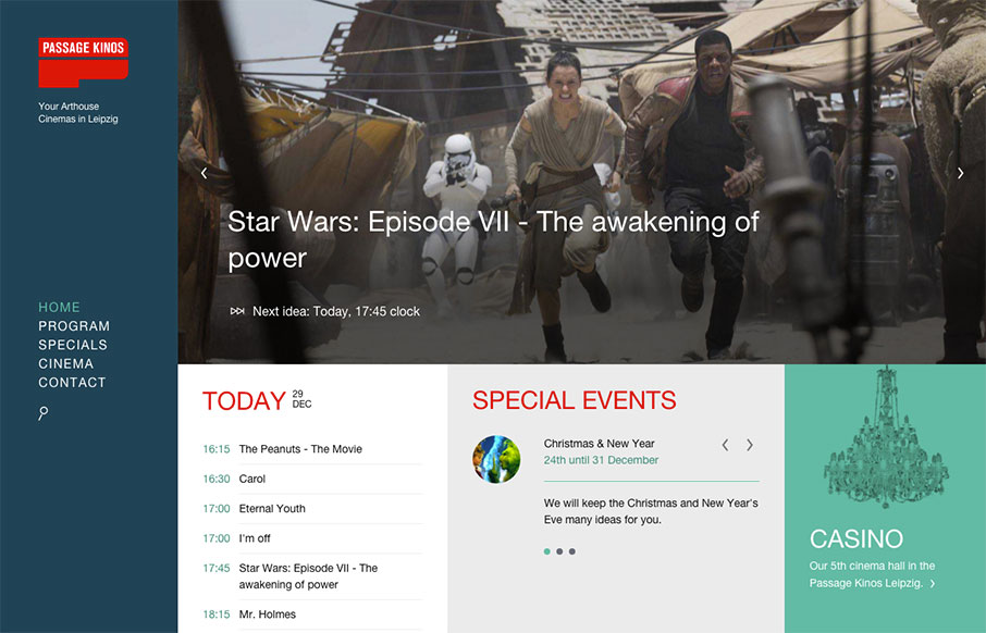
Passage Kinos Leipzig
Here's a clean and interesting way to display movie times for a theater / cinema in Leipzig Germany. It has some moving pieces, but the site is designed simply enough to get to whatever info you need. From the Designer: Clean and mobil optimized Page for the...
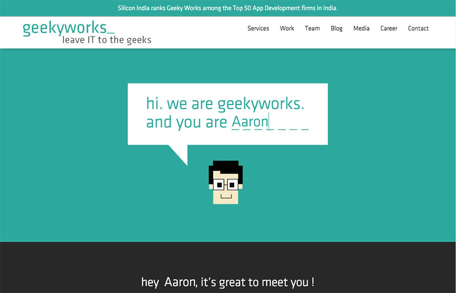
Geeky Works
Quick good one-pager from Geeky Works out of India. I like how they try to make it a little interactive with entering your name - and it types out a personalized greeting. From the Designer: We recently redesigned our Website and would love to get some feedback from...
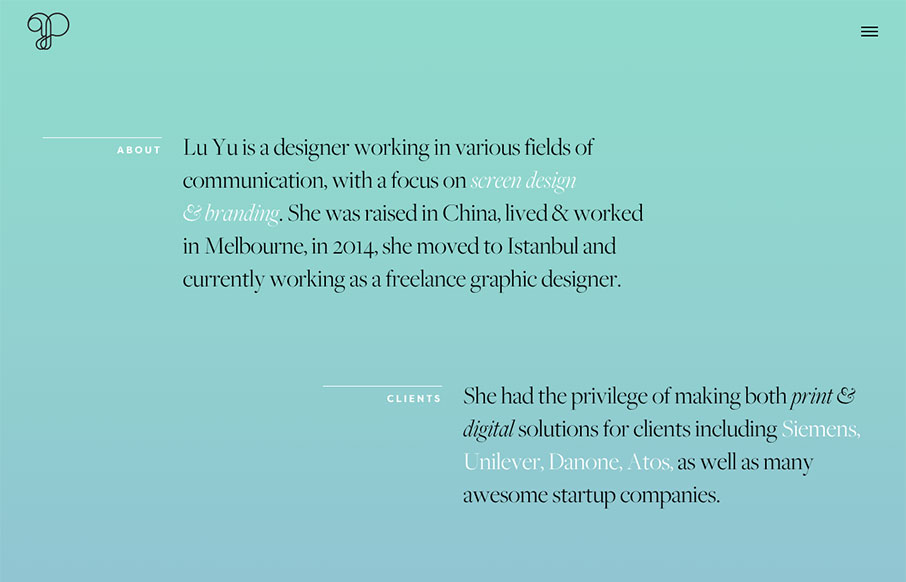
Lu Yu
This is a good, quick portfolio for graphic designer, Lu Yu, out of Istanbul. It looks like it was built on Semplice - but it also looks like Yu works with Semplice. I like the off-set sections of the home page, and how the project names are attached to the images,...
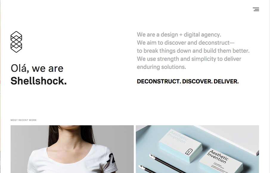
Shellshock Inc.
Good design work out of Rhode Island from Shellshock. Really like the look of the hamburger drawer nav, like the rest of the site, is very clean and easy to navigate. From the Designer: We're a design + digital agency based in Providence, Rhode Island. After a major...
EMAIL NEWSLETTER
News & Articles
Kickdrop Code Sample: The Timeline
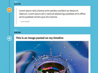 A nice timeline design and free code sample from Kickdrop. Free to download and use in your next project.
Win a pass to BDConf in Nashville.
 We are giving away a pass to the Breaking Development: Beyond the Desktop Conference in Nashville on July 29–30.
Draft Episode 30: All Responsive Sites Look The Same?
 Do all responsive website designs look the same these days? What’s going on…

HARD WORK. CLEAN FUEL. NO EXCUSES
Use “WARRIOR2023″ for 10% off.