Web Design Inspiration Curated
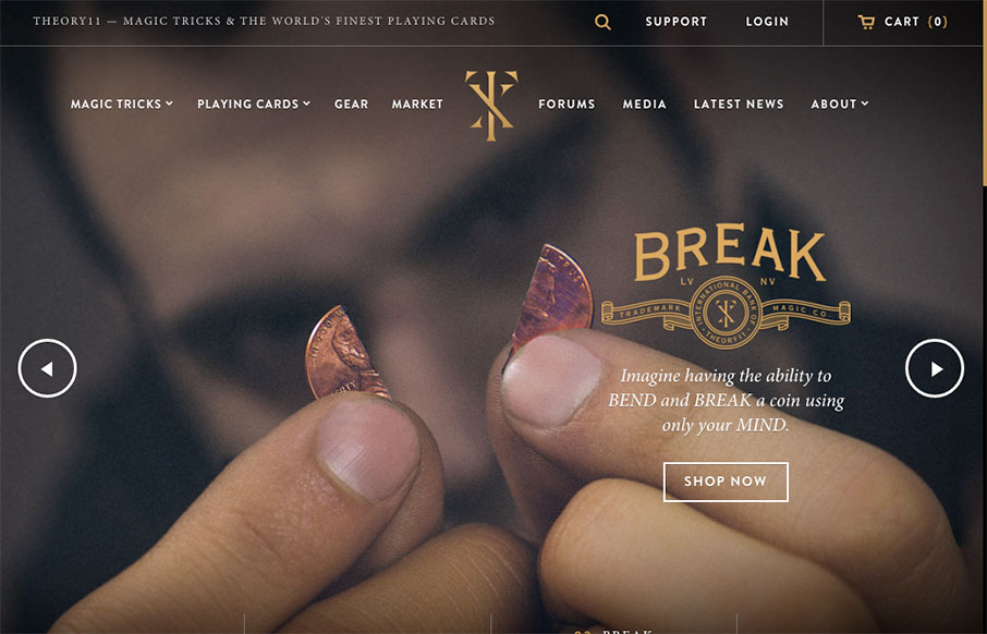
theory11
Love this site from Theory 11. There is so much going on, but it still stays organized (good for shopping) - and has some fun pages too (like the About page). Done by @Forefathers - who has a great site themselves - and looks like it's a custom Shopify theme. More...
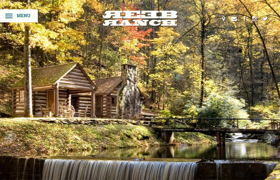
REEB Ranch
From our friends in Asheville, NC - Open Door Design Studio - is the site for REEB Ranch. It's clean and vibrant, and really emphasizes the event nature of the facility. More from the Designers below: From the Designer: Born from the love of beers, bikes and beautiful...
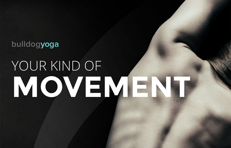
Bulldog Yoga
I am not going to say something like "a little namaste for your morning"... but I did. We're big believers in yoga in our family - and most yoga studio sites we've seen are... not in line with the rest of their flow. Bulldog Yoga, out of Pennsylvania, has a great site...
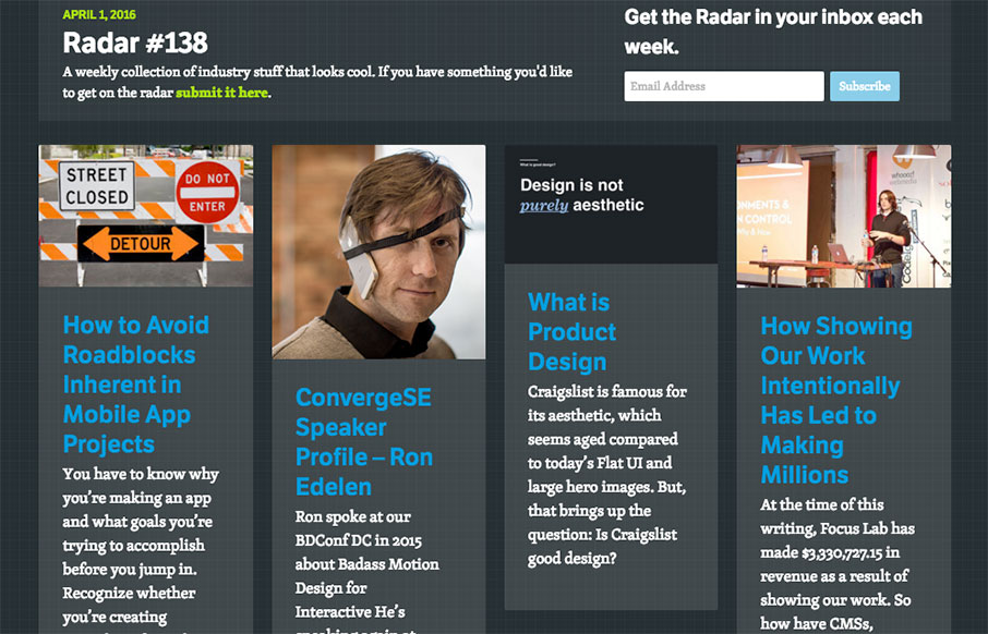
Radar #138
Each week, we do a round up of curated "stuff from the interwebs" that we call Radar. In this week's 138th Radar: How to Avoid Roadblocks Inherent in Mobile App Projects You have to know why you’re making an app and what goals you’re trying to accomplish before you...
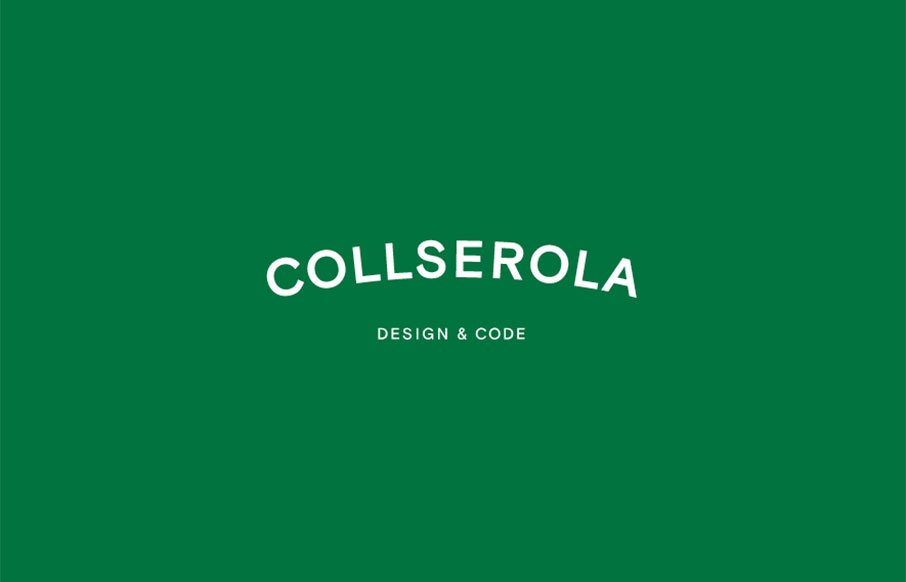
Collserola
It's a simple formula, the design for the Collserola site. Nice fade in interactions and a solid simple grid make this design rock solid IMHO. I'm not wild about the splash area but since the overall production is simple and straight forward it works out. From the...
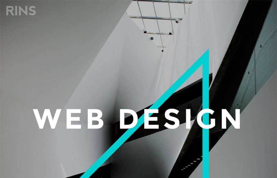
RINS
Amazingly simple website layout with some pretty solid simple design work. I love the photos and the interactions on the letters, it draws you in and makes the simplicity work. From the Designer: We don't just create beautiful designs but also functional and usable...
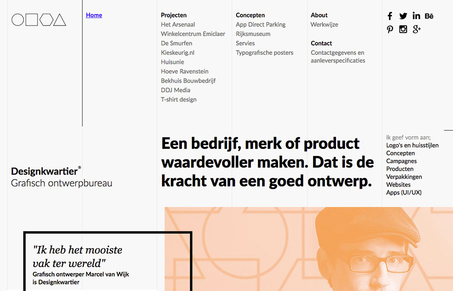
Designkwartier
Super strong grid based design. The layout and details feel very scandanavian to me. I love it so much. It's not responsive, which is a shame but I still love it. From the Designer: Graphic design agency Designkwartier aka Marcel van Wijk one-man-designstudio based in...
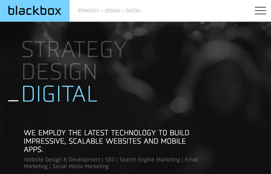
Blackbox Design
Really cool full width layout with a strong grid based. It's made up of largely squares and the grid, it really is a strong layout, it feels kind of "traditional" to me but the type and colors make it look really futuristic. Real solid design here. From the Designer:...
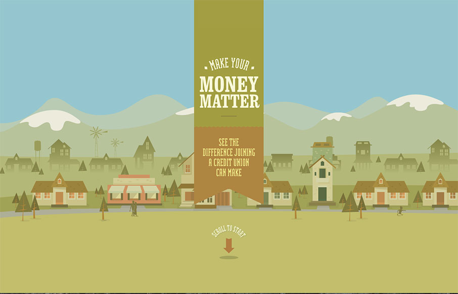
Make Your Money Matter
Excellent story-driven intro to the Make Your Money Matter site - a "brochure" site for using credit unions over banks. The flat illustrations are great as you scroll through the intro - and the final resting part of the site is very smartly done from a marketing /...
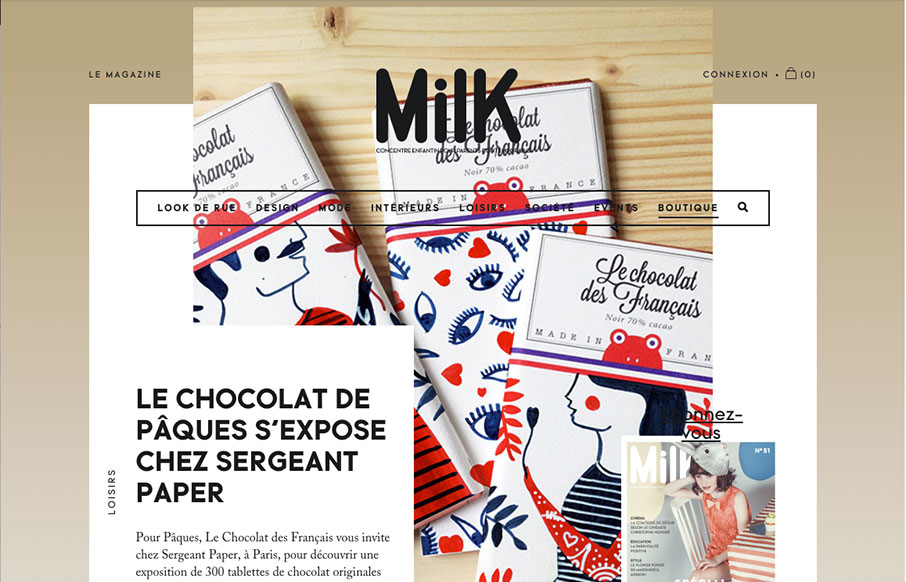
Milk Magazine
Slick yet simple approach to the layout for Milk Magazine. I love how the main/top section has some overlapping elements like that, then the nav slides up and locks into place as you scroll down. It all fits together and "feels" very purposeful.
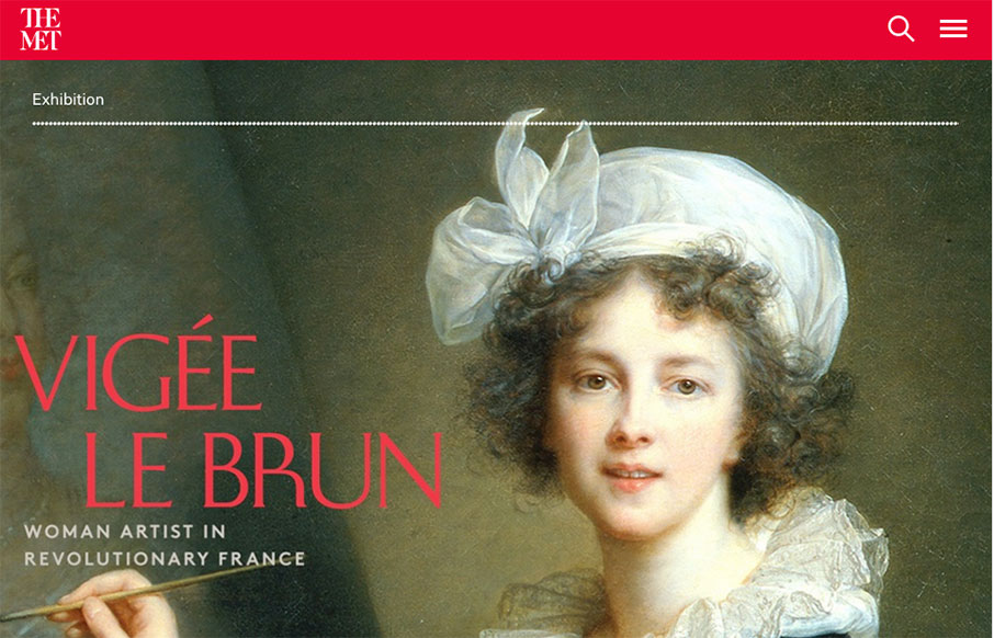
The Met
Holy cow, where to start. Really, it's a huge website with tons of content and the designers have done a superb job of getting you at it. All the while maintaining style and vibe that matches the Met. Spend some time going through this site okay, you'll dig it.
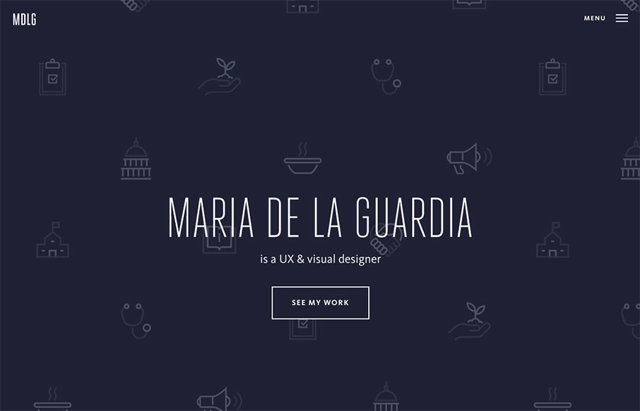
Maria De La Guardia
Pretty cool, basic, Material Design based portfolio site for Maria De La Guardia. I dig the icon/illustration work on the hero/splash are and then how it kind of "dives" straight down into the work like that. Strong work.

Elespacio
Very nice splash/hero type layout for the main page on Elespacio. My favorite section is the portfolio though. The way the image/photos are done to really pop off the page like they do. Solid.
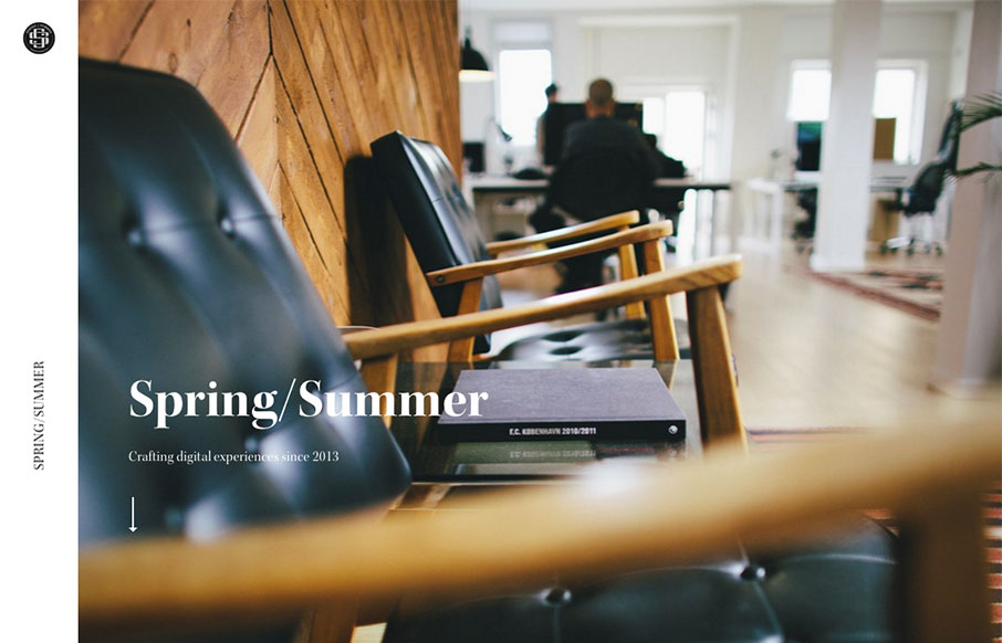
Spring Summer
The first thing that hits you is the photography, it pulls you in. Then there's some superb typography everywhere. Solid rhythm implied with the layout as you scroll down the page, it almost sings to you as you take it in.
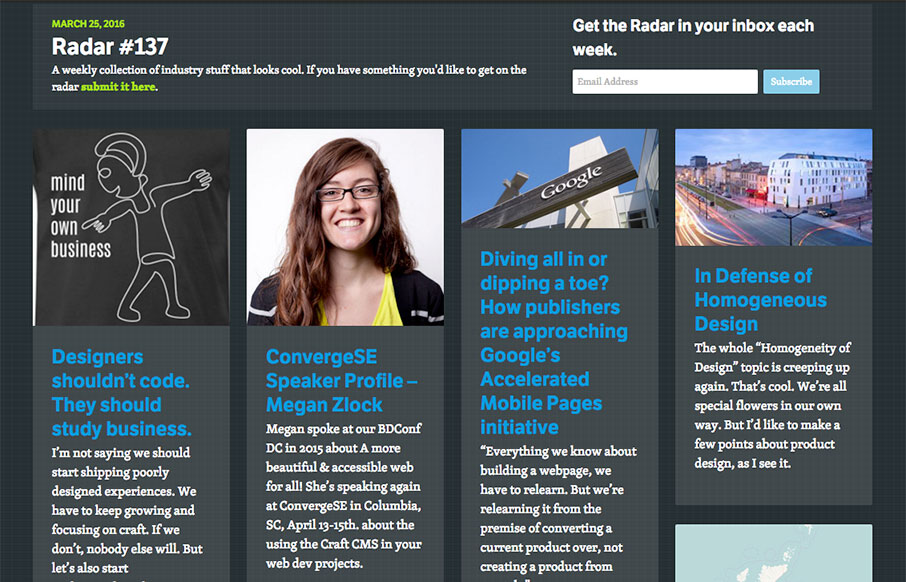
Radar #137
Each week, we do a round up of curated "stuff from the interwebs" that we call Radar. In this week's 137th Radar: Designers shouldn’t code. They should study business. I’m not saying we should start shipping poorly designed experiences. We have to keep growing and...
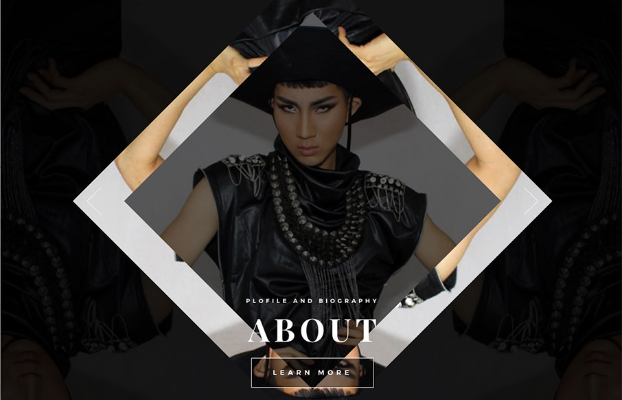
Kodo Nishimura
Pretty cool scrolling interaction/animation here. I like the menu design too. It's kind of set for a lot of pogo-sticking for it's navigation interactions but I suppose that's all well and good for this specific site.
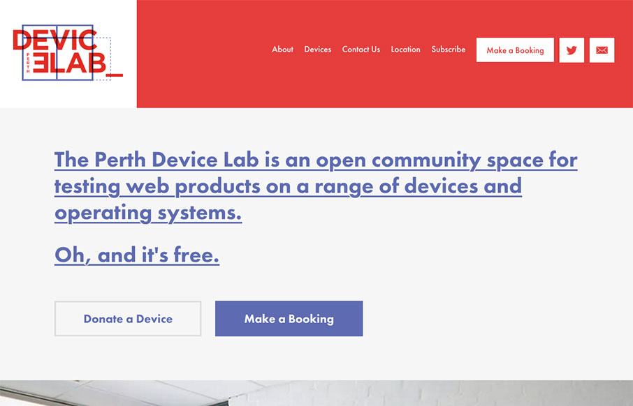
Perth Device Lab
Damn! Super nice website for the Perth Device Lab. And also, Damn, I want one of these... Seriously, pretty swank site.
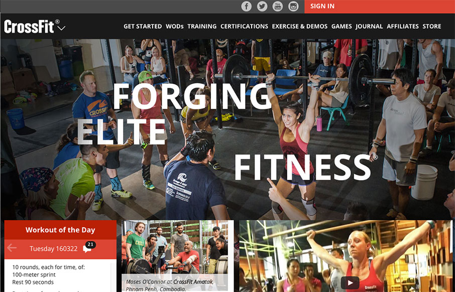
CrossFit
The CrossFit.com website has come a looooong way recently. This design isn't perfect and I know there has been some hubub on it's message boards about some UX issues. But really, it's been optimized for mobile and tablets over desktop users. That's really the crux of...
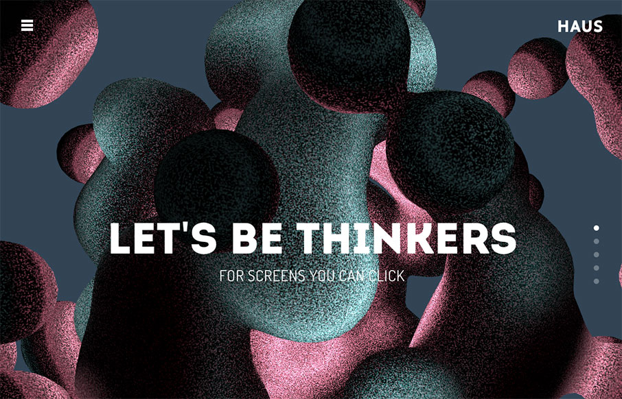
Haus
Yep, scroll jacking, but get over it. 🙂 some beautiful screens to look at here and it works pretty well. Especially the main nav once you open it up, simple and to the point.
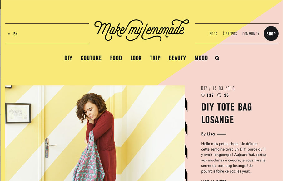
Make My Lemonade
Make My Lemonade is really just a straight forward blog design, but the details. Oh man, the details. I love all these little things cooked into the design. Like the drop-down style nav menus and the little wing dings here and there down the page. It's also broken up...
EMAIL NEWSLETTER
News & Articles
Aaron Gustafson Interview – The Accessibility of Web Forms – Ep.82
 UMS Video Podcast: Giovanni talks with Aaron Gustafson about the accessibility of web forms and how we, as designers, can change the way things are done to create better experiences for users.
Draft Episode 33: Mind The Gap
 In this episode of Draft we discuss Josh Clark’s talk “mind the gap” – which is about taking the spaces in between screens and UI elements into consideration for your experience design.
Interview with Allyson Van Houten from Mailchimp
 Allyson ran us through her typical day at MailChimp, where her responsibilities seem endless. Her time is spent with various teams within the overarching marketing team.

HARD WORK. CLEAN FUEL. NO EXCUSES
Use “WARRIOR2023″ for 10% off.