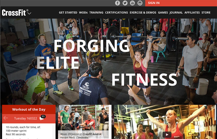
The CrossFit.com website has come a looooong way recently. This design isn’t perfect and I know there has been some hubub on it’s message boards about some UX issues. But really, it’s been optimized for mobile and tablets over desktop users. That’s really the crux of the problem IMHO. Otherwise, it’s a really beautiful upgrade to what we’ve had before.


The Call to Action, Revisited
The Call to Action hasn’t changed in a decade, but the bar has. A fresh look at prominence, copy, mobile tap targets, and accessibility, with lessons from three major design systems.


0 Comments