Web Design Inspiration Curated
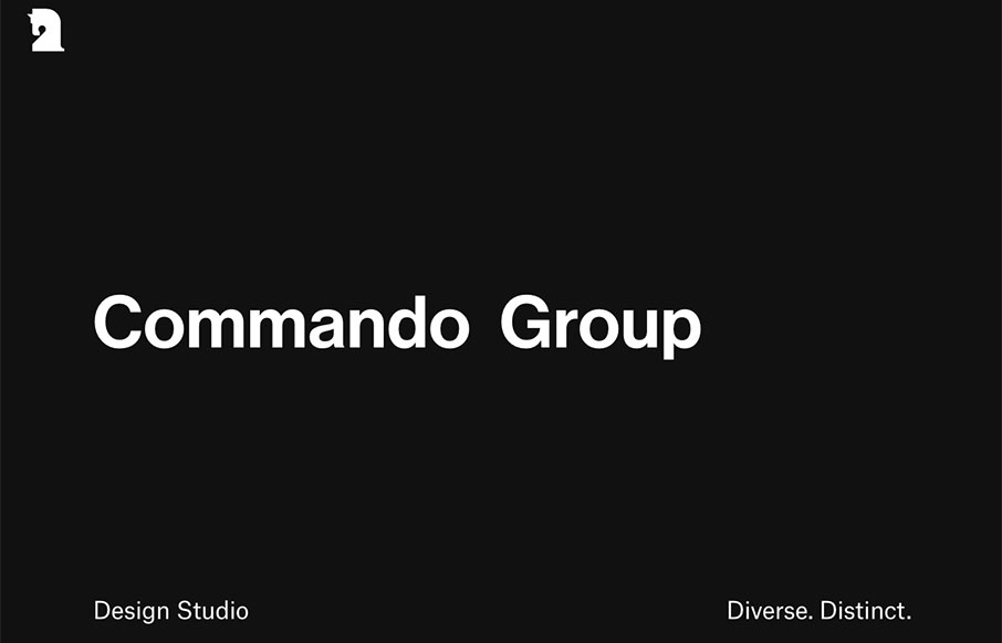
Commando Group
Man oh man, I love this website for Commando Group. It hits all the right notes for me. It's simple and almost minimal, I love that logo and then the overall organization of the page layout is easy to take in and see. Lovely.

Prateek Dave
I like this portfolio site for Prateek Dave because it seems to take an almost standard approach to the overall layout and design and add some special details to it to make it feel different. I like the tool-tip thing on the hero section and the menu drop down is...

The MX5 Supercharger Kit
This site has a lot of really cool looking sections. It's mainly a product site first and foremost and it really does a good job selling the product both visually and contextually and at the same time it really sells the quality of the product with it's quality of...

Nurture Digital
Ah man - check out this site by Nature Digital out of LA. While I'm not as wild about sites that change the footprint of your cursor, it's cool here with the video background. But what is really cool is the layout and movement of the case studies - love the video and...
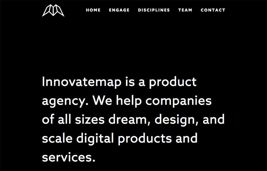
Innovatemap
Man what a cool website. I love when things can be simply and easily communicated without much fuss (interaction/animation/crazy) and this site does just that. With visual pacing, clever graphic design and layout the Innovatemap site just drives along where it needs...

Jacob Stringfellow
There is some good stuff on this portfolio website for Jacob Stringfellow. I Love the way the logo is intercut like it is with the skyline image. It's overall a beautiful design as well, each page carefully crafted to look its best. Love it. From the Designer: Jacob...

Fun Beer Tours MKE
Solid graphic design for the Fun Beer Tours MKE website. I love the bold graphic look and strong colors. I really dig the call to action too, placed easily noticeable in the center of the page there and very clear and easy to understand. From the Designer: Fun Beer...
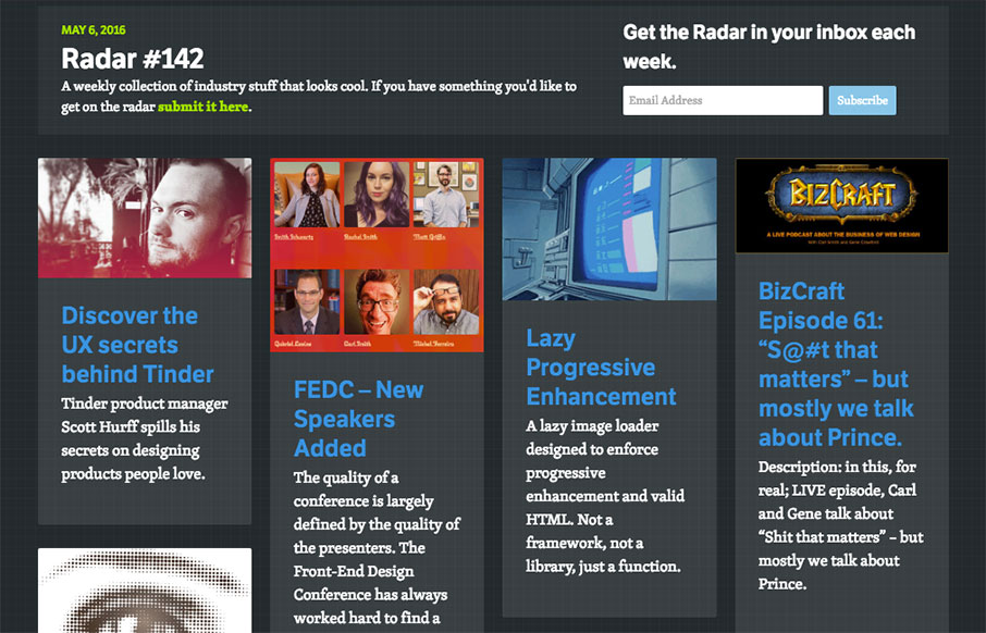
Radar #142
Each week, we do a round up of curated "stuff from the interwebs" that we call Radar. In this week's 142nd Radar: Discover the UX secrets behind Tinder Tinder product manager Scott Hurff spills his secrets on designing products people love. FEDC – New Speakers Added...

Steve Fraschini
Pretty clever visuals, simple execution, means I like it. Particularly the Bushido section... Hell that could be the home page really. Love this stuff. Submitted by: Steve Fraschini Twitter: @Novagraphix Role: Designer Country: France
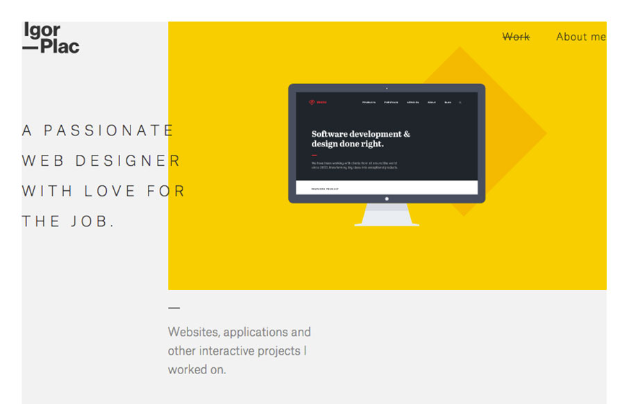
Emptypaper
I love the subtlety employed in this design. It's very straight forward and then you start to notice all the little details and interaction. Beautifully executed too. Portfolio of Igor Plac, designer and web designer from Croatia. Submitted by: Igor Plac Role:...

eli.wtf
Very, very fun website. From the skull to the interactions and page transitions this site is gold. Spend some time on it and you'll see what I mean. Some great work in the portfolio too.
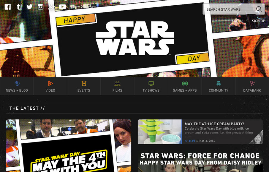
Star Wars Day 2016
My family and I just came back from Disney / Hollywood Studios this weekend - so we are all Star Wars upped! Two of my kids are officially Jedis (they had a class and pins to prove it) Anyway - still love this site - and always appropriate to post it on a day like...
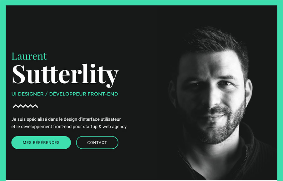
Sutterlity
I love this design. The colors feel very "new" to me, like i've not seen it yet. The layout is pretty straight forward but really boosted by the imagery and type. I freaking love the interactions on the buttons. So good.

Remote Operations Center
Pretty cool layout for the Remote Operations Center website here. I love work like this, because it looks like straight up client work and there are always limitations and such with client work. I love seeing what a designer can do with something like this. Win! One...
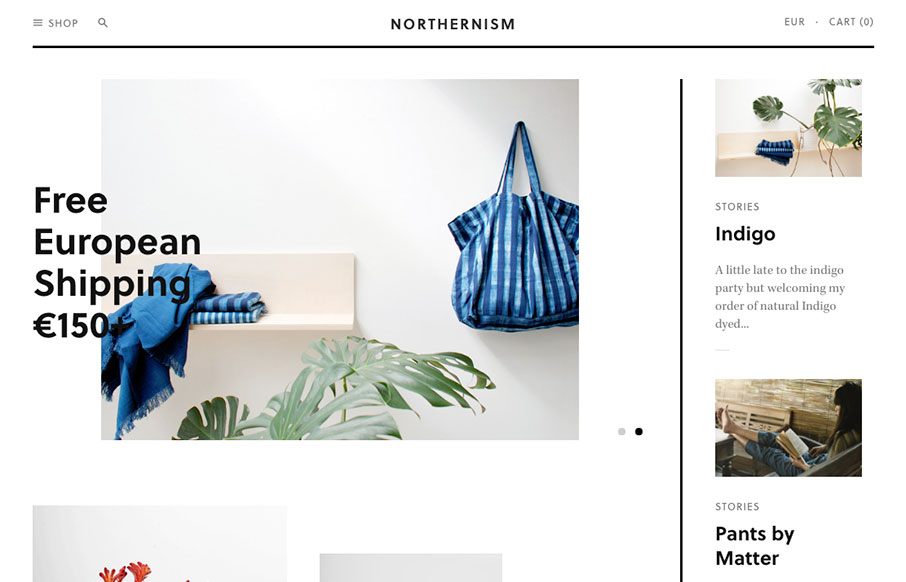
Northernism
Cool and minimalistic - appropriately titled Northernism, this site is for eclectic online shopping out of Amsterdam. Custom Shopify theme - nice. From the Designer: An online store, based in Amsterdam-North, presenting a curated selection of new, found and handmade...
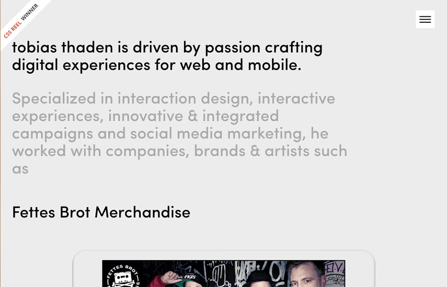
Tobias Thaden
Tobias Thaden's portfolio site, out of Germany, takes a different look than some others - interesting how the slider of work cutouts float on top of the background copy - which is still real text. The case studies are pretty nice too. From the Designer: tobias thaden...
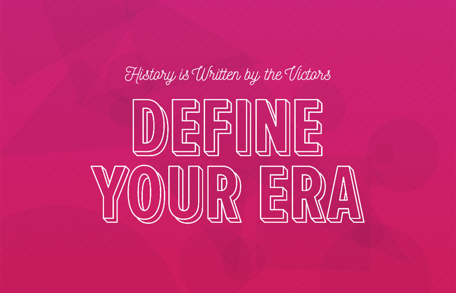
Untitled Era
Sweet intro on this site by Untitled Era out of Brooklyn. Also really love the action that happens after you click the hamburger - nice animation work all the way through! From the Designer: Custom designed and developed WordPress website for Untitled Era, a...
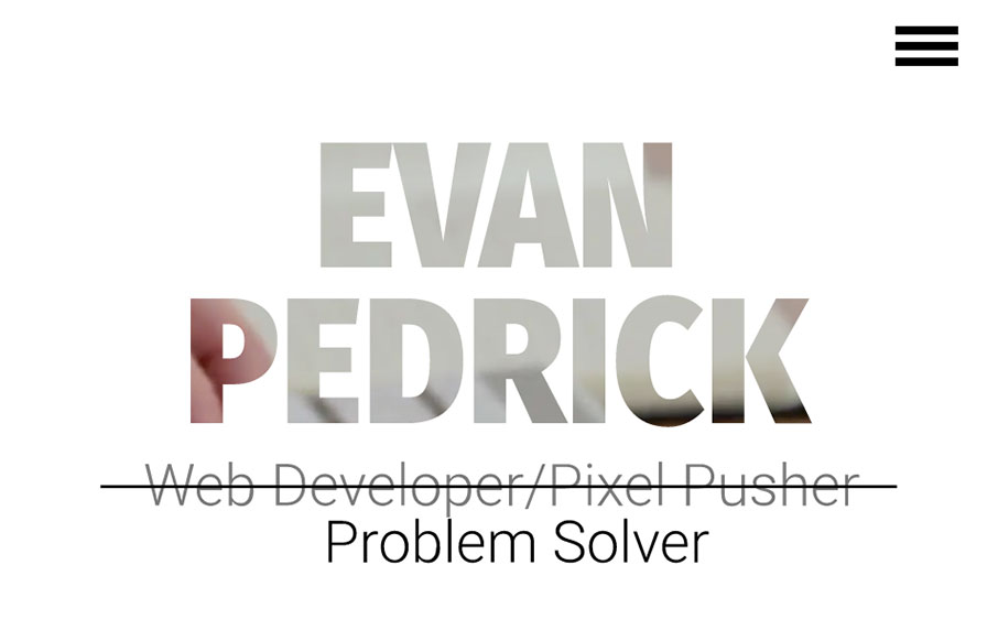
Evan Pedrick
Man I dig this layout. It feels very original and open, the graphics are relatively neat too, especially the main blueprint background imagery. From the Designer: This is my personal portfolio website. It has been designed and built by hand from the ground up. The CSS...
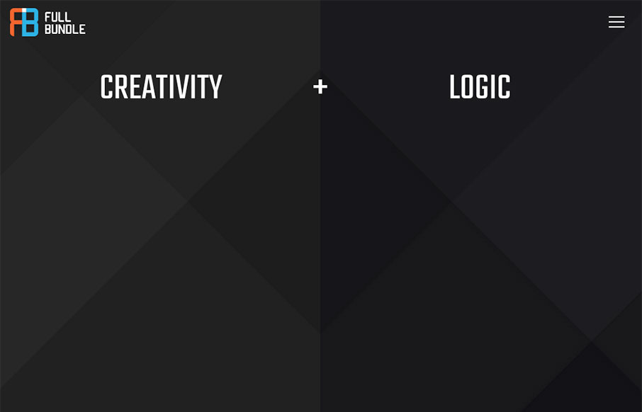
Full Bundle
Really fun website with a fairly minimal base. I love the way the bits of design float up or away from your mouse when you interact with the website/screen. The content sections are solid examples of design too. Great visual work here. From the Designer: Full Bundle...
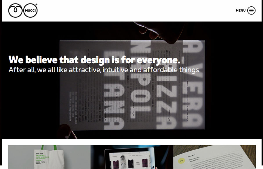
Mucci Estúdio
Clever layout for Mucci Estúdio. I dig the main nav interaction and how the hero image get's folded up under it when you scroll. From the Designer: Mucci Estúdio is a graphic and web design studio based in São Paulo, Brazil. Submitted by: André Giacomucci...
EMAIL NEWSLETTER
News & Articles
Kickdrop Code Sample: Form Pickers
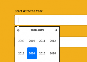 This drop features a set of javascript-driven form components that will come in useful for a variety of web applications.
A to Z CSS: Hover
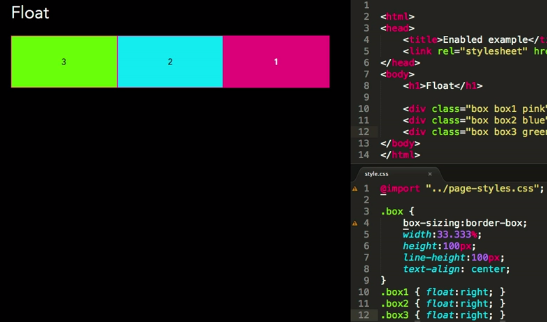 Hover is a pseudo class and can be used to style state. The hover state is active when a users mouse enters the bounding box of an element and is inactive when the users mouse leaves it. In this episode, we’ll look at the :hover pseudo class on text links and create a CSS dropdown menu triggered by hover and enhanced with jQuery for touch devices.
CSSOff Update
 Update on CSSOff progress and some explanation on its status.

HARD WORK. CLEAN FUEL. NO EXCUSES
Use “WARRIOR2023″ for 10% off.