Web Design Inspiration Curated
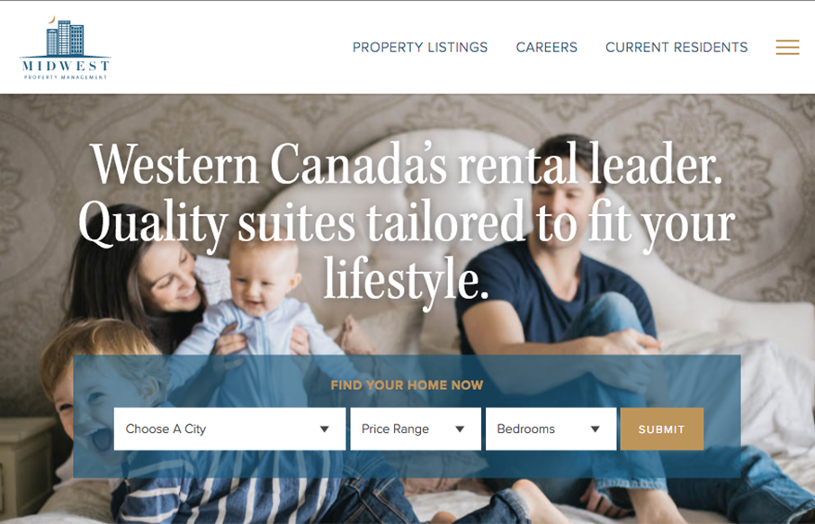
Midwest Property Management
I dig this site for Midwest Property Management. The patterns feel real familiar, like boostrap-py but it's visually designed to give a real deluxe vibe. The lines and crisp photography work so well to sell the vibe. From the Designer: A mobile-first responsive build,...
Authentic Form & Function
Beautiful site design for Authentic Form & Function, I mean, sincerely. I love the layout, the asymmetrical approach is nice here and the muted color palette really sells the exclusive vibe i'm sure they're going for. That main nav that's triggered by the hamburger...
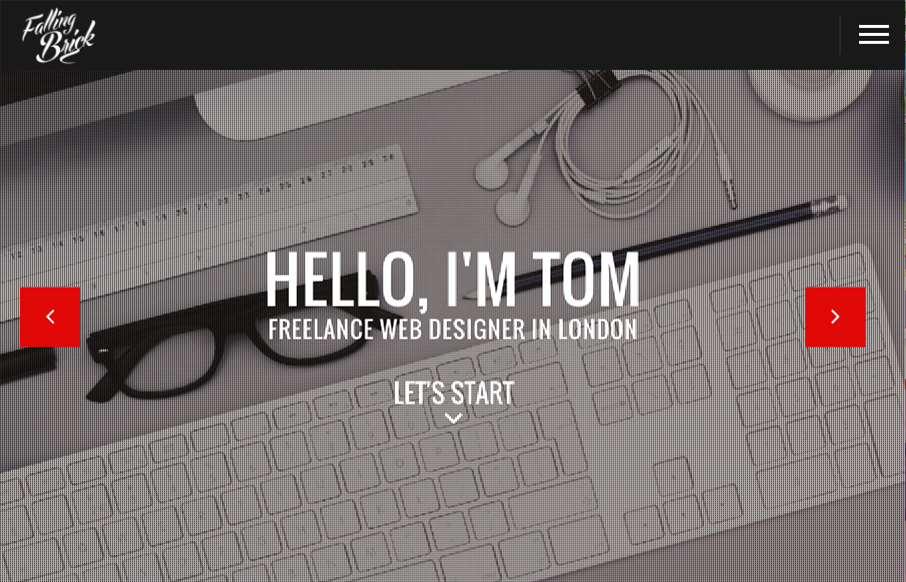
FallingBrick
Pretty different vibe for the layout on the FallingBrick website. I find the placement of the "hamburger" nav item real interesting. I'd be super curious to see what kind of influence placing that in the center of the "header" area would have on it's discoverability....
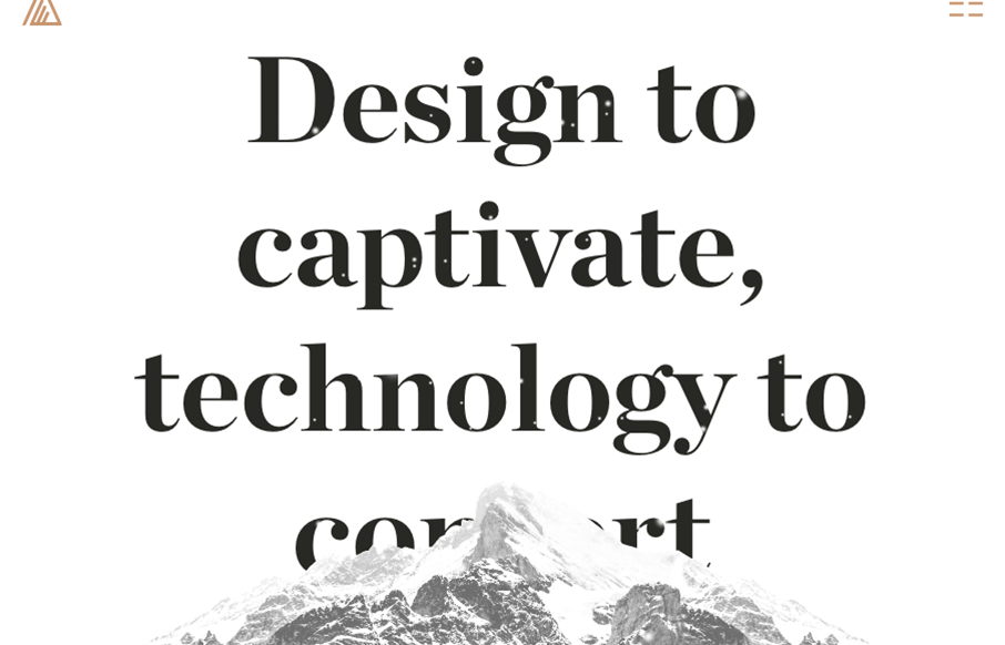
Website Style
Some really nifty and intense looking visual interactions for the Website Style site. I dig the muted (black and white) visual look as well as the long scrolling page with tons of detail work. Solid looking work. The experience gained during our previous realizations...
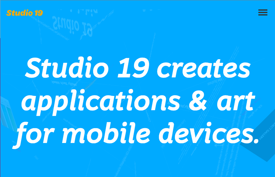
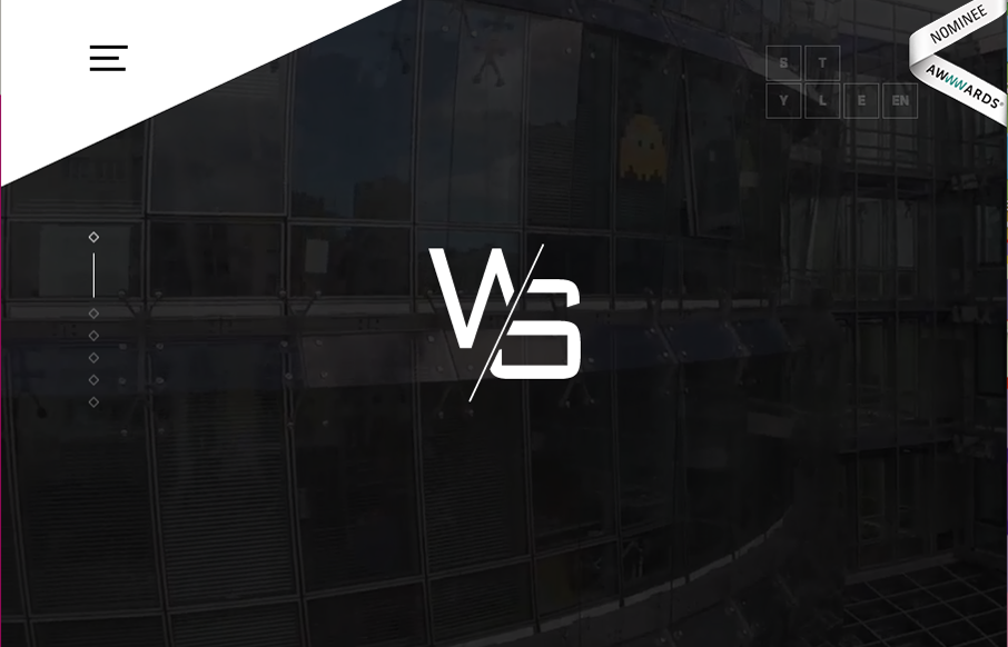
Studio 19
This Studio 19 website is in the gallery because of the screen to screen transitions. Pretty sweet stuff there. I'm not sure it'll work for a lot of generalized design usage but here it's a cool tough.
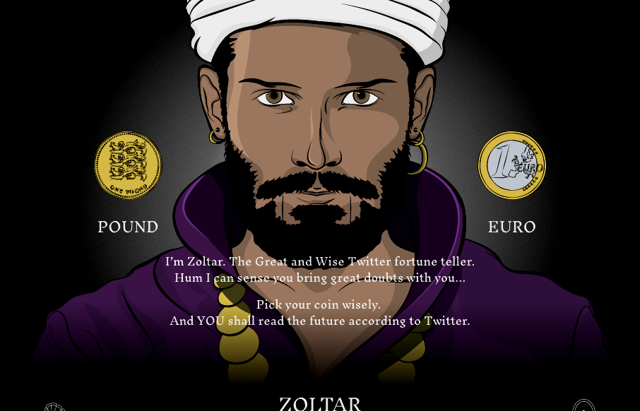
Zoltar Speaks
Cool site from @weareimpero. I'm a little late posting it, they technically submitted it before the Brexit. Still pretty neat though. From the Designer: Zoltar and the entire site is hand illustrated. The site is heavily based on SVG, both Zoltar and UI elements are...
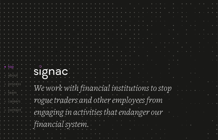
Signac
I love that background animation, very cool. I also dig the idea that this sited design is so non-traditional for what you'd think this company does. Love it. From the Designer: We had fun bringing a lot of animation to what would otherwise be a very simple and...
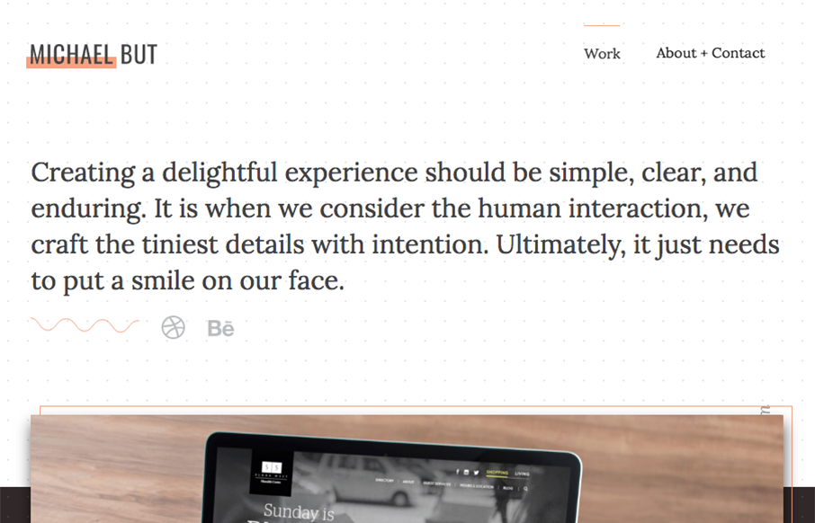
Michael But
Beautiful portfolio site that does just what it needs to do and not much more. Visually it's very classy and professional looking. I also dig that he mainly sends you to Dribbble and Behance to see more work and connect professionally. From the Designer: A minimalist...
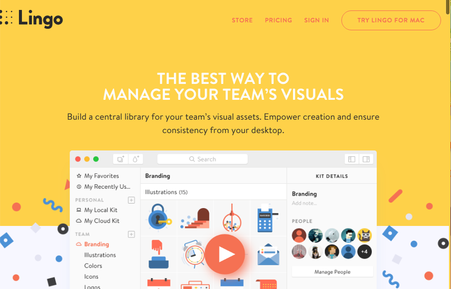
Lingo
Really great product website design. I love the illustration work, it gives the product so much character. That said, what I love most is the way this site interacts, much of the content is displayed in non-traditional (just another page) ways. Give it a once over and...
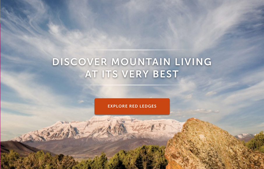
Red Ledges
Spot on site design for Red Ledges. Simply beautiful. The team at eHouse Studio never lets us down with great work. Enjoy! From the Designer: Site’s audience + purpose: Red Ledges is Utah’s premier four-season mountain community in the beautiful Heber Valley. It is...
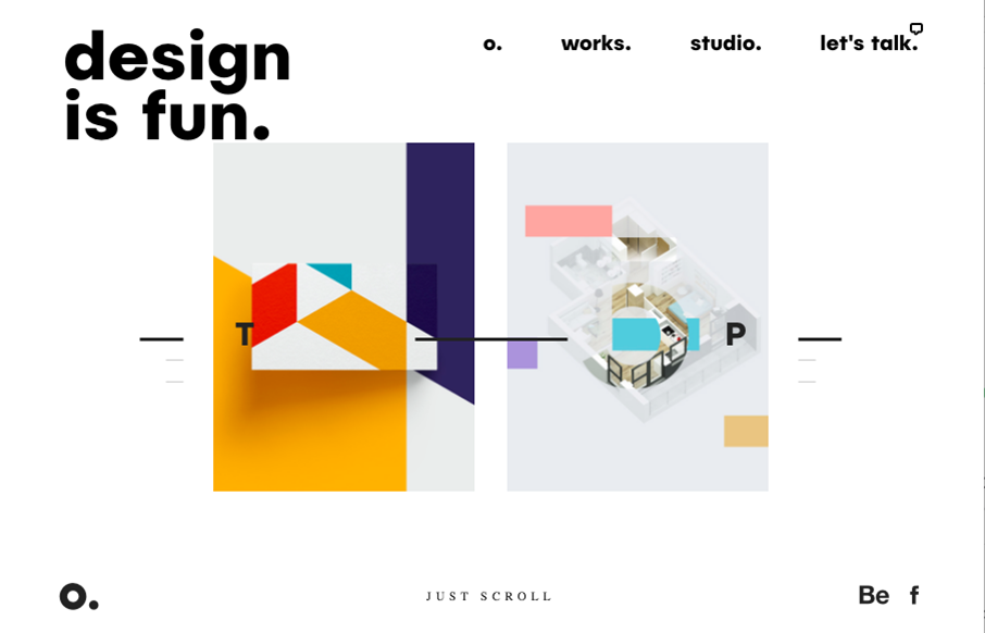
Ollestudio
Pretty unique take on an agency website look. It feels very experimental in it's approach to relaying content. I love that the most about it. Good effort there to keep it fresh and approachable at the same time. It's also a nice visual design too. From the Designer:...
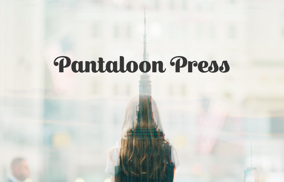
Pantaloon Press
Unique in that it's really just a single page layout for this business. You don't see that too often. It's beautifully simple too, which is always going to win in my book. Pantaloon Press publishes email newsletters distinguished by original writing, elegant design,...
Howdy This
Man, I just love the site for Howdy This, so clever. I love the layout and the limited color palette. The typography is solid from top to bottom. Beautifully done and quite unique looking to me. From the Designer: We tried to enhance every section with some small...
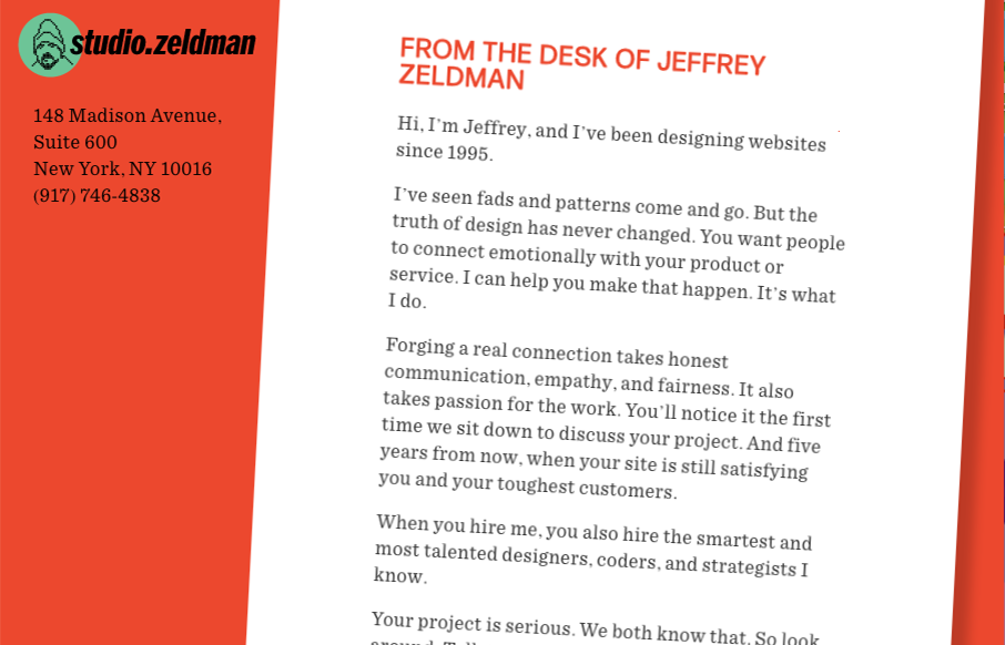
Studio.Zeldman
Pretty cool. Zeldman is hitting the agency world again it looks like. So what do you do when you're Zeldman and you need to inform people of the things you've done. Just put it up there for everyone to remind them. Quite the resume man. Love this. Now, get to work...
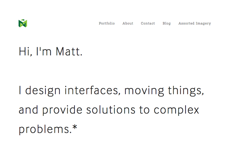
Matt Welch
I love this portfolio site for Matt Welch. "Most complex problems come with an NDA", amen brother. I love that he just puts that up front for you to know. It's the truth, if you do any sort of high-level work your public portfolio is going to be limited. He puts in...
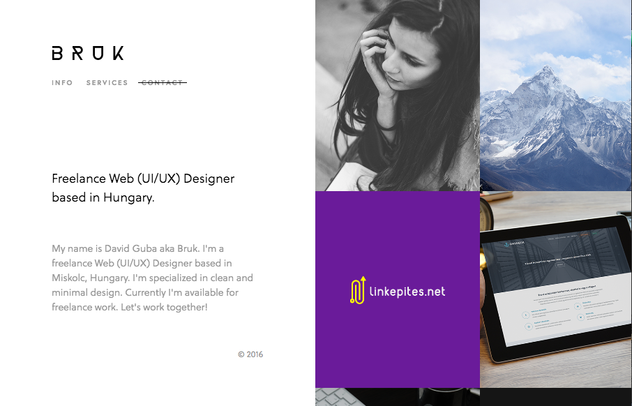
Bruk
Real simple design for Bruk but it also has some really nifty UI details. The left vs. right look is pretty cool and the "X" that stays visible when you check out some of the work is pretty clever too.
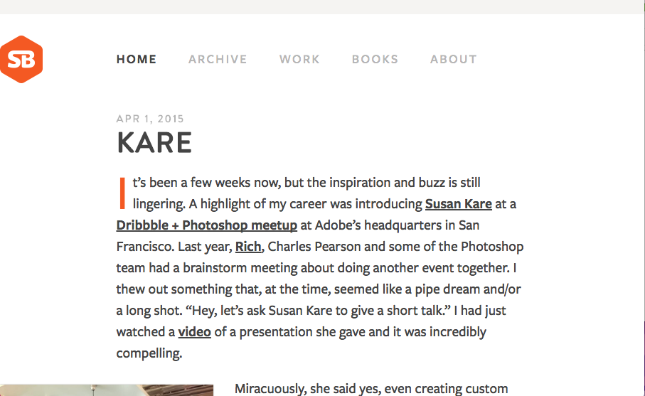
SimpleBits
I'm not entirely sure how old or new this version of SimpleBits is. But it's simply beautiful. Simple, straight forward and editorial based design. The perfect blog look. Mmmm hmmmm.

Full Story
Really nice product based website. Honestly it's really straight forward and in many ways set's the "standard" for how one could approach a product site design. Plenty of straight up product details and minimal but well done interactions.
Mossio
Really cool website that shows what this company does. The atmospheric surreal backtrack makes it feel like coming to this website is an experience along with the homepage animatic.
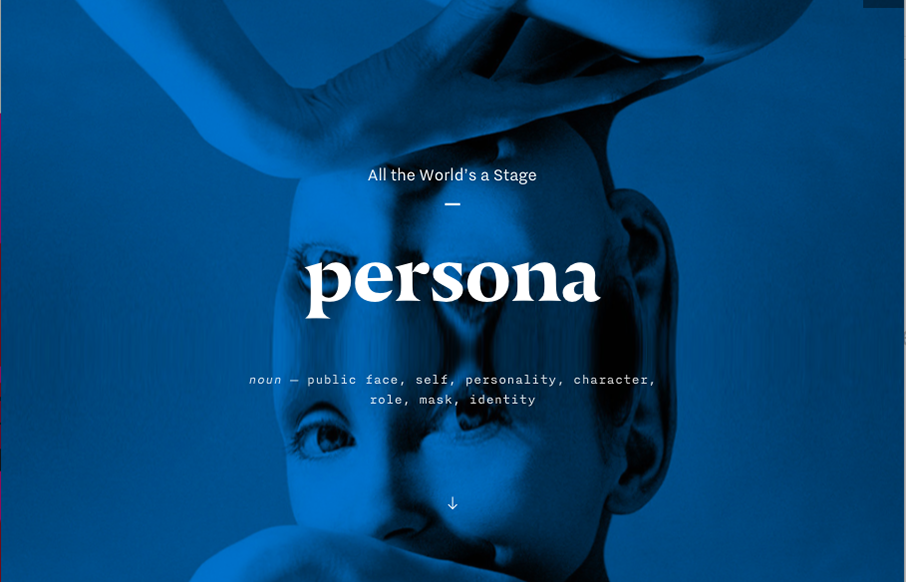
Persona
Pretty cool site design for Persona. I dig the image treatment and the simple approach. The "backstage" fly-out nav is cool and a neat way to subtly get you into some more depth with the content produced behind the sites in the network.
EMAIL NEWSLETTER
News & Articles
Daniel Burka – Prototyping any Product in 5 Days
 UMS Video Podcast: Giovanni talks Daniel Burka of Google Ventures about the fast prototyping approach they take to designing products.
Beyond Mobile: Where No Geek Has Gone Before – by Josh Clark @ Beyond the Desktop Conference
 Everyday technology is hurtling into the realm of science fiction, even magic, with new devices that are as surprising and delightful as they are useful. Josh Clark can help us sort it all out.
BizCraft Episode 44: The Truth-teller Episode
 In this episode of BizCraft Carl and Gene talk about things going on in the web design business industry. How shops are struggling and some reasons why maybe

HARD WORK. CLEAN FUEL. NO EXCUSES
Use “WARRIOR2023″ for 10% off.