Web Design Inspiration Curated
wayray
I love the photography, the use of it, and the way the page scrolls utilizing the photos. So good. Nice nav layout as well.
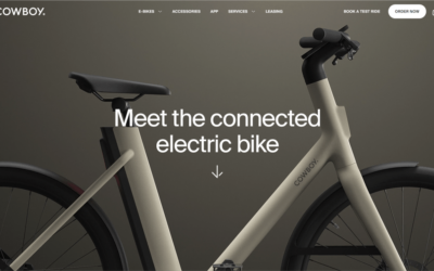
Cowboy
Very Apple inspired layout and approach with this brand/design. I dig it. I also like the mega-nav approach as well.
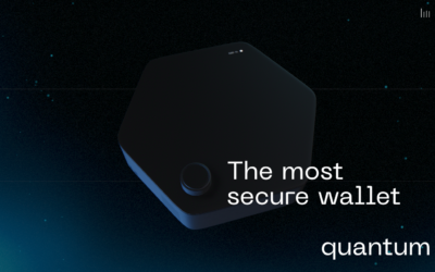
Quantum Wallet
Neat scroll interactions, I like the animations and how they're triggered as you go down the page. Some technical things going on that could make it difficult to load for certain people, in the end though, it's neat-enough.
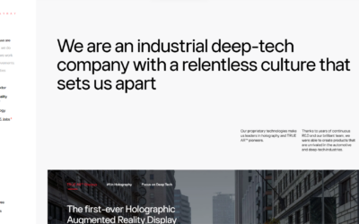
Sahkyo
Nice almost-single page layout. I like the detail work in the big graphics and the project grid layout a lot in this website design. It feels open and airy but not overly so, it comes across as being purposeful.
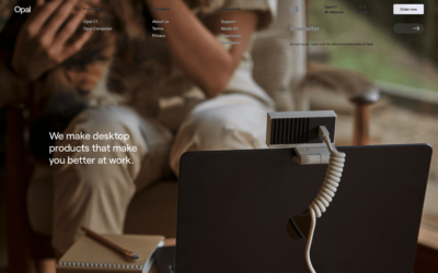
Opal Camera
Very nice use of large imagery to tell a story. You immediately know what they're about just by the image alone. I like the main nav and how it shows the sub-options but when you scroll they go away. Nice. Not wild about the gray on top of the image but it still works...
Pio
Neat effect with the image being "blocked" n by the gray background. I like the big button looks too. Not the most optimized mobile view but it's going to still work for most people. I like the "tech" vibe and colors most of all.
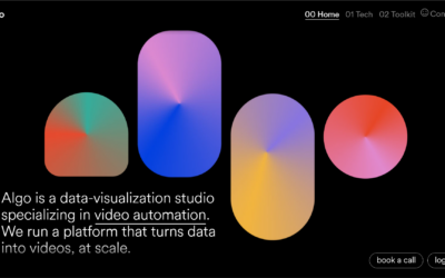
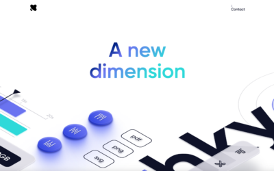
algo
Interesting visual look to the layout. I dig the big shapes and colors and the horizontal nav with the numbers in front of the pages/sections. Go check it out, there's some interesting things going on with the sub pages interaction wise as well.
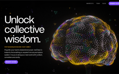
Dala
Very cool interaction with the mouse and the main website graphic of the brain. I like the way it uses the scroll and interaction with the main graphic to support the story telling as you use the website. Good stuff.
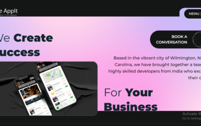
We AppIt
Weappitright is a top mobile app and web development company in North Carolina. As one of the top development firms in The United States of America, we offer a range of innovative services that help businesses around the world grow and reach their top potential. Our services range from iPhone app development, hybrid app development, maintenance, to front-end designing, and maintenance services.
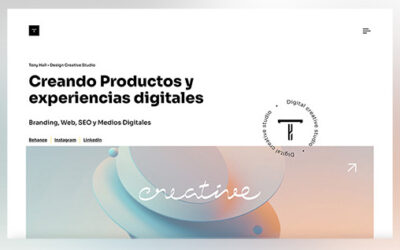
Tony Hall • Studio
Tony Hall. Designer, Consultant and Creator of digital experiences.

Sling Shot Intergalactic
We are your global partner for file sharing, syncing, and cloud services.
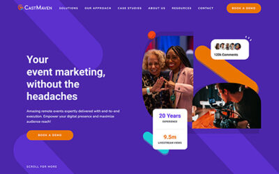
CastMaven
Your hybrid event, virtual event, on-site event, event marketing, without the headaches
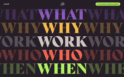
Daydrift Design Studio
A focus on animation makes this site pop, Daydrift is a product and branding studio.
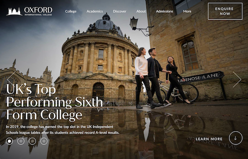
Oxford International College
Oxford International College is an independent sixth form college offering A-Levels, GCSEs, and a range of short courses.
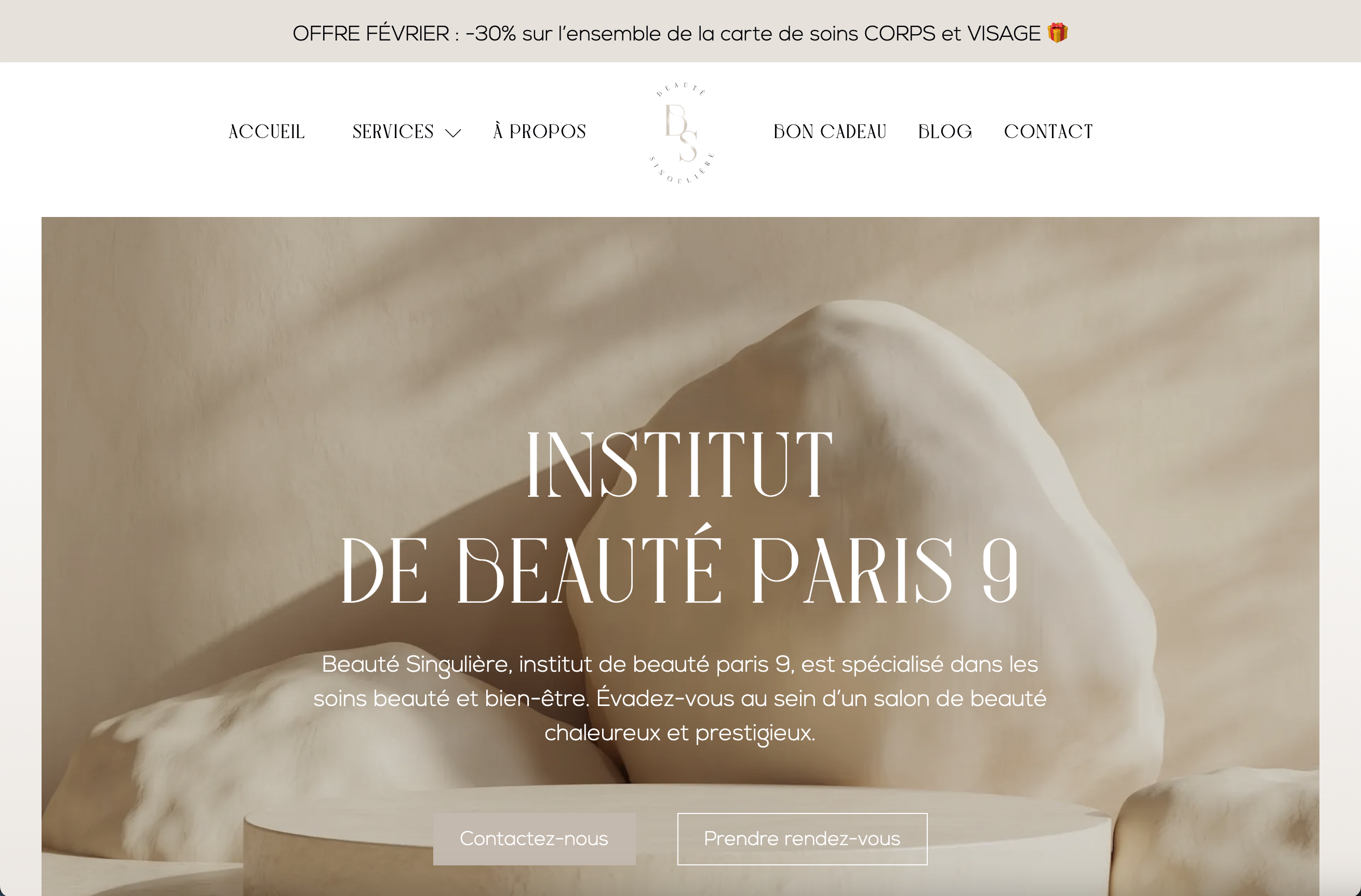
Beaute Singuliere Paris
Institut de beauté à Paris 9.
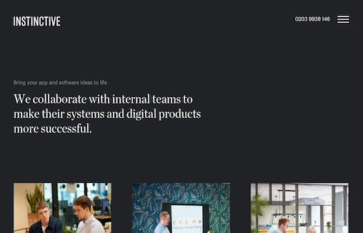
Instinctive Agency
Instinctive are app developers in London, and are part of the Plug & Play (UK) Group; a business that designs and develops mobile apps, web apps and delivers software development for funded start-ups and established app companies uk and globally.

Richard Ekwonye
I love the broken grid layout and the bold typography. I really like the small details in the fixed nav and logo too - nice little surprise. Also has a banger blog too https://blog.richardekwonye.com/bezier-curves
Dirty Line Studio
Real nifty layout with fun details. I like the movement as I scroll and the overall vibe here. I really love that red, contact, section - the moment you see it as you scroll is solid.
Digital Original
Overall this is a fun experience on the first viewing of the website. I really like the dark background and layout details. I feel like the dark background reinforces the brand so it really feels purposeful. I will say that on 3rd or 4th viewing it was tedious in that...
Fold 7
A great marriage of video/movement and bold, solid design. I like the little surprise details here and there, like the logo mouseover and the drawings that pop out here and there. I enjoyed viewing this website for the gallery.
EMAIL NEWSLETTER
News & Articles
Introduction to IBM’s Bluemix and Watson
 Have you heard of IBM’s Bluemix and Watson Developer Cloud yet? Here’s a quick show and tell on what people have been using it for.
Bringing together the Best Minds From Engineering and Design to Create Products That Delight Users
 Have you thought about IBM lately? They’ve made huge strides in standing up a solid design culture and it all starts with IBM Design.
BizCraft Episode 49: Interview Dan Mall
 In this special interview edition of BizCraft Carl talks with Dan Mall about the role of a creative director in a digital agency.

HARD WORK. CLEAN FUEL. NO EXCUSES
Use “WARRIOR2023″ for 10% off.