Web Design Inspiration Curated
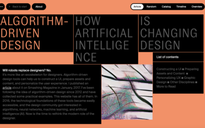
Algorithm Design
Some real clever interaction stuff built on this website design. It's clearly directed toward more design savvy people and that's cool too, considering it's about AI driven design stuff.
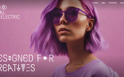
Visual Electric
AI image generator... I like the ripple effect on the hero image area. That display type is pretty far out there - reminds me of sci-fi for sure.
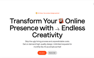
faizur
https://youtu.be/4Mpo8VlkUHU Slick looking layout and design for this design service website. It has all the design details you'd expect to look very professional and trustworthy. Good job there! Check out the video to see what you think about the overall concept of...
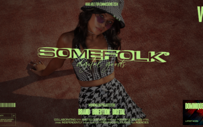
Somefolk
Pretty rad look and feel to this website design. I love the oversized type and the colors used in contrast with the "dark" photography used. I also find it very interesting that the top part of this design starts to look like or at least interacts like a YouTube card...
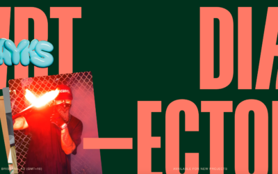
Flayks
https://youtu.be/cb7dCitixm0?si=K1fk5ZTQZV5bZ6Ji Very interesting layout for the Flayks portfolio website, some cool typography work to stand it all up on. I like the green and orange colors - very trendy yet not really. I also very much like the work section and how...
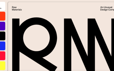
Raw Materials
Raw Materials takes an unconventional approach by not featuring images of their work above the fold on their single-page site, necessitating scrolling to reach the work section. However, their effective use of bright colors and large typography adeptly conveys their...
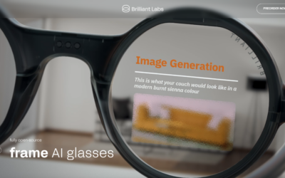
Brilliant Labs – AI Eyewear
I dig scrolling on these long parallax style page layout/interactive/animation based pages. This one is well built and seems pretty seamless. Interesting product as well.
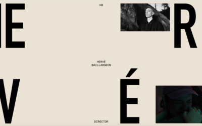
Herve Baillargeon
Interesting visual style for this layout. I like the, i'm going to call it, "broken" typography style - reminds me a bit of David Carson's work from back in the day.
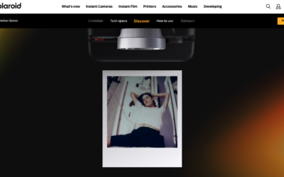
Polaroid i2 Camera
Super slick demo website for the new i2 camera. Solid parallax style triggered animations and super clean and interesting usage of product photography. Not to mention showing off the camera's photo styles as well. Fun!
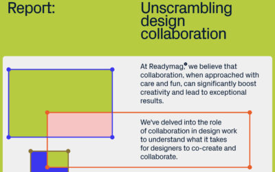
Readymag Report: Unscrambling Design Collaboration
Readymag, the design tool for creating outstanding websites, celebrates its 10th anniversary by launching a report on design collaboration in the form of an interactive digital editorial.
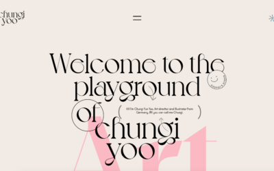
Chung-Yun Yoo
Lots of creative folks, like designers and photographers, really dig HTML5 websites because they let them express themselves in cool ways. Chungi Yoo's portfolio is a neat example. It's not just a plain showcase; it's like a fun playground where you can mess around...
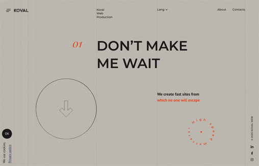
Koval Web
Captivating play between the type layer and background/grid. I like the scroll interactions. Not crazy about taking over my cursor with a circle. Overall solid layout.
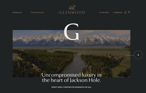
The Glenwood
Branding & Interactive design for The Glenwood, Luxury Real Estate development in the heart of Jackson Hole
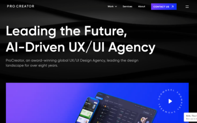
Procreator
Cool background animation. I also dig how the microinteractions work when you mouse over the video area and then the number animations. All in all, this is a compelling visual design that pulls me in.
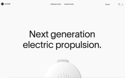
Propel
I LOVE minimal website design. This one really matches the product itself. Clean lines and simply type drive it home to let you just scroll and take in the beauty.
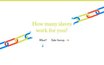
Slavery Footprint
The folks working on Slavery Footprint went with a popular choice for their CSS design: a storytelling approach. They used scroll-activated animations, illustrations, and CSS effects to share a compelling story about slavery. They kept it simple with sliding...
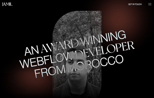
Tarik Jamil
A portfolio site for Tarik Jamil, a Webflow Developer based in Morocco
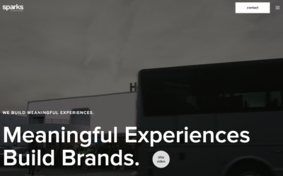
Sparks
Sparks' design is one that works in an organized and structured way visually but with a bit of fun/flair. Image-based hero section, full-screen slider, gallery, and blog - pretty straightforward stuff. This website is a great inspiration for creating a professional...
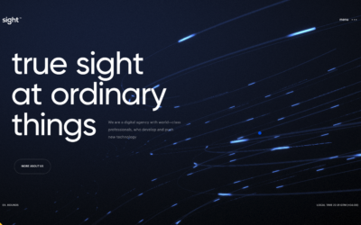
sight
There's a ton going on visually with this website. I'm not wild about the loading image and having to wait and/or click like that, but once you load it up you're given a show. I love the background imagery/animation and how the mouse interacts with it. The...
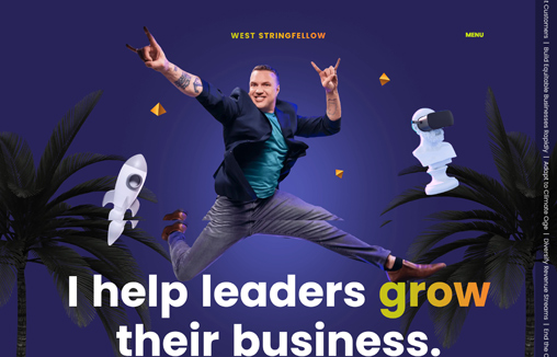
West Stringfellow
Legendary innovator West Stringfellow came to us to design and develop his new website. He wanted a site that reflected his personality fully and delighted his users. Created with Webflow by the team at www.karpi.studio
EMAIL NEWSLETTER
News & Articles

Mat Marquis – The Past, Present, and Future of Responsive Images
Giovanni talks with Mat Marquis about the future of responsive images during BDConf Nashville.
Dribbble’s of the Week – 9/17
 Each week we’d like to show you some of our favorite Dribbbles from some people we think are doing awesome work.
UI Details – Horizontal Overlay Navigation
 User Interface Design Details and Patterns: Some great examples of Horizontal Overlay Navigation

HARD WORK. CLEAN FUEL. NO EXCUSES
Use “WARRIOR2023″ for 10% off.